Последние

This is a drawing of the pond in my backyard. Took a low angle shot of the pond and drew from that.
Song: Winter
Artist: Ryan Farish
Farish Music International (BMI)
Licensed with permission, RYTONE Entertainment
You can purchase the song from itunes here
http://itunes.apple.com/us/alb....um/wonderfall/id2891

Welcome back everyone to the start of my series on how to draw the mountains in the mist!
If you need a reference photo, try this one! http://sphotos-c.ak.fbcdn.net/....hphotos-ak-snc7/4793
Other Places to Find my Art
Facebook: http://www.facebook.com/tylersartshack
Twitter: https://twitter.com/#!/TylersArtShack
Google+: https://plus.google.com/115405....344518849808905/post
Deviant: http://tylersartshack.deviantart.com/
The Sketch:
In this video I show you in real time how to create the basic sketch of the Mountains in the mist. This video's main purpose is to show you how to place all the objects so that everything flows and to work out the major placement. While doing this process, if anything would to be off like the mountains being too large, you would start to notice that when drawing in other parts of the image. The sketch helps to solve a lot of the problems that would normally arise when you skip the process. So this video helps to break down all the elements of the image so that you can easily place them back on the page.
I hope this video helps everyone out.
Music:
Artist: Alex Beroza
Song: Improvisation On Friday.
Music can be found on cc.mixter.org
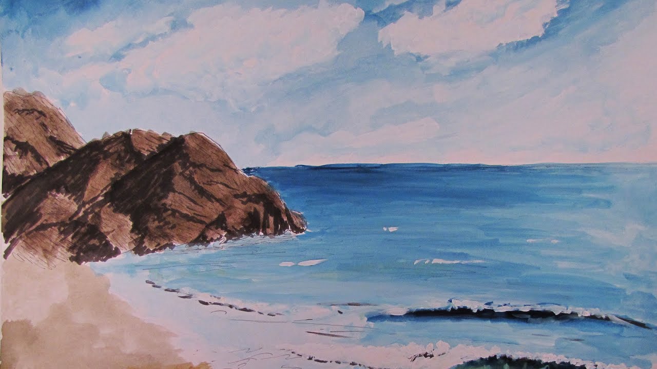
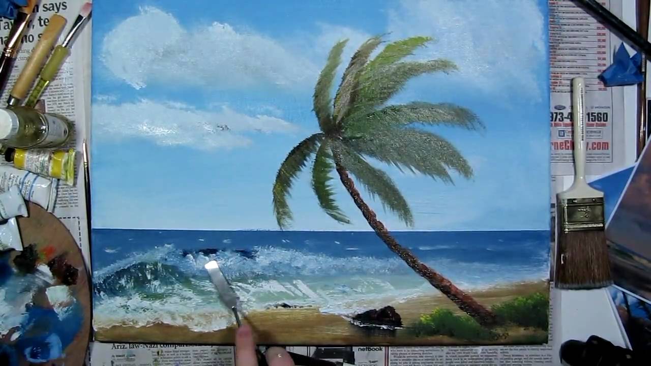
In this video, I show you the steps necessary to create a watercolor beach landscape scene from scratch using water color paints and ink pens.
==================================================
Follow me!
Facebook: http://www.facebook.com/tylersartshack
Twitter: https://twitter.com/#!/TylersArtShack
Google+: https://plus.google.com/115405....344518849808905/post
=-=================================================
In this drawing I used the following Supplies:
Blick Watercolor Paint in various colors
Blick Watercolor Brushes
Copic Inking Pens
Basic pencil for sketch
14 x 17 Bristol Paper
This painting started out with a basic pencil sketch just to get all the object placement arranged and situated to my liking. After which I used a Copic inking pen to put in the darkest darks into the painting. The copic markers dry fast and the watercolor will not disturb them once they are dry.
Soon after the ink is all dried, I then apply the layer of watercolor paint. You have to work fast with watercolor because it dries very fast unlike oil paint. It is also very transparent so you have to have all the placement of colors pre determined because it will be very difficult to fix mistakes if one should arise.
I always start with the furthest object in the background when I paint or draw landscapes. So I usually start with the sky. I left areas white to be the clouds later on. I fill the areas around them with a light blue color.
Once the clouds and sky are finished, ill move to the next object. This is usually the middle ground of the drawing. In this case it is the furthest rocks and distant horizon line ocean water. The rocks were rather simple because I had already applied the darkest darks to them with the markers and all i had to do was add some color to them.
The water was created using a variety of blue colors as well as mixing colors. When I draw or paint water, showing a variety of color helps to show the light and moment of the water without getting too detailed with it.
The same applies for when painting in the waves. I try to vary the colors to show a 3 dimensional object at work. It helps to show the curves and form.
the sand was just a very light wash of light brown sandy colored paint mix.
Thank you for watching, I hope you all enjoyed watching!
Make sure you Subscribe for future tutorials to come!
==================================================
Music by Danosongs.com
Song is called Wait For the Dawn.
Check the link for the song http://www.danosongs.com/music..../danosongs.com-waitf

Here is a drawing lesson that everybody should do. It shows YOU the range and textures your pencils can make. It is an excellent tool to use to better your drawing skills.
Please subscribe to learn many different aspects of landscape art.
Here are the pencil's that I used:
Faber Castell Graphite Pencils
2H
4H
HB
2B
4B
6B
Check out my facebook fan page. I have plenty of updates on sketches and drawings that I have been working on. http://www.facebook.com/tylersartshack
So this is an exercise I did in my sketch book to see how my far I could push my pencils. I wanted to see how many different types of texture and shades they could produce. For each pencil I wanted to test, I drew 5 boxes for the different shades starting from light to dark.
I tested 6 pencils. The pencils I tested are 2h 4h hb 2b 4b and 6b. These are the pencils that I use most often and are the ones that I use for sketching and drawing. You can notice the transition from light to dark within each series of boxes. By doing this, you can fully understand what pencil to use depending in the situation.
For the outer boxes, I used these to test what sorts of texture I could produce. The very first box is hatching. Hatching is a very basic way of shading something in. It is line motion going in a single direction to create shadow and depth.
The second box is cross hatching. This is used to create texture as well as shadow. Cross hatching makes a criss cross type pattern.Cross hatching will produce gradually darker results as more layers are applied.
The third one down is blending. You can either hatch or cross hatch this section and then using something to blend half of it out to create even tone. You can use a: blending stump, Q tip, paint brush, cloth, or your finger.
The 4th one down is scribbling. This one is a texture that is most commonly found in my mountains. I use this texture to create interest and likeness.
The 5th one down is circular scribbling. Ill use a texture like this for fine detailed tree leaves. You can also use it for other things.
The 6th and 7th box is burnishing. Start out using either a H or a B pencil. Hatch the whole box in but leave gaps in pencil strokes. If you used a B pencil to do this, use an H pencil to hatch in a different direction from the original pencil strokes. This will then become cross hatching. The end result leaves the original texture in tact while darkening the overall square. The other box has same process but it just starts with the opposite pencil.
The last box is my favorite type of texture. You will need something sharp to do this. Use either a neede, toothpick, or any sharp object to gently scratch the surface of the page. Do this in a hatching type motion to cover the entire box. Then use either an H or a B pencil to go over that area again. Notice how the scratches are still clearly white and visible. This makes some very fine detail. I will use this to create bark on a tree.
Music on this video is by Dano
Check out his website Danosongs.com
The name of the song is "The Streatham Hill Gods"
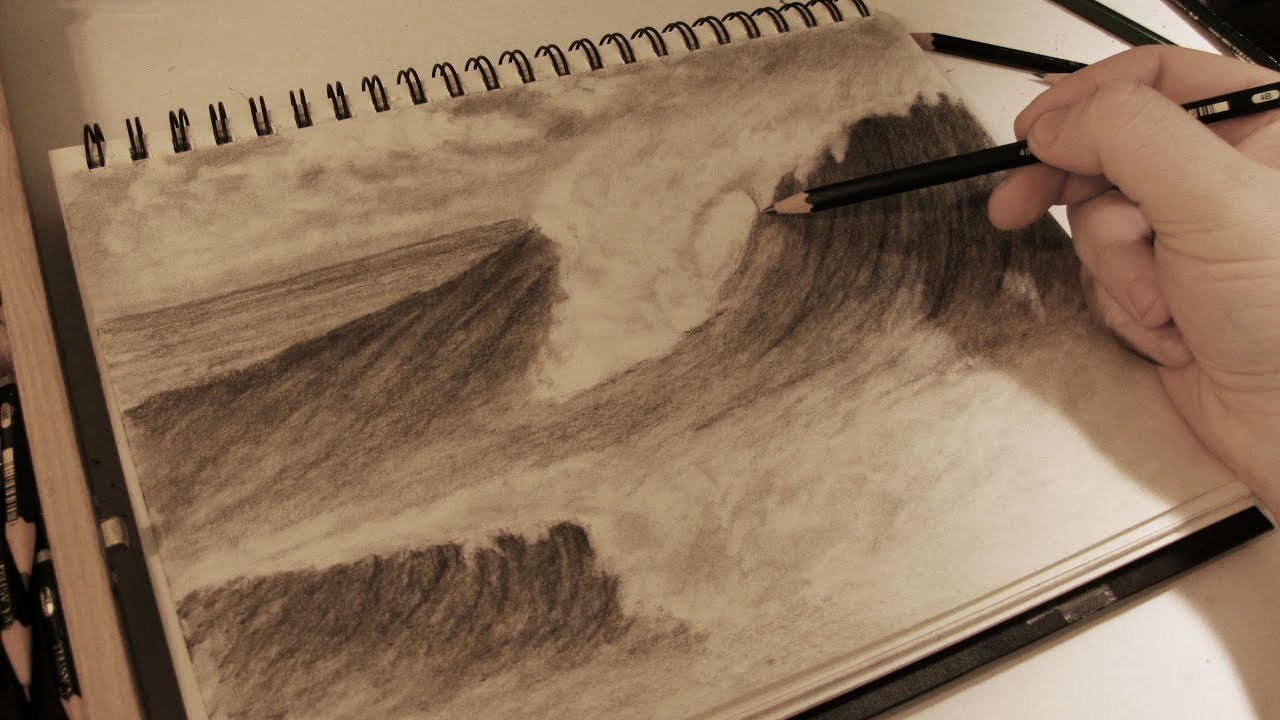
In this video, I will show you the steps needed to draw some realistic crashing waves in the surf using graphite pencils.
Follow me!
Facebook: http://www.facebook.com/tylersartshack
Twitter: https://twitter.com/#!/TylersArtShack
Google+: https://plus.google.com/115405....344518849808905/post
Song is called "Ditto Ditto" from Dokashiteru. He can be found on ccmixter.org
What's going on everybody, welcome back to the Art Shack! This time I have a drawing tutorial on how to draw realistic crashing waves in the ocean. The beach and ocean has always been a big part of my life so I had a great time sharing this experience with all of you.
I started this drawing by using a photo reference to get down the general wave shape and the basic shading of the sky. Once I had this basic detail down, I put the photo away and just took it from there. I always like to do some or most of the drawing from imagination or memory. It helps to add some uniqueness to it as well as my own style.
When I start a new landscape, I will usually sketch out the basic shapes of everything I want to see in a drawing and once that is done, I will usually go in for the sky.
This time I made a lighter sky which I eventually went back into and made darker. I kept it simple. I pretty much shaded the whole thing in and then erased out some clouds. I didn't want to make a detailed cloudy sky because I did not want the clouds to be a major element to this drawing. I decided to have them less detailed than what I would usually do.
When starting the wave, I had an idea of how it was going to look. I knew that there was a part of the wave that was crashing over and mapped that portion out. I also left that area untouched as I was shading in the rest of the wave.
I started the wave with a light pencil. I shaded it in with an HB pencil quite a few times then blending it out. I did this process over and over until I got the wave dark enough. I wanted the large wave to be considerably darker than the sky so that the white foam and mist of the wave would really show up. When adding in details for the wave, I made sure to follow the flow and direction of the wave. Doing this helps to define the movement and shape of the wave. Making lines in a different direction would have taken away from this effect. I went in as dark as a 4B pencil and used that to add in the final detailed line work.
For the mist and foam of the wave. I used the dirty blending stump and went back in with that. I rubbed the excess graphite from that onto the foam section of the wave. I then used an eraser and erased in a motion flowing backwards making the wind look like it was hitting the wave straight on. This helps to create the perfect wave for surfers. I used a few tools to erase out the waves. One was a large white eraser. I also used a mechanical eraser. The final piece that I used was an electric eraser to really get up the darker portions to make them highlights.
Once the main wave was done. the only portion left was the smaller wave that I added in. It took the same steps as the first wave except on a smaller scale.
I hope you all enjoyed this video. Leave drawing suggestions and feedback for future videos!
Laterz!!

In this video, I show you first hand on how to draw realistic clouds using different shading, blending, erasing and texture techniques to create a fully detailed realistic sky with clouds.
Song is from CCmixter and is called Soul Control from BO Crew
Follow me!
Facebook: http://www.facebook.com/tylersartshack
Twitter: https://twitter.com/#!/TylersArtShack
Google+: https://plus.google.com/115405....344518849808905/post
Supplies for this drawing:
Canson Classic Cream Drawing Paper
Pencils: 2B, 4B
Blending Stump
Blending Cloth
Kneaded Eraser
Tuff Stuff Eraser Stick
Large White Eraser
When I draw the sky in, I picture where I want the clouds and will leave those areas white. I will first shade the sky in with a 2H or HB pencil in a single hatching motion. Try not to vary the angle too much because it will put too much texture into the sky. I will then go over that area with a 2B pencil and make the sky rather dark. After the shading is completed, I will go back into the sky with a blending stump and will blend the bottoms of the clouds with the sky to make them fade. Then using the kneaded eraser, place it on the tops of the mountains and give it a small twisting motion. This will give the clouds a wispy look to them. It helps to convey movement. Then using the dirty blending stump, start to shade the clouds in a bit. Then using any eraser, erase out parts of the clouds again to create volume. I wanted puffy clouds in this picture so I did this several times over to give me the desired effect.
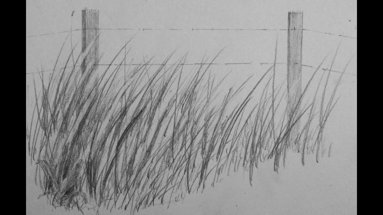
This video will show YOU how to draw realistic grass. I will take you through the steps on how to draw texture and the composition of grass. I even show you how to apply this to other drawings.
Check out my facebook page @ http://www.facebook.com/tylersartshack
Here is a tutorial on how to draw tall grass. This can be used to fill in many areas of landscapes to add in visual interest and texture. This tutorial will help you to draw realistic grass by producing realistic texture.
This drawing only used a 2B and 2H pencil and at the very end I used a 4B for dark shadows to create depth.
The rest of the supplies you will need consist of sharp tipped erasers and a needle point of some sort.
This tutorial starts out with simple pencil strokes. Press a sharp pencil down on the page and flick it upwards to create a gradual line that ends in a sharp tip. After layering this, it will start to create a grass texture. When there is a simple layer on the page, start adding another layer and blend the two layers together. Do this by erasing larger blades of grass extending from the bottom layer to the top layer and also making pencil strokes that extend from the first to the second layer.
The continuing combination of erasing, adding darker lines, and shading will help to create a grass like texture.
To help show grass growing into the distance, Continue above the current grass but make the pencil strokes significantly smaller to the point that the grass is simply a shaded area.
I have a few photos on my facebook page on grass that I have drawn. Check them out to see some more examples.
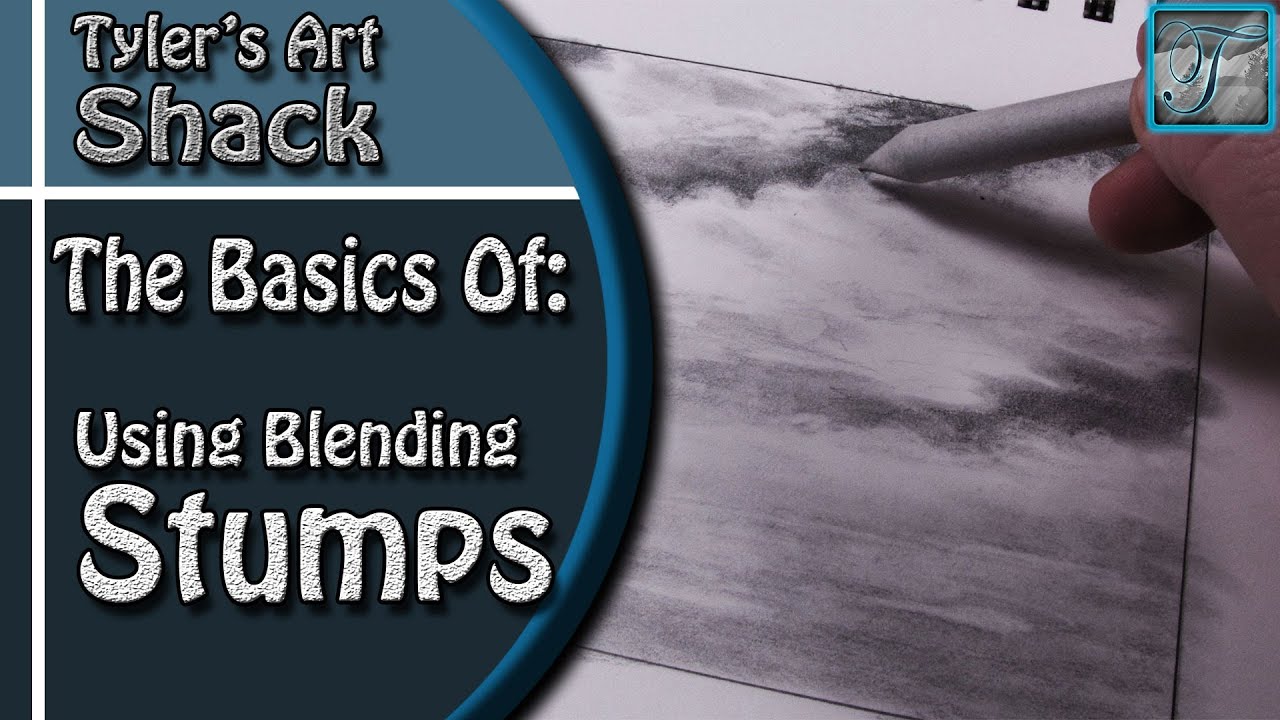
Welcome back everyone to The Basics of Using Blending Stumps
Other Places to Find my Art
Website: http://www.tylersartshack.com
Facebook: http://www.facebook.com/tylersartshack
Twitter: https://twitter.com/#!/TylersArtShack
Google+: https://plus.google.com/115405....344518849808905/post
Deviant: http://tylersartshack.deviantart.com
Here is a quick video about the basic use of blending stumps. I made a rough sketch of clouds that need to be touched up. The use of a blending stump does a great job at this. I started out by blending out the dark areas of the sky to clean things up. I will also use the blending stump to start smoothing out the bottoms of the clouds. This will help to build up the contrast between the bottom and the top of the clouds.
I made my sky darker on the top of the page than I did on the bottom. They sky will naturally tend to lighten on the horizon.
Once everything is smoothed over, my next step is to use an eraser and bring out some highlights. This is not all that essential to how to use a blending stump but the materials combined help to really produce a nice piece of artwork.
I hope you all enjoyed this short demo on blending stumps and thanks for watching!!
Artist: Dano Songs
Song: Helium Hues
Music can be found at DanoSongs.com

In this video, I show you the steps to drawing a variety of trees from start to finish.
Follow me!
Facebook: http://www.facebook.com/tylersartshack
Twitter: https://twitter.com/#!/TylersArtShack
Google+: https://plus.google.com/115405....344518849808905/post
Deviant Art: http://tylersartshack.deviantart.com/
Hey everyone, welcome back to this weeks video where I show you to draw a couple of different trees. I drew these trees in a more lose like style to give them a little bit more character.
I start off the first tree with a line that re presents the entire tree. The bottom of that line represents the trunk and the top of the line where I start to really wiggle it around is the very top of the tree. I do this so that there are no issues with placing the entire tree on the page.
Once that line is done, I then go back in and start to design the trunk of the tree and work my way up to the branches making them smaller as I go. One issue that I had a lot of trouble with was making the tree look organic and less stiff. Avoid straight lines. Instead use curves, wiggles, and corner shaped lines for the trees to keep it looking organic.
Once the basic outlines of the tree is finished, shading comes next. I like to make my tree first look like a winter tree before adding leaves creating a summer tree. Choose a side of the tree you would like darker than the other and begin to shade. Shade in the direction of the tree's movement. This will help to simulate the bark and texture of the tree.
Once all that is done, you can leave your tree at what you have and call it a winter tree or take the next step and add in the leaves and see what you can create. Adding the leaves is much more simple if you think of it as adding in bunches of leaves instead of each single individual leaf. If drawing each leaf is your method of choice, you may be drawing for quite some time. I find that drawing the texture of a bunch of leaves translates to the eye just fine. It is the texture that conveys the image. Use an underhand grip so that maximum amount of graphite is in contact with the paper and use small circular motions while doing this. Use a variety of pencils to get different gradations to create volume.
The Second set of trees is out of my Mountains in the Mist drawing. I drew 3 trees very similar to them. Those I start out by drawing a straight line representing the whole tree. Then I usually start at the top of the tree making some small texture for the pine. I usually do the same underhand grip for this and work my pencil from the line outward in a slight upward motion. That way the branches have a slight arch to them. This helps to give it a bit of character and interest. I do like to make them look lush so I add in quite a few branches. Sometimes Ill make them a little bit more weathered looking by holding back on the amount of branches overall.
Alright everyone! I hope you all enjoyed this weeks video! Please leave me a comment on your thoughts and rate thumbs up if you enjoyed it! Subscribe for future videos!
Music Info:
Artist: DJ Lang
Song: Drops of H2O

Hey guys, it has been a very long time since I have uploaded a video to YouTube. I honestly miss the community of subscribers and other content creators. I miss feeling a part of something that we all had in common and loved doing. So, here I am a few years later just checking in with everyone.
I don't want to promise that I will be making more regular content such as drawing, woodworking, or anything else but I do want to do something every now and then. Ill see what happens.
Thanks for watching!
Supplies I used
Gamblin Oil paint
Colors:
Titanium White
Ivory Black
Cadmium Yellow Light
Cadmium Yellow Deep
Cadmium Orange
Cadmium Red Light
Cadmium Red Medium
Cadmium Red Deep
Alizarin Crimson
Manganese Blue
Cobalt Blue
Ultramarine blue
Olive Green
Sap Green
Brushes
Blick Masterstroke Bristle
Sizes 6,8,10 - flat brushes
Size 3 Filbert
Size 3 Bright
Music: Song is called "Laid Back Guitars" by Kevin MacLeod
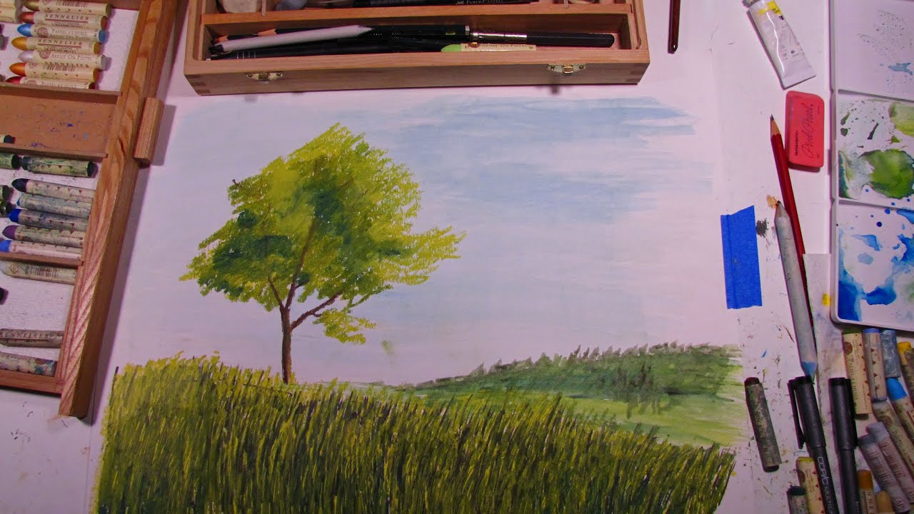
In this video, I will show you the steps needed to create a simple landscape scene with grass and a tree in oil pastel, marker, and watercolor paints.
Follow me!
Facebook: http://www.facebook.com/tylersartshack
Twitter: https://twitter.com/#!/TylersArtShack
Google+: https://plus.google.com/115405....344518849808905/post
I will add to the description soon....

This is my first time painting on a canvas. I had a very good time painting this picture. There are so many shortcuts with painting and it makes it so much fun to do. It can get costly to do but its worth it in the end.
You can view this painting as well as all my other works of art from my deviant page.
http://digg409.deviantart.com/....art/Winter-Mountain-
Song: Breakthrough
Artist: Ryan Farish
Farish Music International (BMI)
Licensed with permission, RYTONE Entertainment
www.ryanfarish.com
You can purchase this song from Itunes here
http://itunes.apple.com/us/alb....um/everlasting-delux
Oil on canvas. This was one of my very first tries with oil paints.
Used Grumbacher oil paints. Took me little over an hour to complete.
Song: Freedom Song
Artist: Ryan Farish
Farish Music International (BMI)
Licensed with permission, RYTONE Entertainment
You can purchase this song from the following link. http://itunes.apple.com/us/album/bloom/id360509452

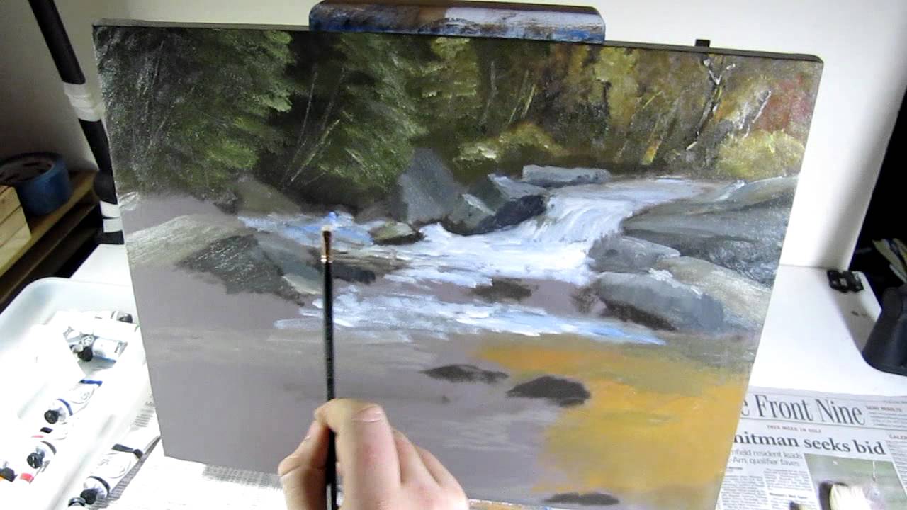
Did this drawing with oil pastels on a 12 by 16 inch acrylic sheet of paper. Took me about 2 hours to complete this over 2 days.
Supplies
Sennelier oil pastels
Canson Acrylic grade paper 185 pound
Blending stump
standard pencil
You can view this drawing on my deviant art page.
http://digg409.deviantart.com/....art/Fall-Stream-1623
Song: Home Again
Artist: Ryan Farish
Farish Music International (BMI)
Licensed with permission, RYTONE Entertainment
You can download this song from the Itunes store.
http://itunes.apple.com/us/alb....um/from-the-sky-delu

Welcome back everyone to my tutorial and demonstration of The Basics of Blending Stumps.
Other Places to Find my Art
Website: http://www.tylersartshack.com
Facebook: http://www.facebook.com/tylersartshack
Twitter: https://twitter.com/#!/TylersArtShack
Google+: https://plus.google.com/115405....344518849808905/post
Deviant: http://tylersartshack.deviantart.com
In this video I will go over briefly about 6 different types of blending materials starting from the more conventional materials to the more make shift ones starting with regular blending stumps.
Blending stumps are my go to materials for blending since they are one of the easiest and best performing ones to use. I hardly ever clean mine because I have never had a need to do so. I just keep using the dirty ones over and over again.
Tortillons are another popular method of blending but I don't use these too much. They are hollow in the center and if you press too hard on the tip, they will become more of a rounded tip instead of a sharp one. They still non the less perform quite well.
A cloth is a very nice tool to have. They blend more smoothly than any other material and they will also take up graphite as well which can really come in handy if you have made an area too dark.
Paper towel is getting a bit more on the unconventional side and your results will strictly depend on the texture of your particular brand of paper towel. They leave a bit more texture than a cloth will which can give them some unique uses.
A paint brush is a tool that will blend graphite in a particular area but will not smear it around like other materials would. I use paint brushes to clean away eraser shavings more than blending.
A Q-Tip is just one of those things that nobody would ever really think to use as a blending material. It is what I will recommend to those that can't find blending stumps or just need a quick fix. They only last for so long but they are quite cheap and do the job rather well.
I hope you all enjoyed my demonstration about different types of blending materials and thanks a lot for watching!!
Music Info
Artist: Dano Songs
Song: Helium Hues
Music can be found at DanoSongs.com
If you would like to see a real time version of this drawing, I have an 8 part series of how to draw this exact drawing step by step! Follow this link to watch!
http://www.youtube.com/watch?v=VG1Mqvtw1VM&list=SPQ2Zh_NCUBvQI0K0zk8HeYbdXFnulJmsn
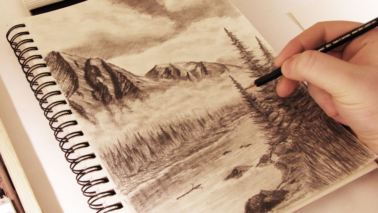
In this video, I will show you the tools and tell you the steps that I took to complete a realistic mountains in the mist landscape scene done in graphite pencils.
Follow me!
Facebook: http://www.facebook.com/tylersartshack
Twitter: https://twitter.com/#!/TylersArtShack
Google+: https://plus.google.com/115405....344518849808905/post
Music is from "The Spark that Thought" and the song is called "A Driving Rain" You can find this song as well as many other songs on http://dig.ccmixter.org/
Supplies and general information about video.
Time to draw: About 3 and a half hours.
Paper: Canson 90Ib Drawing sketch book
Pencils: Mostly HB. Also used 4H, 2H for highlights and 2B 4B for shadows.
Erasers: Tuff Stuff Eraser Stick (mechanical eraser) Kneaded eraser
Welcome back everybody to another drawing tutorial. This time I decided to draw one of my favorite subjects which is a mountain landscape. I have done many mountains in the past but I do not believe to this amount of detail.
I start off every mountain sketch in the same way. I will usually sketch the general placement of the mountains and will usually divide them up as to where the highlights and shadows will be placed. I then will usually jump right into the sky.
When I draw the sky in, I picture where I want the clouds and will leave those areas white. I will first shade the sky in with a 2H or HB pencil in a single hatching motion. Try not to vary the angle too much because it will put too much texture into the sky. I will then go over that area with a 2B pencil and make the sky rather dark. After the shading is completed, I will go back into the sky with a blending stump and will blend the bottoms of the clouds with the sky to make them fade. Then using the kneaded eraser, place it on the tops of the mountains and give it a small twisting motion. This will give the clouds a wispy look to them. It helps to convey movement. Then using the dirty blending stump, start to shade the clouds in a bit. Then using any eraser, erase out parts of the clouds again to create volume. I wanted puffy clouds in this picture so I did this several times over to give me the desired effect.
After the sky is finished up. I then go in to the mountains. I will usually divide them up between which side will have highlights and which side will be shaded. I will save the H pencils for the highlight side and use B pencils for the darker side. I start off light then progressively go darker when I am more confident about how I want the mountains to look.
Moving down the drawing. I decided to add in a layer of clouds or mist. I prepared for this by blending out the bottoms of the mountains and carrying that blend line quite a ways down the page. I then did the same procedure for the clouds and started to erase out clouds. Then going back in and adding more shadows again to enhance them and bring them out more.
Going down the page further I drew in a river with some trees lining the shoreline. I wanted to make this tree line interact with the layer of mist. I achieved this by using very light 4H pencils and making very simple verticle lines. With them being so light, it looks like the mist is interacting with them. I also made more lines using darker pencils to make a layering effect. I also put in some details for individual trees to add visual interest.
The next step was the stream. That was rather simple. Just used a darker pencil for the reflections and used an H pencil for the rest of the water. Blending it with a blending stump. The erasing here and there for some white water.
The final piece of the drawing was shoreline closest to the picture plane. I added in some larger trees. I used a total of 3 different pencils for those. 2H for the first layer then an HB and 2B for the shadows to give them depth and volume. The last stages was the shoreline and adding details to the rocks. I also added in some detailed grass at the end.
Hope you all enjoyed this one and I will see you all again soon with another tutorial!
Leave comments for future suggestions!

Happy Holidays everybody!
This is a drawing I did on christmas eve using oil pastels. This video shows you how I drew the picture from start to finish.
This final picture can be viewed from my facebook fan page here
http://www.facebook.com/pages/....Tylers-Art-Shack/181
This picture took me about an hour and a half to draw. It was done by Sennelier oil pastels.
I decided to draw a holiday edition drawing for all of my fans of youtube. This drawing is done in a very Bob Ross style. He is one of my favorite painters and love his style. I have never done a painting at night before and wanted to give it a shot.
Hope you enjoy
I started this drawing off by making an outline for where the mountains would be placed. From there, I made a transition from light blue all the way to black for the sky. Towards the end of the drawing, I added in some stars to give it an extra appeal to it.
I right after started to fill in the mountains. I used a white color for the lighter side of the picture, and a lighter blue color for the shadow side of the mountain. I find that after a fresh snowfall and a bright moon, that the landscape is lit up very bright. So i replicated this as best as I could.
After shading in the mountains, I went back in and added in some black to indicate some rocks and little things like that. I added more of these towards the base of the mountain. I then used a blending stump and started to blend out the base of the mountains to create a layer of mist. This helps to give a nice transition from the mountains to the tree line.
I added in the tree line just by simply using up and down like strokes with black and then green for the tops of the trees. I also added in more trees below the tree line and they would later become a reflection in the water. As the tree line came closer and closer to the picture plane, I made some trees larger and put snow on the branches to indicate a fresh snow fall. For the waters reflection, I used the same colors I did for the sky. I started off with the reflection of the trees and working our way towards the picture plane, I added in a lighter blue that went all the way to a very dark blue and eventually black.
I added in some snow banks at the edge of the river and put some snow on them. I carried the black water all the way up to the picture plane. and added some water marks into it to make it look like it was moving. I also added in some stars reflecting into the water.
Music is from Kevin MacLeod and the song is called "It came upon a Midnight Clear"

Andrew and I decided to draw this picture. Took me just over an hour to draw this. did this with Sennelier oil pastels
Song: Indian Summer
Artist: Ryan Farish
Farish Music International (BMI)
Licensed with permission, RYTONE Entertainment
You can purchase this song from Itunes here
http://itunes.apple.com/us/alb....um/beautiful-deluxe-

Here is my very first drawing with oil pastels. The brand of oil pastels that I used is called Sennelier. Drawing time took me just over 2 hours.
Supplies:
Sennelier oil pastels
Canson Acrylic grade paper 185 pound
Blending stump
standard pencil
Song: Walk with You
Artist: Ryan Farish
Farish Music International (BMI)
Licensed with permission, RYTONE Entertainment
You can purchase this song from Itunes here
http://itunes.apple.com/us/album/miles-away/id318237348?i=318237557&ign-mpt=uo%3D4
