Neueste Videos
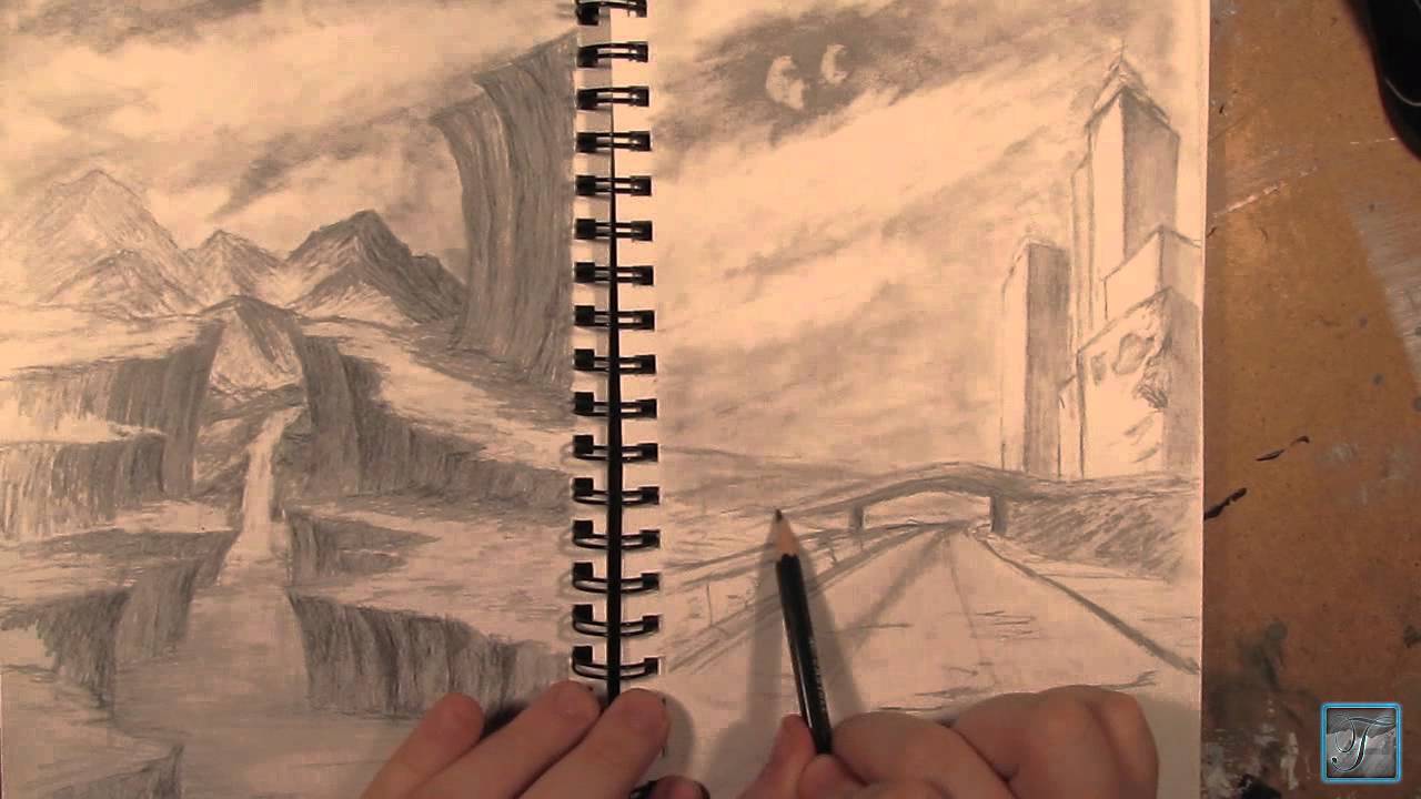
Hello and welcome to the first part in my how to draw landscape series. In this part ill cover how to create a simple sky and mountains using charcoal techniques.
This video is part 1 of 3 in this series so be sure to watch the other 2 videos to complete this whole videos.
For the complete series here Ill be using different grades of generals charcoal pencil. Compressed charcoal in 6b. Generals white charcoal.
3 different types of erasers. kneaded eraser, a white one and a pink eraser.
Ill also be using blending stumps pencil sharpeners and sandpaper.
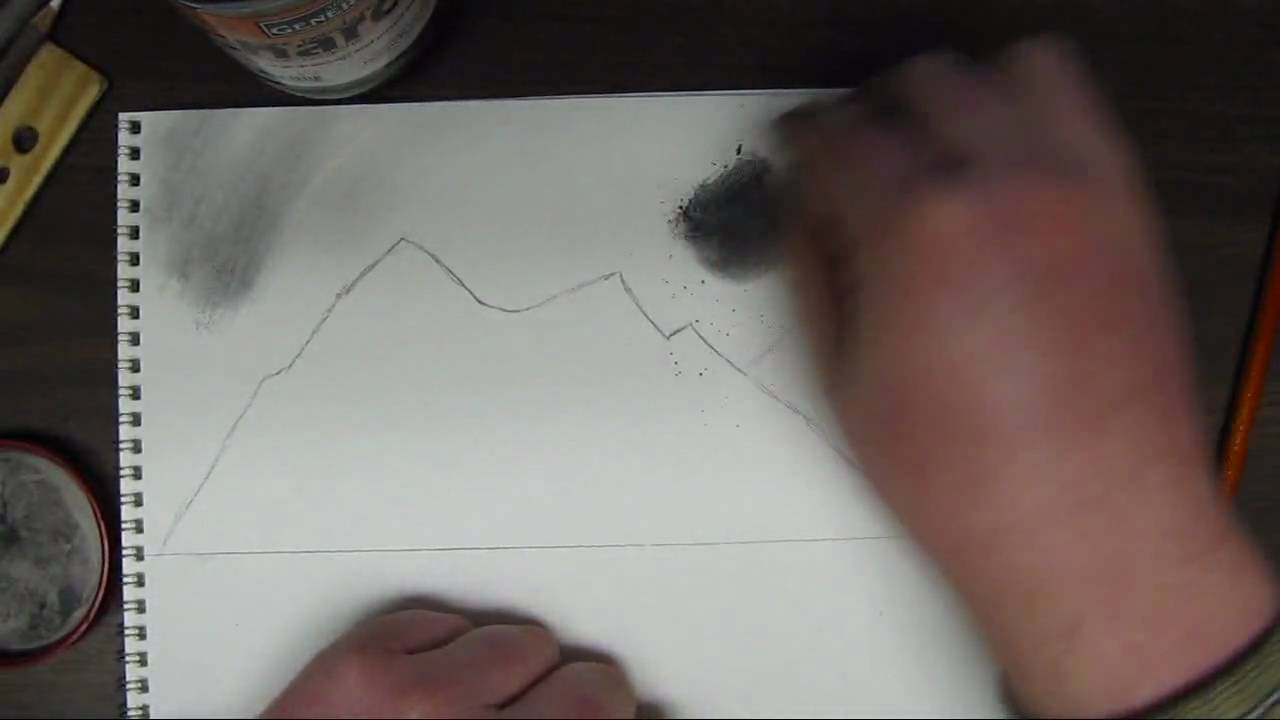
This tutorial focuses on the sky and the mountains. I first start off by drawing an outline to the mountains. Powdered charcoal works great for shading in the sky. This creates a nice even coat. Use a cotton ball with this or a paper towel. This creates a very even tone for the sky and really sets it up nice if you wanted to add in some clouds. Add in the sky area first in the drawing so that you dont mess up any detail you set into the mountains.
After the sky is shaded in. Re define the mountain area and once that is done you want to create some lines going from the peaks of the mountains down to the base. After this you want to establish a direction of light and any mountain face that is facing away from that light will be shaded while everything facing the light source will be highlighted. This creates a 3d and realistic look to them.
Be sure to come back and watch part 2 to put in trees and a distance beach in the background along with a lake, close up pine trees, and some rocks. Hope you enjoyed and thanks for watching!

In this video, I show you in real time how to draw a phoenix step by step to create a realistic drawing.
Follow me!
Facebook: http://www.facebook.com/tylersartshack
Twitter: https://twitter.com/#!/TylersArtShack
Google+: https://plus.google.com/115405....344518849808905/post
Supplies:
Paper: Canson Classic Cream Hard Bound Sketch Book
Pencils: Faber Castell 2H HB 2B 4B
Kimberly 9xxB Graphite Pencil
Blending Stump
Erasers: Tuff Stuff Eraser Stick
Music: Song from CCmixter.org Song: "A Driving Rain" Artist: The Spark That Thought
What is going on everyone!! Little bit of back story to this drawing: I posted a similar drawing to this (seen in beginning intro) on my FB page and it went rather crazy with activity from my audience so I just had to make a tutorial on how to draw a Phoenix.
This drawing first time around took me about a half hour or so to create but this tutorial took me closer to an hour to draw. I sped up portions of the video just to save time.
Welcome back to how to draw a landscape part 2. In this video I will be mainly going over how to start out drawing some hills or a beach in the background and some trees into the very far background. This part is very simple. All you need to do is draw some "m" like shapes for the hills/beach area. Shade that in simply, not much need for detail at this point. The trees i the background are only defined by up and down strokes. You only put in minor detail for the distance trees because after all they are very far in the background.
Next comes the reflections. I will be reflecting the tops of the mountains into the water. I start out by drawing simple lines that look like a mirror in the lake and shade them in simply. The water reflections usually are not as detailed as the mountain itself so leaving detail out is not a big deal. you want to blend them in quite well and get them nice and even.
Next comes the water. I use the powdered charcoal to get a nice even coat on the water area to get the tone down. After which I use a charcoal pencil to start putting in horizontal strokes. Add more of these marks closer to the bottom of the page. As the water reseeds into the background, add less detail into the water. It adds a sense of perspective into the drawing and shows depth.
I start on drawing in the pieces of land right after the lake is completed. Make sure the lake is done before you start to draw in the areas of land. I use the powdered charcoal to shade in the areas of land. Right after that I start drawing in lines that will be the trees. I add in a few of these trees.
Part 3 of this tutorial will cover the last of the trees that will be added in. So please come back and watch part 3!
You can find this drawing for a reference image as well as other drawings from my deviant page.
http://digg409.deviantart.com/gallery/

Welcome back everyone to the start of my series on how to draw the mountains in the mist!
If you need a reference photo, try this one! http://sphotos-c.ak.fbcdn.net/....hphotos-ak-snc7/4793
Other Places to Find my Art
Facebook: http://www.facebook.com/tylersartshack
Twitter: https://twitter.com/#!/TylersArtShack
Google+: https://plus.google.com/115405....344518849808905/post
Deviant: http://tylersartshack.deviantart.com/
How to Draw Mist
During the video I seem to have an issue with the difference between clouds and mist haha. They both have very similar techniques for drawing them so that is the main reason why I was mixing them up during the video. :)
The Mist layer starts out with just using the blending stump from last video and blending out the bottoms of the mountains. Then using a combination of an eraser and a pencil, I go back in and start to erase out some cloud like shapes that will become the mist. It is then just a matter of going back in and adding some shadows to the mist and this layering effect will start to really show through creating some nice looking mist.
I hope you all enjoyed this one and I hope to see you all again for the next part of how to draw the mountains in the mist!
Music Info:
Artist: DJ Lang59
Song: Drops of H20
Music can be found on cc.mixter.org

In this video, I show you how to take in atmospheric perspective and give the illusion of depth in a drawing by varying the shade and texture of distant mountains.
Follow me!
Music is from ccmixter.org
Song: Yiourgh
Artist: DoKashiteru
Facebook: http://www.facebook.com/tylersartshack
Twitter: https://twitter.com/#!/TylersArtShack
Google+: https://plus.google.com/115405....344518849808905/post
Welcome back everyone to another drawing tutorial. Due to the positive feedback on real time drawing tutorials. I am going to try and do more of them. I will still do some in my older fashion but it will be more of a mixed bag from here on.
Anyway, in this drawing I wanted to show you my knowledge on Atmospheric Perspective. This happens in landscapes where you can see over a large distance. As you look further and further to distant hills, mountains, and other objects they tend to decrease in contrast and detail. The further back they are, the more blue/gray they become depending upon the time of day. In mid day, they will turn more blue but in early and late evening, they can range widely in color. All the way from oranges to reds and peaches depending on the overall sky color.
The reason why this happens is because of the water vapor in the air. As light from those distant objects comes towards your eye, the light becomes distorted because of the shape of the water vapor. Because of the distorted light, a lot of light from the sky is mixed into the color of the objects which is why more distant objects become lighter and lighter. The effect is magnified significantly.
So when you apply this to drawing, you can make very believable distance within a simple landscape demonstration like this one I am drawing now. I start with closer mountains showing more texture and details while ones that are further back, I lighten the shade and add less detail and texture to push it back into the background. Increase this effect the further an object is away from the viewer.
Knowing atmospheric perspective is a great tool to help show distance in a drawing and makes them much more believable and understandable to view.
I hope this video has helped you and as always, thank you for watching and please like and subscribe! Stay tuned for next weeks video!

This video will show you how to draw a realistic landscape scene by taking it step by step.
Tools used:
Faber Castell Pencils
4H, 2H, HB, 2B, 4B, 6B
Kneeded Eraser
Tuff Stuff eraser stick
White erasers
Canson hard bound sketch book with 90Ib drawing paper.
Follow me!
Facebook: http://www.facebook.com/tylersartshack
Twitter: https://twitter.com/#!/TylersArtShack
This drawing is a continuation of last weeks tutorial where I took the time to show you how to draw a realistic tree using textures. In this tutorial, I will show you how to seat the tree in the ground and how to draw a simple landscape around that tree. The completed picture will be a nice little farm style landscape picture.
This tutorial starts off by drawing in grass in front of the tree. Since I am not drawing in the base or roots of the tree, I am using the grass to convince the viewer that all of that detail is hiding behind the grass.
The grass starts off as simple pencil strokes in a slight arc or angle to convey that the grass is blowing in the wind. It helps to create a likeness and realistic feel to the overall landscape. The pencils that can be used for this are a 2H for the initial sketch of the grass. An HB to shade a bit and a B or 2B to shade a bit darker.
A tool that is an absolute must for this drawing is a small eraser. I use a tuff stuff plastic eraser that is like a mechanical pencil but has an eraser instead of the graphite sticks. This tool is used to erase out single blades of grass. Erase these out contrasting to the pencil strokes. Erase in different directions to show variation in the pattern of the grass.
Once some grass is erased out of the picture, shading should be done around that single blade of grass c loser to where that eraser mark started to show that it is surrounded by multiple darker blades of grass. After this is done more grass can be drawn over the highlighted ones to show more depth.
This process is quite time consuming and takes a while to get used to. Take the time to practice drawing this before applying it to a completed landscape picture.
After a large enough patch is drawn, you can continue with the landscape picture. In this case, I decided to draw fence posts receding into the background. I used a ruler for this part of the drawing. When all of the fence posts were drawn, I used the ruler once again to draw in the wire connecting the posts to one another.
Once that was done, I took a moment to decide what the picture needed and decided to draw in a few more trees way in the background to give it some visual interest. I did this by simplifying the detail needed for a tree by a lot. This helps to show the viewer that the tree does not have a lot of detail so it must be far back into the background of the picture.
Reducing the detail of an object helps to push objects into the background.
Once that was done this picture pretty much wrapped itself up. Thanks for joining me on this one and I hoped you enjoyed it!
The music of this video was created by danosongs.com
The name of the song is "Imagine Magneta"

Welcome back everyone! This video will be about The Basics of Highlights Midtones and Shadows
Other Places to Find my Art
Website: http://www.tylersartshack.com
Facebook: http://www.facebook.com/tylersartshack
Twitter: https://twitter.com/#!/TylersArtShack
Google+: https://plus.google.com/115405....344518849808905/post
Deviant: http://tylersartshack.deviantart.com
Make a Donation Via Paypal! http://tinyurl.com/o6cnnpv
This video is all about highlights, midtones, shadows, cast shadows, and reflected light. I will use an apple to demonstrate all of these and give you a basic understanding of this so that you can apply this method to other drawings.
I wanted to start out by explaining different types of lighting to show you how one light source or multiple can really change how an object looks. Using one light source is a great way of being able to clearly see highlights and shadows. Think of a highlight as a direct reflection or the brightest area of a drawing and a shadow as the absence of light. The midtones are indirect light that is illuminating an object.
Now that this has been established, the next thing is to begin drawing. Before that though, we need to understand where the highlights midtones, and shadows are. This can be difficult when looking at an object in color. So what I like to do is take a photo of the object and turn it into black and white with a filter. This gets rid of all the color and you can see the true value scale of the drawing. This helps a huge amount and this method can be used for anything you wish to replicate in pencil.
Working on the drawing now, I really only used an HB and 2B pencil for the entire piece. I began by drawing a rough circle for the overall apple shape and then the cast shadow. Afterwards, I toned the background. Keeping in mind where the lightest tones would be, I began to shade the whole apple in that tone. Then with the darker tones, I shaded the overall apple starting in those darker areas and working my way around. I want to build up layers while shading to help build up depth. This is a process that can take a bit of time and with practice, you should see some improved results.
I hope you all enjoyed this video and thanks a lot for watching!
Music Info:
Song: Corporate Uplifting Rock
Artist: Plastic 3
http://tinyurl.com/nthpoga

Welcome back everyone to this weeks video about how to draw a realistic water texture.
Other Places to Find my Art
Website: http://www.tylersartshack.com
Facebook: http://www.facebook.com/tylersartshack
Twitter: https://twitter.com/#!/TylersArtShack
Google+: https://plus.google.com/115405....344518849808905/post
Deviant: http://tylersartshack.deviantart.com
This drawing starts out with some guidelines for where I wan't the bulk of the choppy water to be. Once I have established that, I use the underhand grip to get the majority of the texture done. I like to create jagged edges on the tops of the peaks just to give it a bit more texture and interest as well.
Once I have everything to my general liking, I will polish things over with a blending stump and an eraser. The eraser will create some highlights for water reflections and also adding in some little details as well. I used the blending stump between everything just to smooth some things out.
Thank you all very much for watching and I hope you all enjoyed it!
Music Info:
Artist: DJlang59
Song: Drops of H20
Music can be found on cc.mixter.org
In this video, I show you the steps that I took to draw a complete weeping willow tree from start to finish.
Other Places to Find my Art
Facebook: http://www.facebook.com/tylersartshack
Twitter: https://twitter.com/#!/TylersArtShack
Google+: https://plus.google.com/115405....344518849808905/post
Deviant: http://tylersartshack.deviantart.com/
Welcome back everyone to another drawing tutorial! This time I took on the challenge of drawing a weeping willow tree after it has been heavily requested by my audience. So I was happy to give it a shot! I have to say though, that this was one of the more complicated drawings that I have done just because of the repetitive details. But I really did enjoy doing this one especially in the end result. I thought It came out well. So I hope you all enjoy this one as well!
Music Info:
Artist: DoKashiteru
Song:Echo
Music can be found on cc.mixter.org

Welcome back to another drawing tutorial everyone! This time let's take a look at how to draw a barn house!
Other Places to Find my Art
Website: http://www.tylersartshack.com
Facebook: http://www.facebook.com/tylersartshack
Twitter: https://twitter.com/#!/TylersArtShack
Google+: https://plus.google.com/115405....344518849808905/post
Deviant: http://tylersartshack.deviantart.com/
How to Draw a Barn House
This drawing I started off with just some light sketch lines for general placement of different trees and hills in the background and then placed in the barn. I used some photo reference to give myself a hand while drawing this but I usually will put my own twist on the drawing to turn it into my own style of drawing.
I started off with the barn and I quickly realized that I would need a ruler for the straight lines. I am usually pretty good with drawing landscapes but when it comes to drawing a straight line, I need to break out the ruler.
I used 2 point perspective to draw the barn. I had the foundation of the barn resting on the horizon and then I had 2 dots to the left and to the right of the barn. The closer the dots are together, the more extreme angles you will get with the barn. So I put those lines pretty far back on the page so that I would just only get a slight angle on the barn.
After the barn had its rough sketch lines in, I started to work on other aspects of the landscape like the sky. I used mainly a 4B pencil for the shading and used a blending stump to smooth it all out making sure not to cover all the sky because I want to leave some white for the clouds. Using a kneaded eraser and an eraser stick, you can start to create some wispy cloud texture. You can always go back into the clouds and add a bit more detail and texture of you like.
After the clouds, went into drawing the background hills which I eventually make darker towards the end of the video. I mostly used 2H pencils to start but switched to 2B pencils to darken the whole thing to make it balance more with the drawing. I did not add too much details to the background hills either. Just some slight eraser texture and left some natural texture from the pencil thats all.
Getting onto the Barn, I used a combination of B pencils along with mechanical pencils to get nice sharp and crisp lines. I wanted to create wood texture and using the eraser stick to pick up lines here and there really helped to add to thee detail of it.
The trees in the landscape used B and H pencils and I actually started with the darker pencils and used the lighter ones over that and it gave a pretty nice overall texture and look. I will usually do it opposite.
Drawing in the ground texture was just simply using an HB pencil lightly covering the area and then using a blending stump to smooth some of it out. Drawing in the road was similar. For the far back road, I just put some graphite on it with my dirty blending stump and for the closer road, I only put down a light layer and blended it out.
The finishing touches was adding in the fence. I feel that it really tied everything together. I also put in some nice shadow lines for them and that made everything pop!
I hope you all enjoyed this video and I will see you all again next week!
Thanks for watching!
Music Info:
Song: Our Lives are Changing
Artist: RJMarshal
Music can be found on cc.mixter.org
In this video, I show you how to make basic sketches for concept art. I go through all the steps that I would normally do to create different landscape scenes. These drawings that I do in the video are only done to a rough stage just to show the basics of creating form, composition, and tone values so that it can be used at a later date for reference. These types of sketches can also be done in a variety of different ways to come up with a final composition for the completed image.Enjoy!
Follow me!
Facebook: http://www.facebook.com/tylersartshack
Twitter: https://twitter.com/#!/TylersArtShack
Google+: https://plus.google.com/115405....344518849808905/post
In this video, I show you all the steps that I took to draw this landscape scene that features a post apocalyptic type feel from start to finish.
Follow me!
Facebook: http://www.facebook.com/tylersartshack
Twitter: https://twitter.com/#!/TylersArtShack
Google+: https://plus.google.com/115405....344518849808905/post
Deviant Art: http://tylersartshack.deviantart.com/
Hey Everyone! Welcome back! In this video, I decided to let my audience fully decide what I should draw. During the hangout when I decided to switch from that cliff drawing to this one, I asked my audience what they would like to see me draw. They commented left and right and I got so many suggestions and really, all of them gave me such great ideas.
The suggestion that came up the most was a post apocalyptic city type drawing. When I heard that one, I got many ideas. The hardest part is creating the initial composition. But once you have a simple idea, it starts to build on top of itself and before you know it, a composition begins to unfold right on the page. That is my favorite part of the drawing. It is the part where I can use my drawing abilities best and create something out of my head. That is my favorite way to do a drawing.
Once the initial composition is completed, it is just about adding details and shading. But really, once you have the composition and basic shading down, the image does not change much from there. It is just about adding in the smaller details that makes the image more appealing to the eye. But once you do start adding details into the image, you can start to get a feel for how things going to look in the end and based from that you can always add in more details and objects.
I hope you all enjoyed this video, please give a thumbs up if you did!
Also subscribe! I release a video at least once per week.
Thank you all for watching! I will see you later!
Music Info,
Song: Down the lighted Path
Artist: Mactonite
Song can be found on cc.mixter.org

Did this once before in my sketch book. Came out ok so I did it again and made a video from it.
Supplies:
I used Staedtler pencils.
Started with 4h for laying in the ground work. Worked in layers gradually working my way all the way to 9b for the absolute dark parts.
Indent stylus for white lines in iris. Needle point makes indents in paper which keeps that area white.
Blending stumps to smooth out tones.
2 types of erasers. the pink one and a click advance one. Its called Tuff Stuff. Has a very firm eraser in it for accurate erasing. Used that for highlights within iris.
Song: Beautiful Moments
Artist: Ryan Farish
Farish Music International (BMI)
Licensed with permission, RYTONE Entertainment
You can view the final image here on my deviant page.
http://digg409.deviantart.com/#/d2q0s4e

Welcome back everyone to the start of my series on how to draw the mountains in the mist!
If you need a reference photo, try this one! http://sphotos-c.ak.fbcdn.net/....hphotos-ak-snc7/4793
Other Places to Find my Art
Facebook: http://www.facebook.com/tylersartshack
Twitter: https://twitter.com/#!/TylersArtShack
Google+: https://plus.google.com/115405....344518849808905/post
Deviant: http://tylersartshack.deviantart.com/
How to Draw Clouds:
In the video, I begin to show you my technique of how to draw clouds. This is something that I have come up with during my own struggles with drawing clouds. After a lot of practice, this is what the result of my cloud drawings have become. Now I can enjoy it even more because I can share it with everyone else. My method starts with just lightly sketching out where I want the clouds to be. After which I shade in with a 4B pencil in and around the areas making sure not to fill in the areas where I want the clouds to be.
Next step is to take a blending stump and blend out the whole shaded part of the sky to make it nice and smooth. Also use that blending stump to start to carry some of that shading into the bottoms of the clouds and fill in the greater part of them as well with shading.
Then take a kneaded eraser and press down with it and give it a bit of a twist on the tops of the clouds. It helps to give it that "wispy" look which helps to give it that illusion of depth. Keep doing this until all of your clouds have a nice overall appeal to them. After which all you really need to do is add in details inside the clouds which can also be done with a kneaded eraser in the same way the edges of the clouds were done.
Then all you need to do is take a fine tipped eraser and just add in some very small details here and there just to give it a bit more visual interest and then you are all set.
I hope you all enjoyed the video and thank you all for watching!
Music Info:
Artist: BOCrew
Song: Soul control
Music can be found on cc.mixter.org

Facebook Fan Page Link- http://www.facebook.com/pages/....Tylers-Art-Shack/181
This video is part of my "How to draw landscapes series"
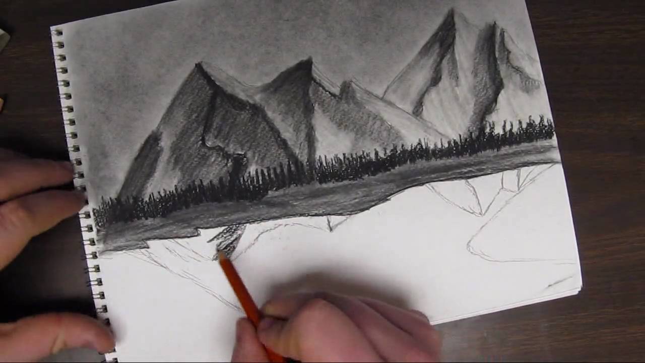
This video will show you how I like to draw mountains. The basic shape of a mountain is a triangle. You take that initial shape and morph it into a mountain by building off it.
This process starts by taking that triangle shape and replace the lines with more organic lines. This means to create curved, jagged....anything but straight direct lines.
Then from that you can start to create peaks branching off from the triangular shape to create a more interesting mountain. Then when the first mountain is created, create a few more.
After that, you create an organic/irregular line from the peak of the mountain all the way down to the base. That line will help to determine where the light and shadow will be.
Then you need to establish where your light is coming from. This is essential for the drawing to have a real life look to it.
After this comes the shading. Where you determined the light source to be is how you will shade the mountains. The side of the mountain facing the light will be lighter than the side facing away from the light source.

Facebook Fan Page Link http://www.facebook.com/pages/....Tylers-Art-Shack/181
Welcome back everybody. This is part 2 to how to draw a tree tutorial. Last video was the tree anatomy and the basics on just how to draw one. This video is going to focus on the detail process including the shading and form.
The sketch started out by just using cylinders and manipulating the shape of it. The shading process of the tree will be using some charcoal. The name of the charcoal is Generals. And ill be using hard medium and extra soft.
You need to establish where the light will be coming from to enable you to understand where the highlights and shadows will be on the tree. Where the light hits the tree will be very light and where the light doesn't hit the tree will be very dark.
The cylinders are only there to help you understand the basic shape of the tree. You leave the cylinder shape on the page and just shade over everything.
The branches and twigs takes some practice. You almost need to twist the pencil in your hand as you are drawing.
With the last parts of the drawing, you want to keep it irregular and unique to help to replicate what a realistic tree would look like in the real world. It really helps to go out and take some reference images or go on google to find images. It is always a plus to have an image next to you to always look back to when you are stuck or dont know where to draw in something.
This whole drawing took me just over 20 minutes or so.

I get back Into OIL PASTELS!! This is what I am really known for on YouTube. In this video I show you how to draw a simple landscape scene using a simple sketch then going over it with oil pastel to add color and vibrance to the piece.
=========================================================
Follow me!
Facebook: http://www.facebook.com/tylersartshack
Twitter: https://twitter.com/#!/TylersArtShack
Google+: https://plus.google.com/115405....344518849808905/post
=======================================================
In this drawing, I started off with a very rough pencil sketch using an HB pencil. I roughly sketched out everything that I wanted in the picture with minimal detail. So for the mountains the the background, I just drew simple outlines for them showing very small details that I would fill in later with oil pastel. The beach line was similar to this as well, I only scribbled in a few lines showing the movement and flow.
Once I had a very basic sketch placing all the objects to my liking I then broke out the oil pastel. When it comes to landscapes, I almost always start with the sky because it is the furthest object in the background and all other objects are usually placed over it. I started with the bottom of the sky nearest the mountains and made the sky with a very light blue color and made it darker as it went up. I also left space open for clouds. I added in white oil pastel even though the paper was white because it still makes a difference and makes them look more puffy. I then added some blue and tan into the clouds to add a bit of warmth and definition to them.
Moving down the landscape the next object that was worked on was the mountains. I wanted them to really feel like they were being pushed into the background so I added a lot of blue with them. Like I was saying the video, blue helps to add atmospheric perspective into the drawing helping to push them back and add depth to the picture.
After this I added a little bit of every color I used for the sky into the water. I wanted to keep the water very light in color as well. I did not want to have a very strong blue. I kept it light by adding in a lot of white and blending it horizontally with a blending stump.
After I got a lot of the water finished, I started to add in the foreground details. I added in some of the rocks that went into the water and the trees on the banks. I used a few shades of yellows and greens for the trees and just used a tapping movement with the oil pastel to make the leaves on the trees. This helped to add depth and show form.
all that was left was adding some minimal details to the rocks and adding in a tan color for the sand. After blending in the tan color, I took a warm brown and put that down where the water met the sand to give it a "wet" look. that brought the whole thing together.
This was a simple landscape drawing I did that hopefully a lot of you viewers can follow along with. If any of you plan to make a replication of this please be sure to share it with me by adding it as a video response to this video or by sharing on my facebook page.
I hope you all enjoyed this drawing as much as I did. Have a wonderful day!!!
Please leave some feedback! I will always respond!
Music I got form CC Mixters Website. It is a search engine for creative commons music.
The song in this video is called Time by Darkroom
Here is the Info!
"Time" by Darkroom (feat. SackJo22)
http://ccmixter.org/files/mactonite/29957
is licensed under a Creative Commons license:
http://creativecommons.org/licenses/by/3.0/
Did another one of those abstract/nonobjective art drawings. Ive done drawings like this a lot in the past and can be great fun to do. Its just doodling on an entire page with random stuff and it looks awesome in the end. It also gives a great boost in drawing technique and skill.
You can view this drawing along with all my other works of art from my deviant art page.
http://digg409.deviantart.com/gallery/
Song: Deep
Artist: Ryan Farish
Farish Music International (BMI)
Licensed with permission, RYTONE Entertainment
www.ryanfarish.com
You can purchase this song from Itunes here.
http://itunes.apple.com/us/album/deep/id327192176?i=327192284&ign-mpt=uo%3D4
Brand of oil pastels used is Sennelier. They are a great brand but can be costly. I recommend that if you have fine art stores near you that carry the brand, sign yourself up to their newsletters because usually during the back to school sales, they will put them on sale for a pretty good price. That is how I got my first set of them.
Other Places to Find my Art
Website: http://www.tylersartshack.com
Facebook: http://www.facebook.com/tylersartshack
Twitter: https://twitter.com/#!/TylersArtShack
Google+: https://plus.google.com/115405....344518849808905/post
Deviant: http://tylersartshack.deviantart.com/
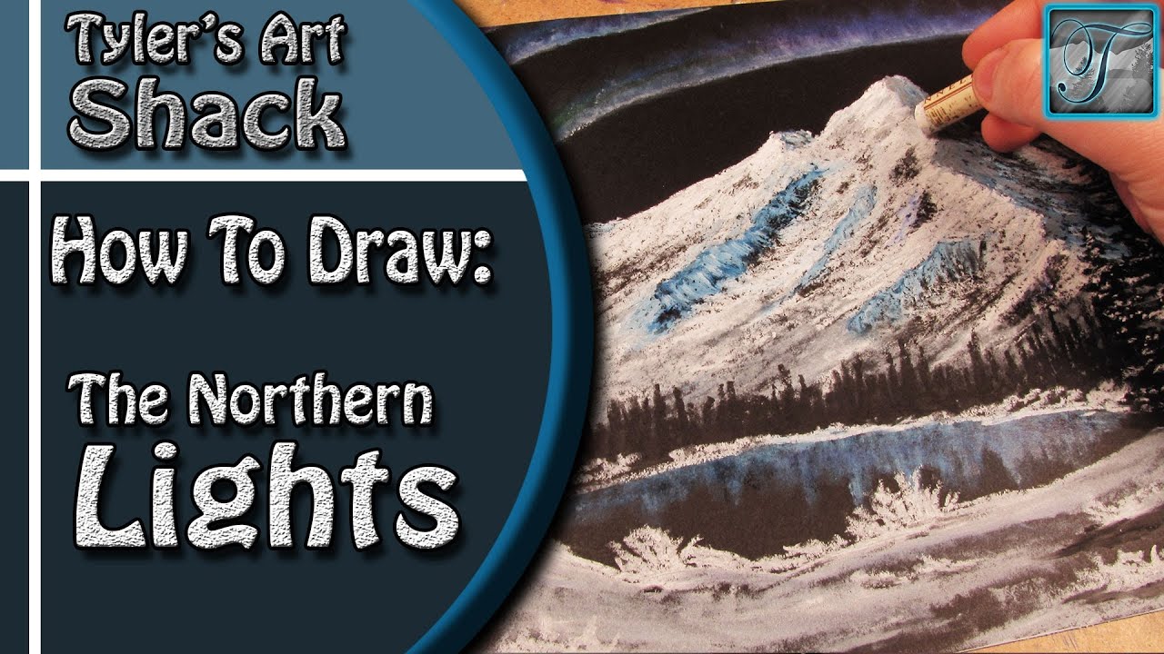
Welcome back everyone to an oil pastel drawing of the northern lights! This was a suggestion that I had gotten on facebook after asking what sorts of drawings everyone would like to see and that one sparked my interest. After searching around for some images, I decided to sort of keep it a bit more bob ross styled but with my own touch of course.
I started this one off with drawing in the mountains. I didn't have to worry about the sky because the paper was black to begin with and that is the color that I wanted the sky to be. It also makes it a lot easier to draw in the mountains with having a black background.
With drawing in the mountains, I started off with a pencil sketch to see where I wanted different details. and general placement of the objects overall. I then got myself going with the oil pastel. I used straight white for the highlighted side of the mountain. I also didn't press too hard on the pastel so that it would give it nice break look so that it would leave a nice texture for it. For the shadowed side, I used a very dark blue and then applied the white oil pastel on top of it to bring out a lighter color.
For the Northern Lights, I simply applied a very potent blue line followed by 2 more to create 3 lines all together. After applying some purple and green to give it added color, I took a blending stump and blended them towards the top of the page to help spread them to give them a better look. Later on I added a lot of white to really help bring them out more.
The trees were done with black oil pastels and did them in the traditional way that I normally do pine trees. I have quite a few videos that explain how to draw in this way. I also decided to add a bit of white oil pastel to make it look like a fresh snowfall just for the added effect.
On the foreground, I literally went to town with that oil pastel just creating different textures and such just to help create a nice area to finish things off. I didn't spend too much time with that. but In the end I think that this one came out really well.
Thank you everyone for watching and I hope you enjoyed the drawing!
Music info:
Artist: DJ_Rkod
Song: Faster than the Eye Can Persieve

Hello everybody welcome back to another drawing tutorial. This will probably be the easiest drawing tutorial I will put on youtube.
Supplies to use to participate in the drawing:
-Drawing Quality Paper
-Range of pencil tones, or school pencil
-Erasers
-Practice
This is a simple drawing tutorial. All you need to do is draw lines in an up and down like motion like sound waves in an audio file. You can make the lines larger to demonstrate distance. The larger lines will simulate larger trees along with adding details to it. This drawing sets you up for drawing in a lake type scene.
Hope you enjoyed the drawing tutorial. I will have another one very soon!
