Những video mới nhất

Yes, this video is a Re Upload from the other one that is on my channel. I had to change the music out.
Did this once before in my sketch book. Came out ok so I did it again and made a video from it.
Supplies:
I used Staedtler pencils.
Started with 4h for laying in the ground work. Worked in layers gradually working my way all the way to 9b for the absolute dark parts.
Indent stylus for white lines in iris. Needle point makes indents in paper which keeps that area white.
Blending stumps to smooth out tones.
2 types of erasers. the pink one and a click advance one. Its called Tuff Stuff. Has a very firm eraser in it for accurate erasing. Used that for highlights within iris.
Music is by Danosongs.com
Song name is Sun Starked
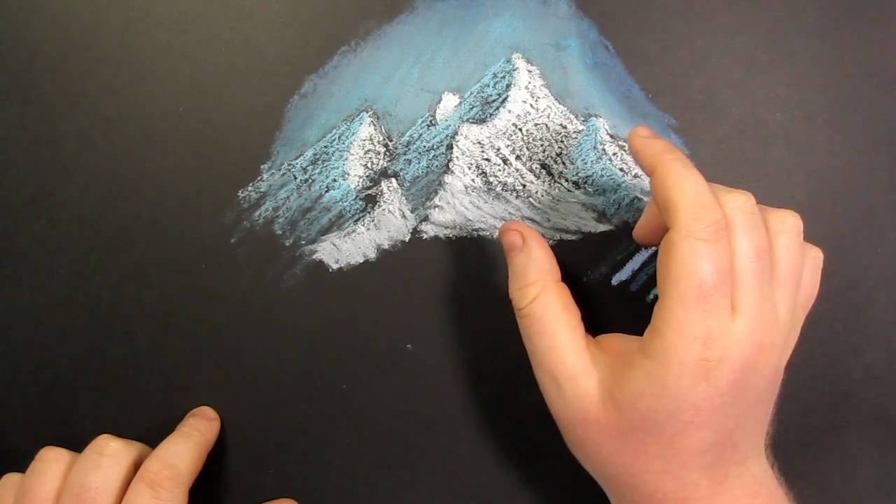
Welcome to tips and tricks number 2!
Here I will demonstrate and show you how to draw snow covered mountains in color with oil pastels in a bob ross like style. It has a very similar effect of having a breaking like texture similar in his paintings but with oil pastels. This is a very simple technique to pull off and takes no time whatsoever to do.
All you need to do this drawing is some black paper, oil pastels and blending stumps
The black paper is by Strathmore and it is called artagain. It is 12 by 18 inch paper
the oil pastel brand that I use is sennelier
The music in this video was done by a friend of mine. His youtube channel name is 007Regent.

Welcome back everyone to the Art Shack. This video I am going to cover the basics of different pencil textures and how you can apply them into your drawings.
Other Places to Find my Art
Website: http://www.tylersartshack.com
Facebook: http://www.facebook.com/tylersartshack
Twitter: https://twitter.com/#!/TylersArtShack
Google+: https://plus.google.com/115405....344518849808905/post
Deviant: http://tylersartshack.deviantart.com/
There are literally hundreds of different textures that you can create based off of what you normally draw. Everyone is going to have their own set of textures that they will use. You can also always go on google and look up pencil textures to give you ideas of different ways to go about drawing.
Pencil textures is an effective way to create realistic details without the painful process of drawing each and every little details. Textures are there as a short cut of sorts to help bring a long the drawing process more smoothly. Once your knowledge and understanding of textures increases, you will be able to combine and change them on the fly to create new textures to suite your needs for drawing.
I hope you all enjoy this video everyone and keep up the practice! Thanks a lot for watching everyone!
Music Info:
Artist: Spinmeister
Song: Moments in space
Music can be found on cc.mixter.org
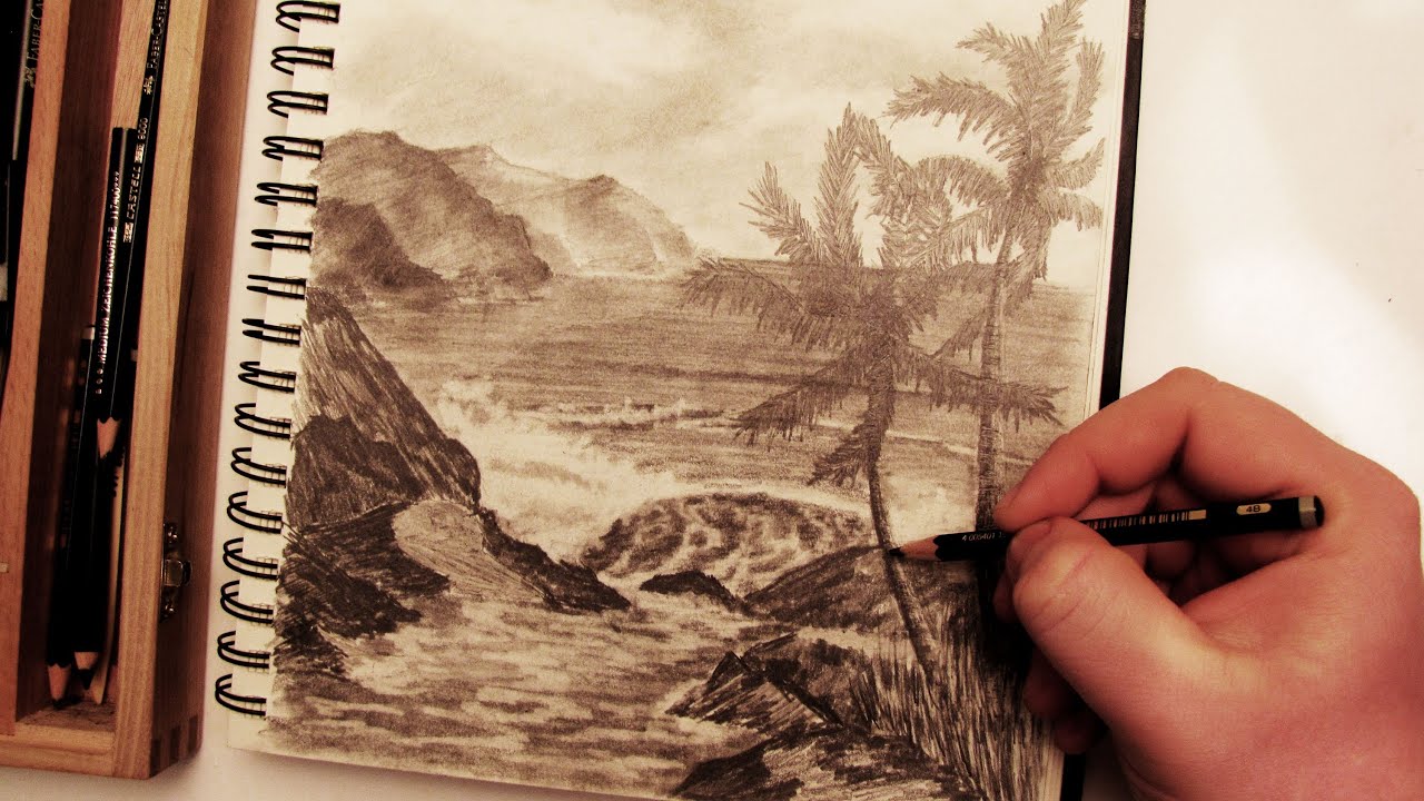
This video will show you the steps I took to create a completed palm tree beach landscape scene using different pencils and tools.
Follow me!
Facebook: http://www.facebook.com/tylersartshack
Twitter: https://twitter.com/#!/TylersArtShack
Google+: https://plus.google.com/115405....344518849808905/post
Supplies:
Pencils: Faber Castell 2H, B 4B
Erasers: Tuff stuff Eraser Stick, Kneaded eraser
Blending Stump
9x12 90Ib Drawing Paper
What is going on everybody, welcome to a brand new tutorial/drawing video. In this video I was just going to do a simple tutorial on how to draw a palm tree with a simple backdrop to give the scene a nice simple look. I started the drawing with putting in that light backdrop to set the scene and decided to make this a completed drawing with lots of details.
I started with the sky. I had never really made a very detailed and cloudy sky before in a landscape scene. Until recently, clouds were an element that I had a lot of trouble drawing. I had spent quite a bit of time drawing clouds in my sketch book and using that as a reference helped a lot when drawing these clouds. I started them out by using a 2H pencil and lightly shading around where I wanted the clouds to be. I usually leave the areas where I want clouds white on the page. After shading the page a bit darker I started to add in some details for the clouds. I started by using a kneaded eraser and softening the tops of the clouds while using a blending stump to blend out the bottoms of the clouds so that they blend in with the sky. I then used the blending stump with graphite all over it to start adding some shadows to the clouds themselves to give them some depth and volume. Then using a small eraser, I lightened up the tops of the clouds with a small white eraser to make them pop. With some fine tuning after this, the clouds took shape.
The next stage in this drawing was drawing in the distant rocks/mountains. I just did a simple outline for placement and shaded them in with simple tones. I didn't want to give them a lot of details because they are far back in the distance. A good way to portray that something is far in the distance, is by leaving it with minimal details. I still wanted to show that they were rugged rocks so I left them with a rough texture in the end.
The next step in the drawing was adding in the water. Water is a simple element to draw in but can be easily over done. I start in the back horizon and add strong horizontal lines close together. I space those lines out as they get closer to the picture plane. This helps to show that the water is receding into the background of the image. After I got most of the line work down, I used a blending stump to soften the water out a bit. I found that the texture was a bit too rough and wanted to calm it down a bit. I also added in a bit of reflection for the distant rocks but did not want to over do it.
Next comes the closer water details. I imagined from the start that I wanted to have a nice wave crashing on some rocks. So I started to map out where this wave would be and added some shading to it. I also showed some white water crashing around the wave as it was hitting the rocks. In the shading of the wave, I used my fine eraser and erased out some foam for details in the water.
Like I said in the beginning of the video, I wanted to have a palm tree demonstration so I had to decide where I wanted them. I wanted this image to be a dynamic landscape and the placement of these palm trees was crucial. If I had place them on the left side of the drawing near the distant rocks, it would have lead the eye right off into the horizon of the water on the right side of the page and it would also hide those rocks from the viewers eye taking away a lot of the visual interest. I did not want to lead the viewers eye off the page when they looked at this drawing. I decided that the best possible place to put them would be on the right side of the page. It was lacking in details as it was because the only object on that side was some rocks and the distant horizon line. When I was drawing in the trunk or main section of the palm trees, I was careful of the shape and direction of them as well. I wanted them lead the eye into the middle of the page where the wave was breaking on the rocks.
I got the general placement of them down and I like to draw the trunks of trees with texture. I did this by using 2 different pencils. I used a 2H pencil to draw in some horizontal details going up the trees and then used a 4B pencil to shade it. Because of the difference in tonal range between these 2 pencils, it left all that detail on the trees and also left the 2H pencil marks light making it look like highlights.
The final stages of this drawing were drawing in the palms themselves. I used a 2H pencil for the undertone and used 4B to make them a bit darker. After this it was adding in some final details for the rocks and added in some grass for the base of the palm tree.

In this video, I show you how to take a photograph and break it down into simple elements that can be transferred over to start a sketch.
If you would like a better look at the photo, Here is a link!
http://sphotos-a.xx.fbcdn.net/....hphotos-snc6/341311_
Other Places to Find my Art
Facebook: http://www.facebook.com/tylersartshack
Twitter: https://twitter.com/#!/TylersArtShack
Google+: https://plus.google.com/115405....344518849808905/post
Deviant: http://tylersartshack.deviantart.com/
Materials:
Photograph
Sketch or drawing paper
Any kind of marker
Drawing Pencils
Erasers
I started this with using a photo reference that I took a few years back. I printed it out and used that as a reference. If you do not have a printer, you could always use reference images from magazines or books and then just use some tracing paper on top of the image and extract the major lines that way.
I start by picking out major lines within the image to break it down. After which I use those lines in my sketch. This helps a lot with the placement of the overall objects as well.
You can also change what is in the original image. Just because it is there does not mean that it has to be that way. Of course it still can be the exact original. changing a few things up helps to make the artwork of your own creation and it helps build up your creativity.
I hope this video helped you all out and I hope you enjoyed it! Thanks everyone!
Music:
Artist: Mactonite
Song: Time
Music is from cc.mixter.org
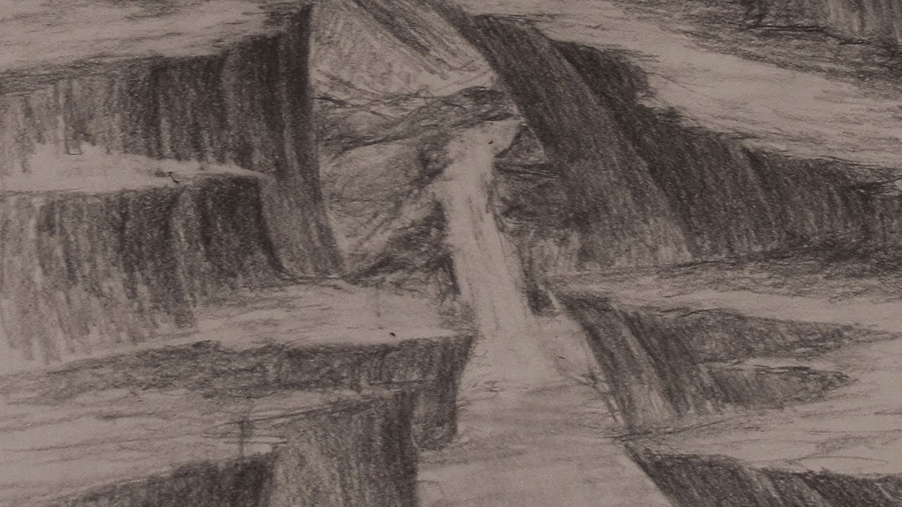
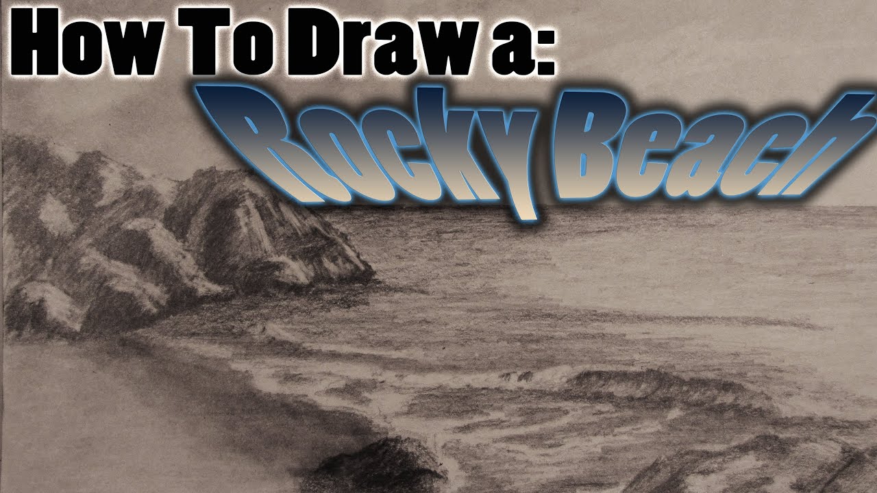
In this video, I take you from start to finish and show you all the steps along the way on how I drew an image full of cliffs. Check it out!
Follow me!
Facebook: http://www.facebook.com/tylersartshack
Twitter: https://twitter.com/#!/TylersArtShack
Google+: https://plus.google.com/115405....344518849808905/post
Deviant Art: http://tylersartshack.deviantart.com/
Music Info:
Music is from CC.mixter.org
Song: Yiourgh
Artist: DoKashiteru
In the start of the live hangout I did on my channel, I was really not sure about what I wanted to draw. So when I do not know what I want to draw, I will usually start making some shapes on the page. I start by making some series of curved lines and some straight. Just keeping things random. Then once I have a few different lines, I start to see what kind of shapes I can make from those. And from that, I start to form a composition. This is usually how I make different scenes even though I have no Idea what I want to draw. I find it another pretty good way to get out of an artists block but you also need to know the basics of how to draw objects in perspective to pull it off.
Once I did this, I created a composition of very steep cliffs. I always have a good time drawing cliffs because of how raw they can look. I always have a fun time trying to capture the rugged nature of them.
When I was in the thick of the drawing, I ended up asking my audience what they wanted to see me add into the drawing. I had about 30 people watching me live when I asked this and got a slew of suggestions. By popular demand, I ended up adding in a waterfall and changed the composition of the foreground to accommodate a river or stream.
I find it great when you kind of get stuck mid drawing and having someone to ask. In this case it was my live audience. The suggestions were all great and because of that, I was able to finish off the composition and complete the overall look of the image. I really enjoyed doing this drawing!

During this video, I take you step by step showing you how to draw detailed leaves on a tree branch that can be used to make a realistic looking tree.
==================================================
Follow me!
Facebook: http://www.facebook.com/tylersartshack
Twitter: https://twitter.com/#!/TylersArtShack
Google+: https://plus.google.com/115405....344518849808905/post
All you need for this tutorial is some standard computer printer paper. I do however recommend that you use drawing or sketch paper for better results because of the tooth of the paper. It makes it a lot easier to make tones because of it. The only other tool you really need is a range of pencils. I always recommend a 2H HB and 2B. Then use a 4B or 6B for the very last detail works of the piece.
Start any drawing out with a 2H. This will be used for getting general lines down in place as well as small detail work.
For this drawing, I used the lighter pencil to start out the very base of all the leaves in this drawing. I always start light to get the placement down as well as first initial details.
After I have the very first base coat down, I will then go in with darker pencils to make more volume within the drawing. Ill do this with the branches and leaves. This also helps to bring out a lot of depth within the drawing.
After the second layer is applied, the 3rd layer is just to darken all the darks of the drawing even more. This is usually the last step needed to create volumetric shapes and forms.
After this it is really just practice. Not everybody will be able to draw this right off but give it a few tries and it will come easily.
It is all within the practice!
Hope you all enjoyed this tutorial!
Please Subscribe for many more tutorials to come!

Welcome back everyone to Time Lapse Drawing - Summer in the Mountains
Other Places to Find my Art
Website: http://www.tylersartshack.com
Facebook: http://www.facebook.com/tylersartshack
Twitter: https://twitter.com/#!/TylersArtShack
Google+: https://plus.google.com/115405....344518849808905/post
Deviant: http://tylersartshack.deviantart.com
Make a Donation Via Paypal! http://tinyurl.com/o6cnnpv
Check out the Real Time Series Playlist here!
http://www.youtube.com/watch?v=dKAcaE4BuNk&list=PLQ2Zh_NCUBvS2AEvD3PthmMHbolcSrCCD&index=1
This video is a Time lapse based off my Summer in the Mountains Real Time series. I like to upload a time lapse just to help give an overview of the entire process that took place. I am quite happy with how the drawing turned out and I hope that you all enjoyed it as well!! Thanks a lot for watching everyone!
Music Info:
Song: Corporate Uplifting Rock
Artist: Plastic 3
http://tinyurl.com/nthpoga
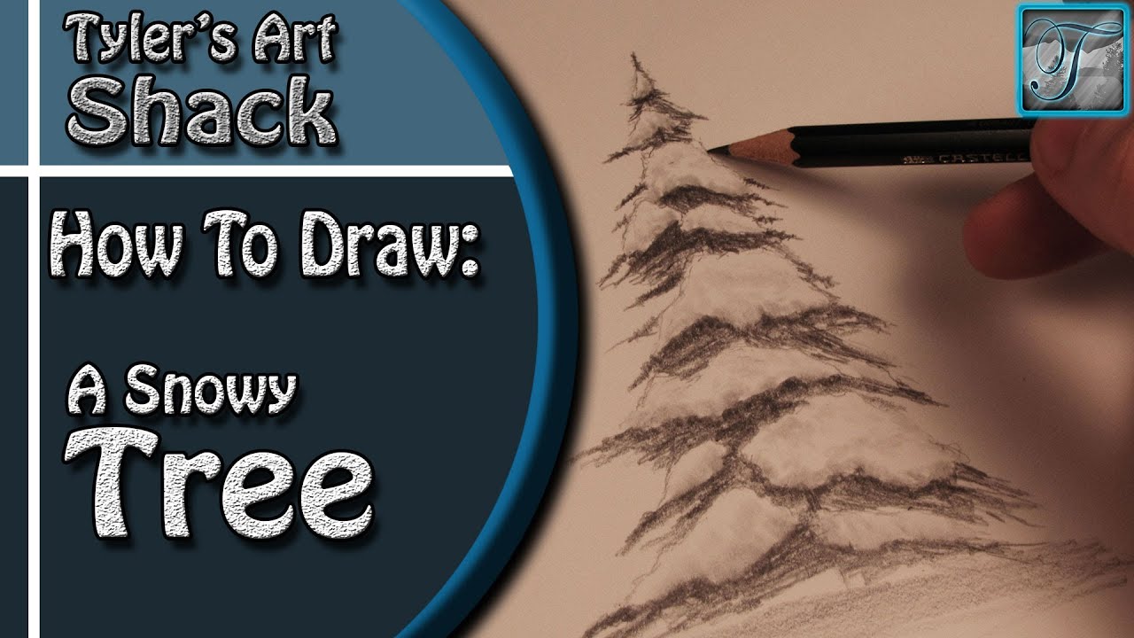
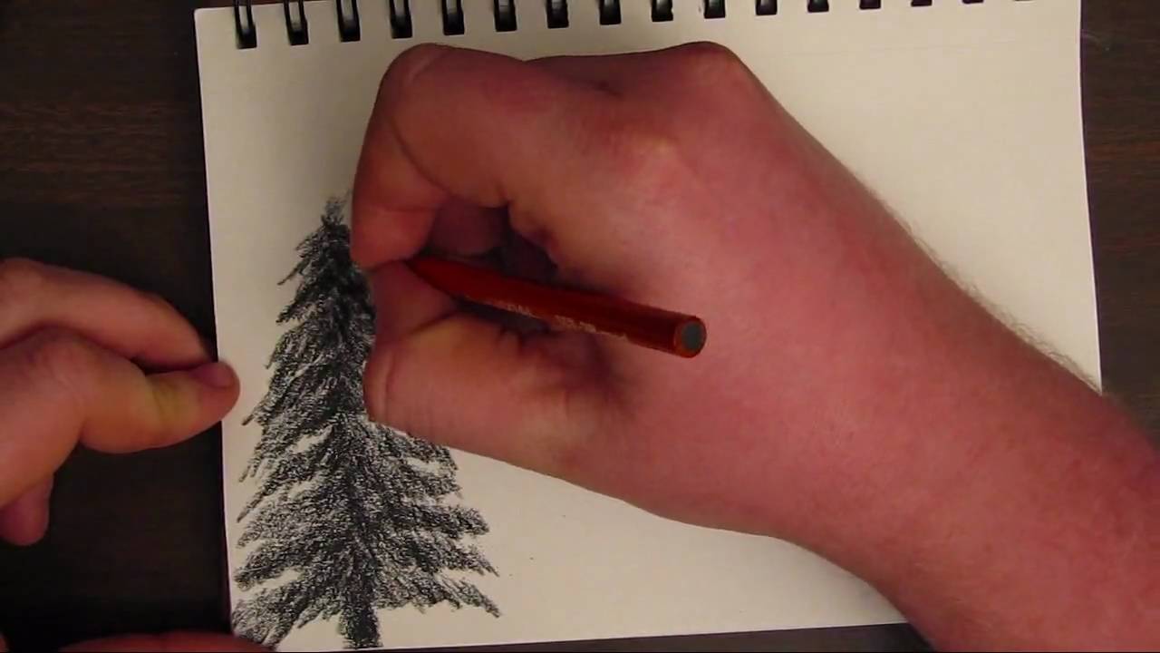
Welcome back everyone to this weeks drawing tutorial where I will take you in real time to show you how to draw a snow covered tree.
Other Places to Find my Art
Website: http://www.tylersartshack.com
Facebook: http://www.facebook.com/tylersartshack
Twitter: https://twitter.com/#!/TylersArtShack
Google+: https://plus.google.com/115405....344518849808905/post
Deviant: http://tylersartshack.deviantart.com/
So to start this drawing off, you don't need a huge variety of pencils. If you only have one pencil grade, that should do you just fine during this.
To start off, I made a line about 4 inches tall just to tell where the top and bottom of my tree is going to be. After this, you can also make a tall cone starting from the top of the line going down the to bottom to help keep your drawing within proportion.
I start the with the snow covered areas of the tree because they are going to be the lightest. Use a sharp pencil for this and follow along in the video where I start to make a snow shape. I start with the cap of the tree and usually do a hershy kiss shape. The rest of the tree I filled in as if I were drawing in clouds. Try to keep the shapes looking organic as it will help your tree to look more lifelike.
After the snow is applied, we are now going to draw in the tree details. Like a lot of my other how to draw tree videos, I use a pencil on its side and start to follow in the direction of the tree. Starting at the main stem and working my way out towards the outer parts of the tree. I try to keep these lines dark to keep a nice contrast.
Once that is finished up, you can go back in with a blending stump, and just blend some of the snow areas that we drew in. No need to add any more graphite to the page. Just blend what is on it so that it will give the snow a bit of volume.
After that you pretty much have a completed drawing! I hope you all enjoyed!
Music Info
Artist: GMZ
Song: Parametaphoriquement
Music can be found on cc.mixter.org

LINKS!
Website: www.TylersTurnings.com
Facebook (Woodworking) www.facebook.com/tylersturnings
Facebook (Drawing)www.facebook.com/tylersartshack
Another day of production in the shop where I show another stage of how an end grain cutting board is formed. This video, I take you through the process of taking the rough panels and running them through my 20 inch grizzly planer to make them smooth and suitable for gluing. I also take out the trash along the way.
Music
Artist: Del Sound
Song: Del & Rabae - Faith (Original Mix)
Del Social Links:
https://soundcloud.com/del-sound
https://delsound.bandcamp.com/
https://www.youtube.com/user/TheDelsound
https://instagram.com/del_sound/
https://twitter.com/Del_Sound
https://delsound.tumblr.com/
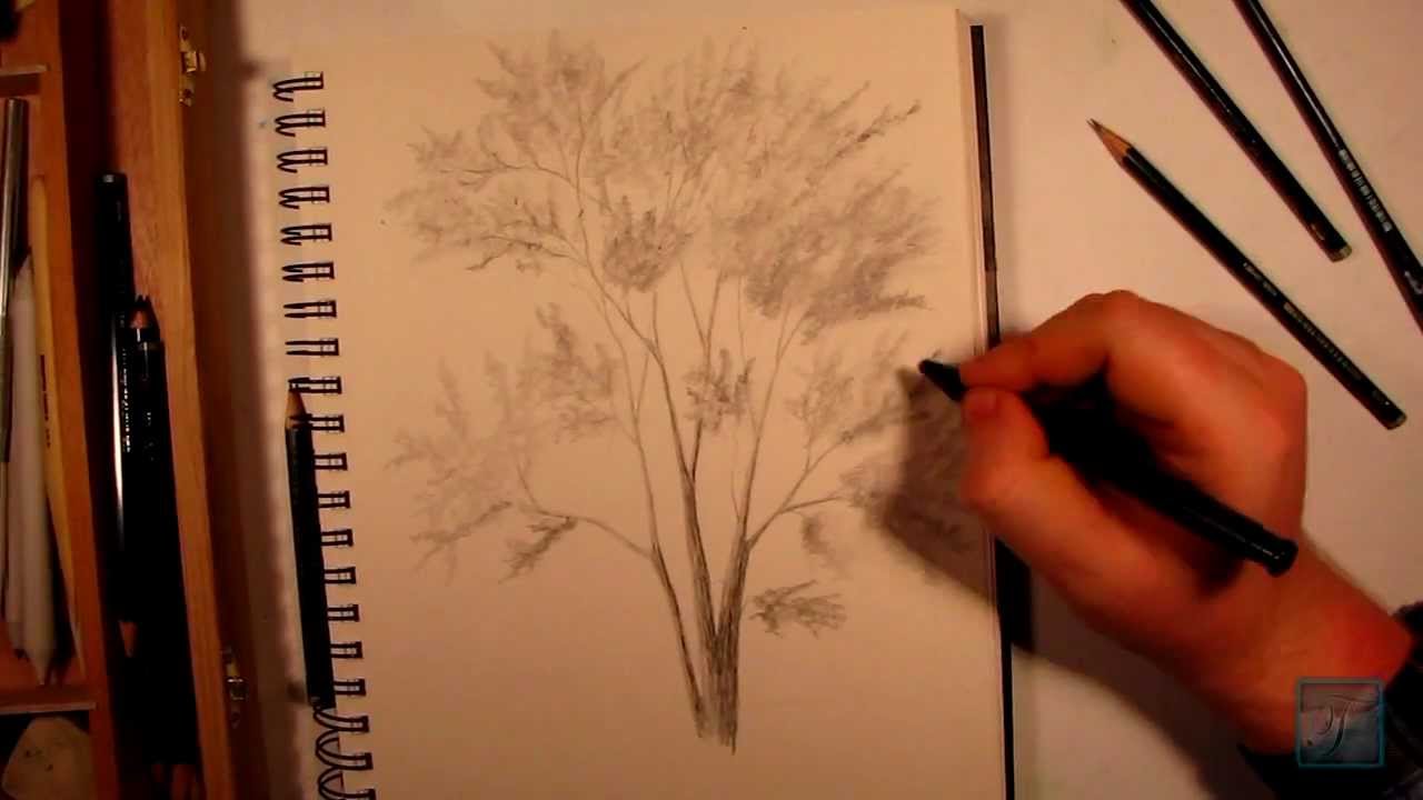
This video WILL show YOU how to draw a realistic tree by using simple steps to create a more complex and dynamic drawing. Stop by and check it out!
Follow me on:
Facebook: http://www.facebook.com/tylersartshack
Twitter: https://twitter.com/#!/TylersArtShack
Google +: https://plus.google.com/115405....344518849808905/post
Please help our Artist movement. We are trying to Advocate for a visual arts category. Post in the forum here showing that you support this.
http://www.google.com/support/forum/p/youtube/thread?tid=2a9806f929074cbd&start=520
Here is a tutorial with commentary showing you how I drew a realistic tree from start to finish. You can bet I will be making more videos like this soon. Most likely more in depth ones too.
This drawing started out with a light pencil in the hb to 2h range just for the initial sketch of the tree. I use a light pencil so that If I make any mistakes I can easily erase them out.
Start with the base of the tree and work outward towards the smaller branches and eventually sticks that make out the very outer part of the tree. As you branch out, make each branch smaller and smaller as it progresses so that it eventually becomes a very small stick. This process takes a little while getting used to but with practice, it will come very naturally to you.
The next process of this is the shading. The shading is time consuming and requires a lot of patience. Think of the tree as a 3 dimensional object and how light would be affecting with it. When you can visualize this, you can really start to figure in where the light and shadow goes. Think of the light source coming in from one general direction and work from that. Using that as a reference, all surfaces facing that object of light will be highlighted while the opposite sides of the same branch will be in shadow.
Once you have the shading done, the next part that is also quite time consuming is the leaves. The way I draw leaves is quite clever. I use a process of negative drawing to make the leaves. It is a process of where I just draw texture and the white space that is left after drawing the texture takes the shape and form of the leaves.
The way I start this texture is I draw small circular strokes with the pencil but making sure that I keep moving the pencil so that the end result looks like a bunch of leaves. I make very irregular edges. Nothing should be very uniform when it comes to leaves. They are constantly blowing in the wind and changing shape, I try to replicate that.
Once the initial layer of leaves is applied, go back in with a darker pencil so you can add depth to them. Once shading is applied, it will make the leaves look much more thick and full. Thus giving it much more life and character.
All that is left is to draw in the foundation that the tree is growing from. I did not include this in this drawing but will do a continuation for next weeks video showing you how to do that. please subscribe so you dont miss out! I will see you all again very soon!
Music info:
Music is from danosongs.com
the song is called Permafrost. Here is a link to that song
http://danosongs.com/music/dan....osongs.com-permafros

Little bit different from what I normally do here on youtube but I wanted to share another passion of mine with all of you. I hope you enjoy!
Parts List
Cooler Master HAF(High Air Flow) X Full Tower
Corsair Professional Series Gold 850W Modular Power Supply
AMD FX-8150 FX 8-core Black Edition Processor Socket AM3+ 3.6Ghz (OC 4.2Ghz)
Corsair Hydro Series H100 Extreme Performance Liquid CPU cooler
ASUS Sabertooth 990FX AM3+ TUF Series ATX Motherboard
G.SKILL Ripjaws X Series 16GB (2 x 8GB) 240-pin DDR3 SDRAM DDR3 1866
G.SKILL FTB Fans
XFX ATI Radeon HD 7950 3GB DDR5
Crucial 128GB Solid State Drive
Western Digital Cabiar Black 2TB SATA III
Lite-on Lightscribe 24x SATA DVD Drive
Follow me!
Facebook: http://www.facebook.com/tylersartshack
Twitter: https://twitter.com/#!/TylersArtShack
Google+: https://plus.google.com/115405....344518849808905/post
Deviant Art: http://tylersartshack.deviantart.com/
Music Info:
Song: Rise up To Heaven
Artist: Jlbrock44
Music can be found on CCmixter
In this video, I show you the steps I used to draw a very simple and basic tree.
Think this tree is too basic or easy?? Check out my channel, I have much more advanced tutorials on how to draw a tree since I have done this one.
Whats up everyone! In this tutorial, I take you step by step and show you the basics of drawing a simple tree. In this video, I use generals charcoal pencils.
I start off by making a general vertical line. After which, I start by adding details to the top of it making jagged irregular strokes to create texture. It helps to make a more interesting subject.
I continue to do this until I reach all the way to the bottom. Gradually making the tree wider and wider as it reaches the base of where the tree would be.
After which you have a basic tree.
This type or detail of a tree is excellent for trees that are further in the background because they will naturally have less details than a tree that is right in front of you. Having less detail on an object is a great way to show that it is further away from you.
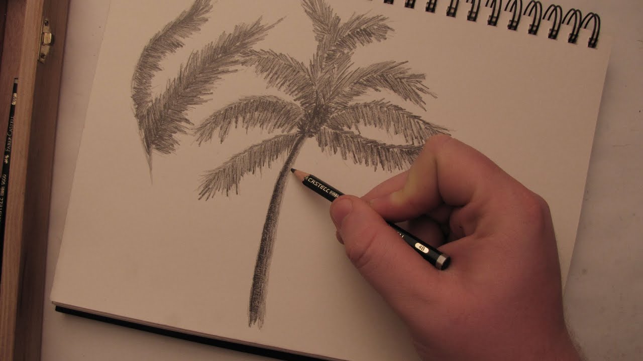
Welcome back everybody! In this video, I will show you the steps I took to create a palm tree with realistic textures. You will only need a few supplies to do this.
Supplies:
Pencils: 2H, 4B
Paper: 90Ib sketch book drawing paper
Blending Stump
Erasers
Follow me!
Facebook: http://www.facebook.com/tylersartshack
Twitter: https://twitter.com/#!/TylersArtShack
Google+: https://plus.google.com/115405....344518849808905/post
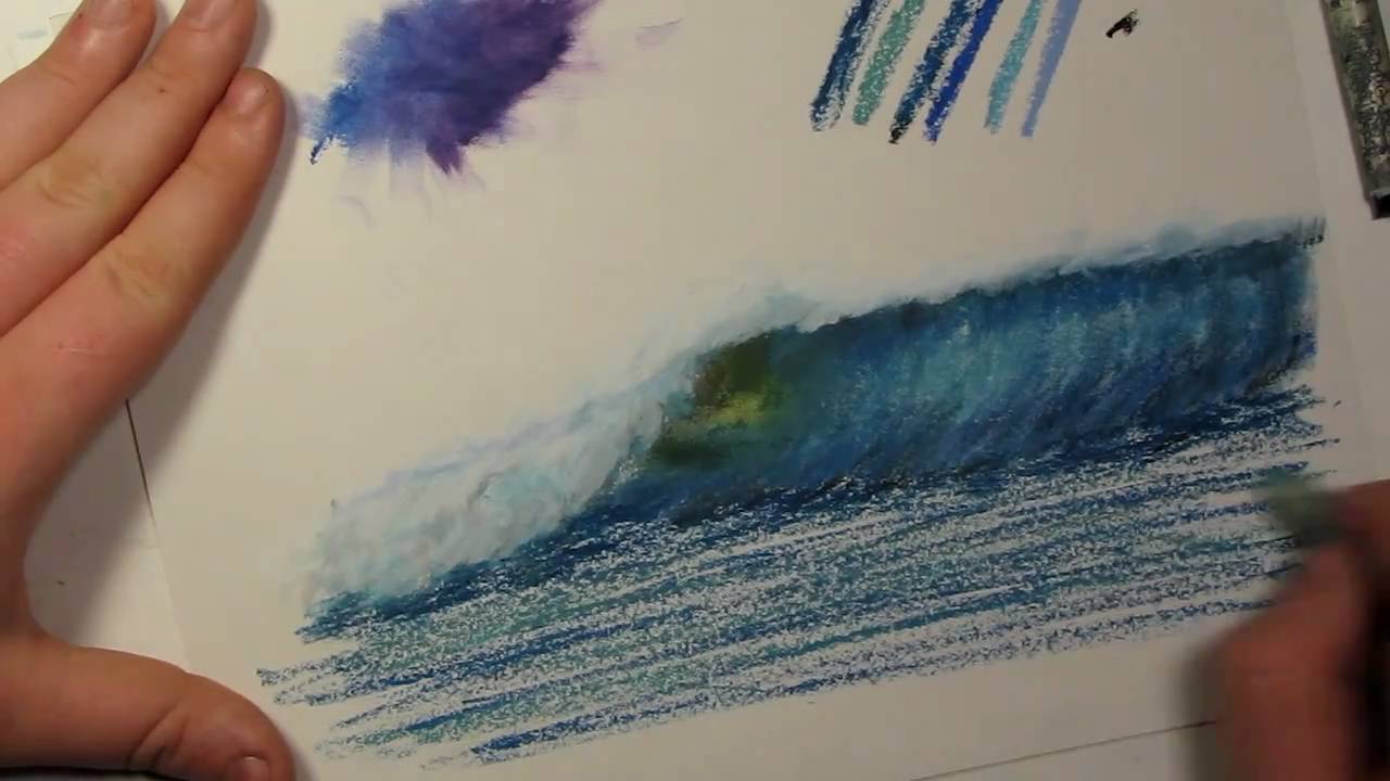
#Hello everybody. So I get questions quite often on how to blend oil pastels quite often. In a few of my videos I blend them with my fingers and in others I blend them with blending stumps. There isn't too big of a difference between the two methods it just depends on what I feel like doing. Some artists might say that blending with your fingers is not a good way to go about it because the oils on your fingers can have a negative effect on your drawings after time. The safest bet to blending colors is to use a blending stump. But for practicing whatever method you chose is fine.
So I figured with showing you this tutorial that I would also start a tips and tricks tutorial series. So when the audience asks questions about the way I draw certain things in my drawings, I can try my best to explain that particular thing. This will be the tips and tricks vlog 1.
Ill get right to it and show you how to blend with my fingers. Just take your finger and start blending the 2 colors together and you will see that they mix quite well. The color blends into one another. Ill zoom in so you can see what the effect of blending does. And again for those of you who don't know, the brand of oil pastels that I do use is sennelier oil pastels. I find that that they blend the best out of any other pastels that I use.
Besides from mixing up color blobs, lets do something a bit more challenging. I am just going to take my blue oil pastel and just going to sketch with it at the moment. I am going to create a wave. Now, I am just sketching this from my mind and I also have a picture in front of me from my last drawing that I did. Alright, so that is the basic sketch of the wave.
So lets grab some black for the top of the wave to show that it is dark. And a little bit for the bottom here to also show that it is dark. I will also mix in some of this blue at the bottom. Probably one of the biggest things I can say about blending is things for me tend to look more realistic when you add more colors to it. So instead of just making objects solid colors, add variety to it, it gives it more depth. You may find it to be a different case but that's what I find. So, give it a try and see how that turns out. I try and add in similar colors. For instance, Ill put in a murky blue color, a royal blue color, stormy blue color, a sky blue, purplish blue and a dark blue. I use the dark blue oil pastel a lot in the rocky beach sunset video. So I will add some of the dark blue as well as sky blue into the wave. I add the sky blue to the upper middle portion of the wave to show that the wave is thinning and light is penetrating through it more giving it a lighter color. I use a dark blue for the top of the wave as well. There is a section of the wave that I like to refer to the wave as the eye. It is the part of the wave that is breaking over and also the thinnest part of the wave. I like to portray this part of the wave as a yellowish green color.
Ill tell you what, Ill blend half this wave with my finger and then ill blend the other half with a blending stump to show you the difference. So when using my finger, I follow the direction of the wave and as you can see, the wave is starting to form. Now that I am using the blending stump, I use it more like a pen. You use the tip to blend around little amounts of color. You can also put the blending stump on its side and blend large amounts of color at the same time.
I start to use a gray color to show the white water splashes of the wave. I then use the lighter blue to guide where the wave will be when its crashes. I use gray to show shadow to the wave. I find by careful observation that the shadow color of white is not gray, it is blue. If you have snow where you live or clouds, look at either one of the 2. If you look at them very carefully you will notice the colors. If you look at snow, you will notice that the shadow color is a grayish blue color and the highlights of snow are a yellowish color. If you look at clouds you will see that the shadow is a lighter blue color.
I start to add white in a counter clockwise circle to show the white water. After blending that around, I then start to add in some more light blue to add more depth and shadow to the wave.
Underneath the splashing of the wave, there is a darker shadow that appears. I use the dark blue to portray that.
I will show you how I drew a realistic beach scene from start to finish. This video will take you through the steps using different techniques and styles to achieve a completed drawing.
Follow me for more content
Facebook: http://www.facebook.com/tylersartshack
Twitter: https://twitter.com/#!/TylersArtShack
Google+: https://plus.google.com/u/0/11....5405344518849808905/
I started this drawing by looking at images in google to get some ideas for composition and placement. I also had a few other similar sketches that I worked from to create this.
After I had a general composition that I liked, I just quickly drew in large objects to start filling in the page. After objects are placed. Start adding in all the details of the overall image. In this case I started with the sky.
The sky consisted of a light tone using an HB pencil. I used a method of cross hatching to achieve this. This is where you draw parallel lines in one direction and then another direction perpendicular to the original ones to create darker tones. This helps to prepare for the next step. Next step would be to take a blending stump and make the sky into a smooth value. Once this is done, use an eraser to erase out rough shapes that will take the form of clouds.
In this case, I left the drawing with a rough sky. I wanted the focus to be in the water and rocks of this drawing. I started next on the water. The water is very simple to make. All you need is a B or 2B pencil and start making parallel lines with varied pencil pressure to create texture. This helps to create the illusion of movement and gives the water some visual interest.
Up next were the rocks. They were difficult for me at first to render out but as soon as I got all the tone down and started to think of how I draw mountains, I started to get the hang of it. I usually learn as I go when it comes to drawing new things. I used a combination of erasing and darker pencils to create depth and tone. I then started to work on the rocks closer to the picture plane to help show the depth of the picture.
Once those rocks were done it was just a matter of fine tuning the small waves in the water and darkening certain objects.
This drawing overall took me about 3 hours or so to create.
Hope you enjoyed!
Leave me a comment!
Song: Helium Hues
Artist: Danosongs.com
I always run into a case of artists block. This has always worked out for me. Hopefully it will help you as well.
This style of art is what I used to draw back when I first got into art. Yes, I used to be an abstract artist way back in the day. I find that drawing abstract art really preps myself for drawing something more complicated. It sort of loosen's me up. It also helps me to get flow and rhythm into my artwork.
When I draw these, There are really only two things I think about. The first being composition. I like to try and balance the drawing out by keeping the "weight" even on all sides. The second would be repetition. I use very similar line structure through out the entire drawing, just repeated many times. By doing this, there is a sense of unification when one observes the drawing. It also helps the eye flow around the drawing.
Give something like this a shot, it is a very different style of art and you can make it into your own very personal way.
Music is by Kevin MacLeod
Song is called Killing Time
You can find it here: http://incompetech.com/m/c/royalty-free/index.html?keywords=killing+time&Search=Search

It takes me on average about 5 days to put a cutting board together from scratch. What I am showing here is the very beginning process of doing so. I will be posting further vlogs which documents the process.
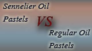
Here is a demonstration of the sennelier oil pastels that I use. This video will show you the quality of them vs other brands you can buy. In this video I show you a box of the sennelier oil pastels that I use. I also show the product that I will be using to show another product and how it compares to the sennelier oil pastels.
I start the video out with a comparison running 2 videos showing the quality of the two of them.

In this video, I go in depth and show you all the supplies that I use to draw realistic landscapes. Check it out.
Follow me!
Facebook: http://www.facebook.com/tylersartshack
Twitter: https://twitter.com/#!/TylersArtShack
Google+: https://plus.google.com/115405....344518849808905/post
Welcome back to another video everyone! This video is going to be a little bit different from what I normally do. Instead of doing an actual drawing, I an going to show you all the supplies that I use to create a realistic pencil drawing. Brace yourselves, this could be a long one.
I use a wide array of different supplies for drawing. Most of which I will fully explain in the videos but here are the highlights.
Faber Castell Drawing Pencils
Derwent Charcoal Pencils
Generals Charcoal White
Staedtler mechanical pencils
Blending
Blending Stump
Blending tortillon
Blending Cloth
Erasers
Tuff Stuff Eraser Stick
Factis white eraser
Factis black eraser
Faber Castell White eraser
Kneaded Eraser
Sakura Electric Eraser
Sharpening
Faber Castell trio sharpener
Alvin glass jar sharpener
Kum 2 stage pencil sharpener
Miscellaneous
Xacto blade for sharpening
Sandpaper
Clay Modeling Tools
The wooden box in this video can be found from blick art materials on this link here:
http://www.dickblick.com/produ....cts/art-alternatives
