Лучшие
Draw & COLOR at your own pace with Fun2draw APPs!
Apple: https://itunes.apple.com/artis....t/mei-yu/id674269351
Android: https://play.google.com/store/....apps/dev?id=64643504
Each Fun2draw App features NEVER-BEFORE-SEEN Fun2draw characters, with over 100 drawing & color steps available, plus my own easy voice instructions & tips! It's like having me as your very own portable art teacher on your mobile devices!
Each Collection in each app has 1 free character for you to try out. The rest of the characters in that Collection, in that app, are available for purchase.
See my Fun2draw APP INTRO video here:http://youtu.be/4f6WS4sOfyI
---------------------------------------------
How to draw a kawaii baby animal step by step! 100 + easy drawings of big cats, animals, wildlife, zoo animals, cute pets & adorable, cuddly characters: http://www.youtube.com/fun2draw
Awesome Fun2draw playlists:
Uploaded Videos
http://www.youtube.com/playlis....t?list=UUFf_ebUsE0QH
How to Draw Cute Baby Animals!
http://www.youtube.com/playlis....t?list=PLCBDD2772D28
How to Draw Cartoon People
http://www.youtube.com/playlis....t?list=PLF154B123208
How to Draw Dragons!
http://www.youtube.com/playlis....t?list=PL6D61D9B57C7
How to Draw Wild Animals
http://www.youtube.com/playlis....t?list=PL3B3DAEBF471
How to Draw Pets
http://www.youtube.com/playlis....t?list=PLBC2638D9ACE
LIKE Fun2draw on Facebook :) http://www.facebook.com/Fun2draw
Watch and request more "how to draw animals" and "how to draw people" on the Fun2draw youtube channel!
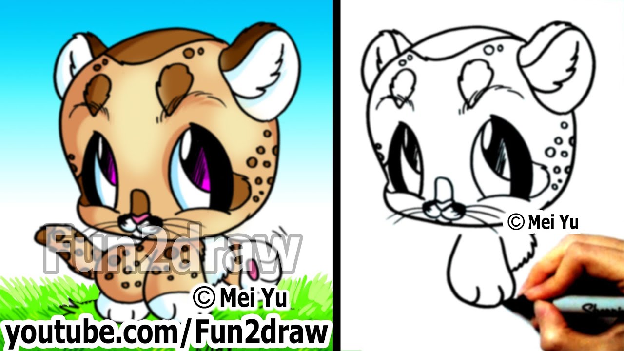
Fun2draw is created by Mei Yu, a Canadian artist, "how to draw cartoons" and "how to draw anime" instructor. In this fun to draw video, she shows you how to draw a cute cartoon baby mountain lion (or cougar or puma) step by step - great for beginners! How to draw a chibi character is easy and simple in this drawing tutorial.
It'll be Fun2draw this cougar with the other wild forest animals from Fun2draw's youtube channel: the wolf, deer, owl, bob cat, snow leopard, raccoon, eagle, otter or skunk!
http://www.youtube.com/Fun2draw
HAPPY DRAWING! ^___^
*******************************************************
BEFORE YOU REQUEST please read the INFO REGARDING REQUESTS:
Please note I just DON'T have the time to draw everyone's requests. Also, I cannot promise to draw anyone's request as soon as they want, or as exactly as they want. Your request may not get drawn at all.
I won't be able to reply to every comment. Also, I won't be able to tell you whether or when I'm going to draw your request or not. Thanks for understanding!
Disrespectful comments will not be considered and may be removed.
---------- COPYRIGHT NOTICE -------------
Fun2draw, its logo, videos, drawings, characters, and their distinctive likeness belong to Mei Yu, and are protected by Copyright Laws. ANY COMMERCIAL USE IS STRICTLY PROHIBITED. Please report any copyright violations to Mei Yu by personal message.

Draw & COLOR at your own pace with Fun2draw APPs!
Apple: https://itunes.apple.com/artis....t/mei-yu/id674269351
Android: https://play.google.com/store/....apps/dev?id=64643504
Each Fun2draw App features NEVER-BEFORE-SEEN Fun2draw characters, with over 100 drawing & color steps available, plus my own easy voice instructions & tips! It's like having me as your very own portable art teacher on your mobile devices!
Each Collection in each app has 1 free character for you to try out. The rest of the characters in that Collection, in that app, are available for purchase.
See my Fun2draw APP INTRO video here:http://youtu.be/4f6WS4sOfyI
------------------------------------
"How to draw a cute, easy dinosaur" - "How to draw a cute cartoon chibi dinosaur" - "How to draw a trex" - "How to draw a cartoon t-rex" step by step! New Fun2draw videos EVERY WEEK at: http://www.youtube.com/fun2draw
Watch these AWESOME Fun2draw playlists:
How to Draw Dinosaurs & Prehistoric Creatures
http://www.youtube.com/playlis....t?list=PLA62806F9FFB
How to Draw Dolphins, Whales and Sharks
http://www.youtube.com/playlis....t?list=PL70174178DC4
How to Draw Wild Animals
http://www.youtube.com/playlis....t?list=PL3B3DAEBF471
LIKE Fun2draw on Facebook :) http://www.facebook.com/Fun2draw
Watch and request more "how to draw animals" and "how to draw people" on the Fun2draw youtube channel!
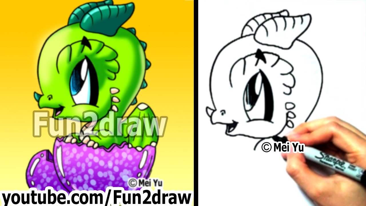
Fun2draw is created by Mei Yu, a Canadian artist, "how to draw cartoons" and "how to draw anime" instructor. In this Fun 2 draw video, she shows you how to draw a cute cartoon baby dino "step by step". "How to draw a chibi" t rex is easy and simple in this "drawing tutorial".
Tyrannosaurus Rex was a carnivore (meat-eater) that preyed upon many different dinosaur species, including hadrosaurus (duck-billed dinosaurs).
It's Fun 2 draw a cute cartoon trex dinosar for your friends and family, or for your school project / assignment! Try drawing a tyrannosaur (T.rex) for a prehistoric or jurassic scene!
BEFORE YOU REQUEST please read the INFO REGARDING REQUESTS:
Please note I just DON'T have the time to draw everyone's requests. Also, I cannot promise to draw anyone's request as soon as they want, or as exactly as they want. Your request may not get drawn at all.
I won't be able to reply to every comment. Also, I won't be able to tell you whether or when I'm going to draw your request or not. Thanks for understanding!
Disrespectful comments will not be considered and may be removed.
---------- COPYRIGHT NOTICE -------------
Fun2draw, its logo, videos, drawings, characters, and their distinctive likeness belong to Mei Yu, and are protected by Copyright Laws. ANY COMMERCIAL USE IS STRICTLY PROHIBITED. Please report any copyright violations to Mei Yu by personal message.

REAL TIME ART VIDEO: Draw Famous Character in 1 minute art challenge. I try to draw famous cartoon, video game, and movie characters in under 1 minute, real-time, in this drawing art challenge! See more inspirational art challenges on my Fun2draw channel! ❤ SUBSCRIBE http://www.youtube.com/subscri....ption_center?add_use Draw & COLOR at your own pace with Fun2draw APPs! ✿ Apple: https://itunes.apple.com/artis....t/mei-yu/id674269351 ✿ Android: https://play.google.com/store/....apps/dev?id=64643504
End Card Links:
★ SUBSCRIBE to Fun2draw for new videos! http://www.youtube.com/user/Fu....n2draw?sub_confirmat
★ Art Challenges:
https://www.youtube.com/watch?v=7n2J1jSnbcw&list=PLppWsG9UuVI85zzpFj5E8QfxK-WhLHv82&index=1
★ How to Draw Fun2draw & Manga:
https://www.youtube.com/watch?v=iIP39Z2qQ44&index=37&list=PLppWsG9UuVI-TOtt0wKwgTwLvr5y6yCHc
★ Travel with the Artist:
https://www.youtube.com/watch?v=Vj8Qwj9abWE&index=1&list=PLppWsG9UuVI-2p_b4DEOBBEzCwEdWRNGP
★ Specials, My Apps & eBooks:
https://www.youtube.com/watch?v=2lcD9ZmAGXE&index=1&list=PLppWsG9UuVI-tVWmmElAS3AgS8wwAnAsR
Adventure Meme by Kevin MacLeod is licensed under a Creative Commons Attribution license (https://creativecommons.org/licenses/by/4.0/)
Source: http://incompetech.com/music/r....oyalty-free/index.ht
Artist: http://incompetech.com/
A Turn for the Worse - Sadness by Kevin MacLeod is licensed under a Creative Commons Attribution license (https://creativecommons.org/licenses/by/4.0/)
Source: http://incompetech.com/music/royalty-free/?keywords=worse
Artist: http://incompetech.com/
Music from the Youtube Audio Library
https://www.youtube.com/audiolibrary
How to Draw Step by Step - super CUTE Emoji Face - Easy Quick Fun2draw - drawings for beginners kids
Learn to draw super EASY things step by step in minutes in my new Easy Quick Fun2draw drawing tutorial video series!
Also, Draw & COLOR at your own pace with Fun2draw APPs:
Apple: https://itunes.apple.com/artis....t/mei-yu/id674269351
Android: https://play.google.com/store/....apps/dev?id=64643504
*NOTE: App selection may vary by store.
Each Fun2draw App features NEVER-BEFORE-SEEN Fun2draw characters, with over 100 drawing & color steps available, plus my own easy voice instructions & tips! It's like having me as your very own portable art teacher on your mobile devices!
Each Collection in each app has 1 free character for you to try out. The rest of the characters in that Collection, in that app, are available for purchase. Each Collection in each app is sold separately.
See my latest Fun2draw APP video:
http://youtu.be/p1usr0weBWk
--------------------------------------------
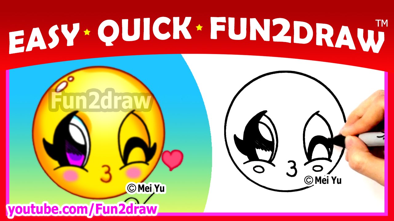
Learn how to draw cartoons easy, step by step for kids, children, teens and beginners! In this cute drawing, you can learn to draw a funny emoji face blowing a kiss and winking as a cute kawaii chibi cartoon character step by step from the popular Youtube art channel Fun2draw!
It's Easy, Quick and Fun2draw!
"Easy Quick Fun2draw" is a new drawing instruction and cartoon tutorial series from Fun2draw creator, Mei Yu. This series will help you learn how to draw all sorts of very easy cartoons & cute things step by step in minutes.
This cartoon art lesson is great for beginners, kids, children, teens and artists of all ages & skill levels.
Other best and popular online art lessons from Fun2draw include drawings of the Fun2draw peace sign, Fun2draw makeup compact, lipstick, nail polish, perfume bottle, flower, rose, cute sun, kawaii sunflower, cupcake, pizza slice, soft drink cup, tea cup, easy soccer ball, baseball / soft ball, Minion from Despicable Me, Olaf from Disney's Frozen, Fun2draw creeper and Minecraft pig, and more!
Fun2draw shows you how to draw easy things, cute cartoons, animals, food, kawaii things, Holidays, chibi people, celebrities, movie, cartoon and game characters, in MINUTES!
450 + easy things to draw, popular cartoon videos & art lesson tutorials here: http://www.youtube.com/fun2draw
SUBSCRIBE so you won't miss new videos!
http://www.youtube.com/subscri....ption_center?add_use
----- AWESOME Fun2draw playlists: --------
Uploaded Videos
http://www.youtube.com/playlis....t?list=UUFf_ebUsE0QH
Celebrity Chibi Drawings! (Super Cute & Easy)
http://www.youtube.com/playlis....t?list=PLppWsG9UuVI-
Draw Cute Baby Animals!
http://www.youtube.com/playlis....t?list=PLCBDD2772D28
Draw Horses, Unicorns & Pegasus!
http://www.youtube.com/playlis....t?list=PLB94D377B1AD
Draw Cartoon People!
http://www.youtube.com/playlis....t?list=PLF154B123208
Draw Dragons!
http://www.youtube.com/playlis....t?list=PL6D61D9B57C7
Draw Fantasy Characters!
http://www.youtube.com/playlis....t?list=PLB23465365E1
Draw Wild Animals!
http://www.youtube.com/playlis....t?list=PL3B3DAEBF471
Draw CUTE Pets!
http://www.youtube.com/playlis....t?list=PLBC2638D9ACE
Draw Cool Graffiti & Bubble LETTERS!
http://www.youtube.com/playlis....t?list=PLppWsG9UuVI-
Draw CUTE Food!
http://www.youtube.com/playlis....t?list=PLppWsG9UuVI9
Draw Monsters, Beasts & Aliens!
http://www.youtube.com/playlis....t?list=PLppWsG9UuVI9
Draw Kitty Cats, Lions and Tigers!
http://www.youtube.com/playlis....t?list=PLCD71AC61C34
Draw Puppy Dogs!
http://www.youtube.com/playlis....t?list=PLA2FF3D49311
~~~~~ EVERY SINGLE Fun2draw Playlist here: ~~~~~
http://www.youtube.com/user/Fun2draw/videos?flow=grid&view=1
----------------------------------
FACEBOOK: http://www.facebook.com/Fun2draw
TWITTER: http://www.twitter.com/Fun2draw
-----------------------------------
INFO REGARDING REQUESTS:
Due to lots of requests, I don't have the time to do everyone's. There's a chance your request may not get done at all. Thanks for understanding :)
---------- COPYRIGHT / TRADEMARK NOTICE -------------
Fun2draw, its logo, videos, drawings, characters, and their distinctive likeness belong to Mei Yu, and are protected by Copyright & Trademark Laws. ANY COMMERCIAL USE IS STRICTLY PROHIBITED. Please report any copyright & trademark violations to Mei Yu by personal message.

Draw & COLOR at your own pace with Fun2draw APPs!
Apple: https://itunes.apple.com/artis....t/mei-yu/id674269351
Android: https://play.google.com/store/....apps/dev?id=64643504
Each Fun2draw App features NEVER-BEFORE-SEEN Fun2draw characters, with over 100 drawing & color steps available, plus my own easy voice instructions & tips! It's like having me as your very own portable art teacher on your mobile devices!
Each Collection in each app has 1 free character for you to try out. The rest of the characters in that Collection, in that app, are available for purchase.
See my Fun2draw APP INTRO video here:http://youtu.be/4f6WS4sOfyI
------------------------------------
"How to draw farm animals" - "How to draw a cow" - "how to draw easy cartoons" step by step! " How to draw cartoon characters" - Watch 100+ drawing tutorials, easy art lessons: http://www.youtube.com/Fun2draw
LIKE Fun2draw: http://www.facebook.com/Fun2draw
AWESOME playlists below:
How to Draw Farm Animals
http://www.youtube.com/playlis....t?list=PL7106735E110
How to Draw Pets
http://www.youtube.com/playlis....t?list=PLBC2638D9ACE
How to Draw Cartoon People
http://www.youtube.com/playlis....t?list=PLF154B123208
How to Draw Cute Baby Animals!
http://www.youtube.com/playlis....t?list=PLCBDD2772D28
You can learn how to draw a cute cartoon cow in a few minutes with Mei Yu, a Canadian artist and "how to draw cartoons" instructor. "Drawing a chibi" animal is easy in this "drawing tutorial". You can draw this cute cow on a farm, or as an animal scene with the other animals from Fun2draw's drawing videos. Request by commenting. Watch and share more "how to draw animals" and "how to draw" video tutorials on the Fun2draw youtube channel: http://www.youtube.com/fun2draw
BEFORE YOU REQUEST please read the INFO REGARDING REQUESTS:
Please note I just DON'T have the time to draw everyone's requests. Also, I cannot promise to draw anyone's request as soon as they want, or as exactly as they want. Your request may not get drawn at all.
I won't be able to reply to every comment. Also, I won't be able to tell you whether or when I'm going to draw your request or not. Thanks for understanding!
Disrespectful comments will not be considered and may be removed.
---------- COPYRIGHT NOTICE -------------
Fun2draw, its logo, videos, drawings, characters, and their distinctive likeness belong to Mei Yu, and are protected by Copyright Laws. ANY COMMERCIAL USE IS STRICTLY PROHIBITED. Please report any copyright violations to Mei Yu by personal message.

Learn how to draw an easy simple penguin step by step for kids & beginners! Draw & COLOR at your own pace with Fun2draw APPs!
Apple: https://itunes.apple.com/artis....t/mei-yu/id674269351
Android: https://play.google.com/store/....apps/dev?id=64643504
*NOTE: App selection may vary by store.
Each Fun2draw App features NEVER-BEFORE-SEEN Fun2draw characters, with over 100 drawing & color steps available, plus my own easy voice instructions & tips! It's like having me as your very own portable art teacher on your mobile devices!
Each Collection in each app has 1 free character for you to try out. The rest of the characters in that Collection, in that app, are available for purchase. Each Collection in each app is sold separately.
See my latest Fun2draw APP video:
http://youtu.be/p1usr0weBWk
--------------------------------------------
Learn how to draw your favorite cartoon and movie characters easy! In this step by step drawing tutorial for beginners, kids and teens, you can learn to draw baby Private from The Penguins of Madagascar, an animated family film from Dreamworks Animation, as a cute kawaii chibi baby penguin with an egg shell step by step from the popular Youtube art & drawing channel Fun2draw!
It's Simple! It's Quick! It's Fun2draw!
This cartoon art lesson is great for beginners, kids, children, teens and artists of all ages & skill levels.
Other best and popular online art lessons from Fun2draw include drawings of the Fun2draw Skipper the Penguin from The Penguins of Madagascar, the Fun2draw Olaf the Snowman from Frozen, Princess Elsa and Anna from the same Disney movie, the Fun2draw reindeer, Rudolph the Red Nosed Reindeer in a Christmas present, a cute stocking, a kawaii Christmas wreath, kawaii cute Christmas desserts (Cupcake with Holly and Hot Chocolate), a cute girl snowman, a girly penguin with a pretty bow, the chibi figure skater, the beautiful Christmas Angel with a cute pony tail hairstyle, a pretty Santa Elf girl with cute Christmas outfit and shoes, a Fun2draw Santa with a bag of gifts, the kawaii Christmas gift box with a bow, and the kawaii ice skate!
Fun2draw shows you how to draw easy things, cute cartoons, animals, food, kawaii things, Holidays, chibi people, celebrities, movie, cartoon and game characters, in MINUTES!
400 + easy things to draw, popular cartoon videos & art lesson tutorials here: http://www.youtube.com/fun2draw
SUBSCRIBE so you won't miss new videos!
http://www.youtube.com/subscri....ption_center?add_use
----- AWESOME Fun2draw playlists: --------
Uploaded Videos
http://www.youtube.com/playlis....t?list=UUFf_ebUsE0QH
Celebrity Chibi Drawings! (Super Cute & Easy)
http://www.youtube.com/playlis....t?list=PLppWsG9UuVI-
Draw Cute Baby Animals!
http://www.youtube.com/playlis....t?list=PLCBDD2772D28
Draw Horses, Unicorns & Pegasus!
http://www.youtube.com/playlis....t?list=PLB94D377B1AD
Draw Cartoon People!
http://www.youtube.com/playlis....t?list=PLF154B123208
Draw Dragons!
http://www.youtube.com/playlis....t?list=PL6D61D9B57C7
Draw Fantasy Characters!
http://www.youtube.com/playlis....t?list=PLB23465365E1
Draw Wild Animals!
http://www.youtube.com/playlis....t?list=PL3B3DAEBF471
Draw CUTE Pets!
http://www.youtube.com/playlis....t?list=PLBC2638D9ACE
Draw Cool Graffiti & Bubble LETTERS!
http://www.youtube.com/playlis....t?list=PLppWsG9UuVI-
Draw CUTE Food!
http://www.youtube.com/playlis....t?list=PLppWsG9UuVI9
Draw Monsters, Beasts & Aliens!
http://www.youtube.com/playlis....t?list=PLppWsG9UuVI9
Draw Kitty Cats, Lions and Tigers!
http://www.youtube.com/playlis....t?list=PLCD71AC61C34
Draw Puppy Dogs!
http://www.youtube.com/playlis....t?list=PLA2FF3D49311
~~~~~ EVERY SINGLE Fun2draw Playlist here: ~~~~~
http://www.youtube.com/user/Fun2draw/videos?flow=grid&view=1
----------------------------------
FACEBOOK: http://www.facebook.com/Fun2draw
TWITTER: http://www.twitter.com/Fun2draw
-----------------------------------
INFO REGARDING REQUESTS:
Due to lots of requests, I don't have the time to do everyone's. There's a chance your request may not get done at all. Thanks for understanding :)
---------- COPYRIGHT / TRADEMARK NOTICE -------------
Fun2draw, its logo, videos, drawings, characters, and their distinctive likeness belong to Mei Yu, and are protected by Copyright & Trademark Laws. ANY COMMERCIAL USE IS STRICTLY PROHIBITED. Please report any copyright & trademark violations to Mei Yu by personal message.

Draw & COLOR at your own pace with Fun2draw APPs!
Apple: https://itunes.apple.com/artis....t/mei-yu/id674269351
Android: https://play.google.com/store/....apps/dev?id=64643504
Each Fun2draw App features NEVER-BEFORE-SEEN Fun2draw characters, with over 100 drawing & color steps available, plus my own easy voice instructions & tips! It's like having me as your very own portable art teacher on your mobile devices!
Each Collection in each app has 1 free character for you to try out. The rest of the characters in that Collection, in that app, are available for purchase.
See my Fun2draw APP INTRO video here:http://youtu.be/4f6WS4sOfyI
---------------------------------------------
"How to draw a little mermaid" - "How to draw a mermaid" - "How to draw a girl" step by step! New Fun2draw vids EVERY WEEK: http://www.youtube.com/Fun2draw. LIKE Fun2draw on Facebook here: http://www.facebook.com/Fun2draw
Watch these AWESOME Fun2draw playlists:
Uploaded Videos
http://www.youtube.com/playlis....t?list=UUFf_ebUsE0QH
How to Draw Cartoon People
http://www.youtube.com/playlis....t?list=PLF154B123208
How to Draw Fantasy Characters
http://www.youtube.com/playlis....t?list=PLB23465365E1
How to Draw Sea Animals
http://www.youtube.com/playlis....t?list=PLAD4C1B53204
You can learn how to draw a girl's face, hair, eyes, hands, expression, hairstyle, and body.
Fun2draw is created by Mei Yu, a Canadian artist and "how to draw cartoon people", cartoon animals and anime book author. In this easy and simple cartooning lesson, she shows you how to draw a cute mermaid "step by step". "How to draw a little mermaid" is easy in this "drawing tutorial". You can learn how to draw a mermaid and draw one for your friends, family, school project or under water scene with different Fun2draw sea animals!
I used to watch "The Little Mermaid" all the time when I was small :) It's Fun 2 draw a cute cartoon mermaid for your friends and family. Draw a cartoon person easy! Watch and share more "how to draw fantasy characters", "how to draw people" and "how to draw chibis" on the Fun2draw youtube channel: http://www.youtube.com/fun2draw
BEFORE YOU REQUEST please read the INFO REGARDING REQUESTS:
Please note I just DON'T have the time to draw everyone's requests. Also, I cannot promise to draw anyone's request as soon as they want, or as exactly as they want. Your request may not get drawn at all.
I won't be able to reply to every comment. Also, I won't be able to tell you whether or when I'm going to draw your request or not. Thanks for understanding!
Disrespectful comments will not be considered and may be removed.
---------- COPYRIGHT NOTICE -------------
Fun2draw, its logo, videos, drawings, characters, and their distinctive likeness belong to Mei Yu, and are protected by Copyright Laws. ANY COMMERCIAL USE IS STRICTLY PROHIBITED. Please report any copyright violations to Mei Yu by personal message.
Draw & COLOR at your own pace with Fun2draw APPs!
Apple: https://itunes.apple.com/artis....t/mei-yu/id674269351
Android: https://play.google.com/store/....apps/dev?id=64643504
Each Fun2draw App features NEVER-BEFORE-SEEN Fun2draw characters, with over 100 drawing & color steps available, plus my own easy voice instructions & tips! It's like having me as your very own portable art teacher on your mobile devices!
Each Collection in each app has 1 free character for you to try out. The rest of the characters in that Collection, in that app, are available for purchase.
See my Fun2draw APP INTRO video here:http://youtu.be/4f6WS4sOfyI
---------------------------------------------
"How to draw a dragon" - "How to draw a cartoon dragon" - "How to draw easy cute dragon" - "How to draw dragons" More fantasy animal & people drawings: http://www.youtube.com/Fun2draw
Watch these AWESOME Fun2draw playlists:
How to Draw Dragons!
http://www.youtube.com/playlis....t?list=PL6D61D9B57C7
How to Draw Fantasy Characters
http://www.youtube.com/playlis....t?list=PLB23465365E1
How to Draw Cartoon People
http://www.youtube.com/playlis....t?list=PLF154B123208
LIKE Fun2draw on Facebook :) http://www.facebook.com/Fun2draw
Watch and request more "how to draw animals" and "how to draw people" on the Fun2draw youtube channel!
Fun2draw is created by Mei Yu, a Canadian artist, "how to draw cartoons" and "how to draw anime" instructor. In this Fun 2 draw video, she shows you how to draw a cute cartoon baby dragon "step by step". "How to draw a chibi" is easy and simple in this "drawing tutorial". It's Fun 2 draw a easy dragon for your friends and family, or for your school project / assignment!
BEFORE YOU REQUEST please read the INFO REGARDING REQUESTS:
Please note I just DON'T have the time to draw everyone's requests. Also, I cannot promise to draw anyone's request as soon as they want, or as exactly as they want. Your request may not get drawn at all.
I won't be able to reply to every comment. Also, I won't be able to tell you whether or when I'm going to draw your request or not. Thanks for understanding!
Disrespectful comments will not be considered and may be removed.
---------- COPYRIGHT NOTICE -------------
Fun2draw, its logo, videos, drawings, characters, and their distinctive likeness belong to Mei Yu, and are protected by Copyright Laws. ANY COMMERCIAL USE IS STRICTLY PROHIBITED. Please report any copyright violations to Mei Yu by personal message.

Draw & COLOR at your own pace with Fun2draw APPs!
Apple: https://itunes.apple.com/artis....t/mei-yu/id674269351
Android: https://play.google.com/store/....apps/dev?id=64643504
*NOTE: App selection may vary by store.
Each Fun2draw App features NEVER-BEFORE-SEEN Fun2draw characters, with over 100 drawing & color steps available, plus my own easy voice instructions & tips! It's like having me as your very own portable art teacher on your mobile devices!
Each Collection in each app has 1 free character for you to try out. The rest of the characters in that Collection, in that app, are available for purchase. Each Collection in each app is sold separately.
See my latest Fun2draw APP video:
http://youtu.be/p1usr0weBWk
--------------------------------------------
Learn how to draw easy things / stuff step by step for beginners! In this super cute and stylish makeup / beauty tutorial on how to draw, you can learn to draw a tube of lip gloss / lip balm as a cute kawaii character with big pretty eyes, eyelashes, and full glossy, gorgeous, beautiful lips step by step from the popular Youtube art channel Fun2draw! This how to tutorial is part of Fun2draw's Beauty, style, make up and cosmetics series of cute stylish creations!
It's Simple! It's Quick! It's Fun2draw!
This cartoon art lesson is great for beginners, kids, children, teens and artists of all ages & skill levels.
Other best and popular online art lessons from Fun2draw include drawings of the Fun2draw makeup compact, Fun2draw lipstick, Fun2draw nail polish, Fun2draw perfume bottle, the stylish chibi teen school girl, nerd girl in a cute skirt and wavy hairstyle, cute scene girl with a cool hair style, emo girl, teen pop star on stage singing, cute stylish celebrities, beautiful angel girl, kawaii peace sign and more!
Fun2draw shows you how to draw easy things, cute cartoons, animals, food, kawaii things, Holidays, chibi people, celebrities, movie, cartoon and game characters, in MINUTES!
400 + easy things to draw, popular cartoon videos & art lesson tutorials here: http://www.youtube.com/fun2draw
SUBSCRIBE so you won't miss new videos!
http://www.youtube.com/subscri....ption_center?add_use
----- AWESOME Fun2draw playlists: --------
Uploaded Videos
http://www.youtube.com/playlis....t?list=UUFf_ebUsE0QH
Celebrity Chibi Drawings! (Super Cute & Easy)
http://www.youtube.com/playlis....t?list=PLppWsG9UuVI-
Draw Cute Baby Animals!
http://www.youtube.com/playlis....t?list=PLCBDD2772D28
Draw Horses, Unicorns & Pegasus!
http://www.youtube.com/playlis....t?list=PLB94D377B1AD
Draw Cartoon People!
http://www.youtube.com/playlis....t?list=PLF154B123208
Draw Dragons!
http://www.youtube.com/playlis....t?list=PL6D61D9B57C7
Draw Fantasy Characters!
http://www.youtube.com/playlis....t?list=PLB23465365E1
Draw Wild Animals!
http://www.youtube.com/playlis....t?list=PL3B3DAEBF471
Draw CUTE Pets!
http://www.youtube.com/playlis....t?list=PLBC2638D9ACE
Draw Cool Graffiti & Bubble LETTERS!
http://www.youtube.com/playlis....t?list=PLppWsG9UuVI-
Draw CUTE Food!
http://www.youtube.com/playlis....t?list=PLppWsG9UuVI9
Draw Monsters, Beasts & Aliens!
http://www.youtube.com/playlis....t?list=PLppWsG9UuVI9
Draw Kitty Cats, Lions and Tigers!
http://www.youtube.com/playlis....t?list=PLCD71AC61C34
Draw Puppy Dogs!
http://www.youtube.com/playlis....t?list=PLA2FF3D49311
~~~~~ EVERY SINGLE Fun2draw Playlist here: ~~~~~
http://www.youtube.com/user/Fun2draw/videos?flow=grid&view=1
----------------------------------
FACEBOOK: http://www.facebook.com/Fun2draw
TWITTER: http://www.twitter.com/Fun2draw
-----------------------------------
INFO REGARDING REQUESTS:
Due to lots of requests, I don't have the time to do everyone's. There's a chance your request may not get done at all. Thanks for understanding :)
---------- COPYRIGHT / TRADEMARK NOTICE -------------
Fun2draw, its logo, videos, drawings, characters, and their distinctive likeness belong to Mei Yu, and are protected by Copyright & Trademark Laws. ANY COMMERCIAL USE IS STRICTLY PROHIBITED. Please report any copyright & trademark violations to Mei Yu by personal message.

Draw & COLOR at your own pace with Fun2draw APPs!
Apple: https://itunes.apple.com/artis....t/mei-yu/id674269351
Android: https://play.google.com/store/....apps/dev?id=64643504
Each Fun2draw App features NEVER-BEFORE-SEEN Fun2draw characters, with over 100 drawing & color steps available, plus my own easy voice instructions & tips! It's like having me as your very own portable art teacher on your mobile devices!
Each Collection in each app has 1 free character for you to try out. The rest of the characters in that Collection, in that app, are available for purchase.
See my Fun2draw APP INTRO video here:http://youtu.be/4f6WS4sOfyI
--------------------------------------------
This Fun2draw cartoon drawing is inspired by the Disney character Sven the Reindeer from the family movie "Frozen". Draw this cute reindeer with the other cute, fun & easy cartoon character drawings & doodles from the Fun2draw drawing channel, including the Fun2draw Elsa, Olaf, different reindeer, Santa, polar bear, penguins, winter ice skating girl, gingerbread man, kawaii snowflake, stocking & more!
300 + easy drawings & cartoon art tutorials here: http://www.youtube.com/fun2draw
NEW video every week :)
Become a Fun2drawer!
SUBSCRIBE: http://www.youtube.com/subscri....ption_center?add_use
----- AWESOME Fun2draw playlists: --------
Uploaded Videos
http://www.youtube.com/playlis....t?list=UUFf_ebUsE0QH
Celebrity Chibi Drawings! (Super Cute & Easy)
http://www.youtube.com/playlis....t?list=PLppWsG9UuVI-
Draw Cute Baby Animals!
http://www.youtube.com/playlis....t?list=PLCBDD2772D28
Draw Horses, Unicorns & Pegasus!
http://www.youtube.com/playlis....t?list=PLB94D377B1AD
Draw Cartoon People!
http://www.youtube.com/playlis....t?list=PLF154B123208
Draw Dragons!
http://www.youtube.com/playlis....t?list=PL6D61D9B57C7
Draw Fantasy Characters!
http://www.youtube.com/playlis....t?list=PLB23465365E1
Draw Wild Animals!
http://www.youtube.com/playlis....t?list=PL3B3DAEBF471
Draw CUTE Pets!
http://www.youtube.com/playlis....t?list=PLBC2638D9ACE
Draw Cool Graffiti & Bubble LETTERS!
http://www.youtube.com/playlis....t?list=PLppWsG9UuVI-
Draw CUTE Food!
http://www.youtube.com/playlis....t?list=PLppWsG9UuVI9
Draw Monsters, Beasts & Aliens!
http://www.youtube.com/playlis....t?list=PLppWsG9UuVI9
Draw Kitty Cats, Lions and Tigers!
http://www.youtube.com/playlis....t?list=PLCD71AC61C34
Draw Puppy Dogs!
http://www.youtube.com/playlis....t?list=PLA2FF3D49311
~~~~~ EVERY SINGLE Fun2draw Playlist here: ~~~~~
http://www.youtube.com/user/Fun2draw/videos?flow=grid&view=1
----------------------------------
FACEBOOK: http://www.facebook.com/Fun2draw
TWITTER: http://www.twitter.com/Fun2draw
-----------------------------------
INFO REGARDING REQUESTS:
Due to lots of requests, I don't have the time to do everyone's. There's a chance your request may not get done at all. Thanks for understanding :)
---------- COPYRIGHT NOTICE -------------
Fun2draw, its logo, videos, drawings, characters, and their distinctive likeness belong to Mei Yu, and are protected by Copyright Laws. ANY COMMERCIAL USE IS STRICTLY PROHIBITED. Please report any copyright violations to Mei Yu by personal message.

TOP ART VIDEO: Amazing Art Challenge! Draw GOOD GUYS as VILLAINS. These inspirational art challenges are one of my top art challenge videos.
Subscribe here: http://www.youtube.com/subscri....ption_center?add_use
*Get my Fun2draw APPs! ✿ Apple: https://itunes.apple.com/artis....t/mei-yu/id674269351 ✿ Android: https://play.google.com/store/....apps/dev?id=64643504
★ SUBSCRIBE to Fun2draw for new Tutorial Thursday and Fun Friday videos! http://www.youtube.com/user/Fu....n2draw?sub_confirmat
★ Art Challenges:
https://www.youtube.com/watch?v=7n2J1jSnbcw&list=PLppWsG9UuVI85zzpFj5E8QfxK-WhLHv82&index=1
★ How to Draw Fun2draw & Manga:
https://www.youtube.com/watch?v=iIP39Z2qQ44&index=37&list=PLppWsG9UuVI-TOtt0wKwgTwLvr5y6yCHc
★ Travel with the Artist:
https://www.youtube.com/watch?v=Vj8Qwj9abWE&index=1&list=PLppWsG9UuVI-2p_b4DEOBBEzCwEdWRNGP
★ Specials, My Apps & eBooks:
https://www.youtube.com/watch?v=2lcD9ZmAGXE&index=1&list=PLppWsG9UuVI-tVWmmElAS3AgS8wwAnAsR
Music:
8bit Dungeon Boss - Video Classica by Kevin MacLeod is licensed under a Creative Commons Attribution license (https://creativecommons.org/licenses/by/4.0/)
Source: http://incompetech.com/music/r....oyalty-free/index.ht
Artist: http://incompetech.com/
A Dream Within a Dream by Twin Musicom is licensed under a Creative Commons Attribution license (https://creativecommons.org/licenses/by/4.0/)
Source: http://www.twinmusicom.org/son....g/301/a-dream-within
Artist: http://www.twinmusicom.org
Lone Harvest by Kevin MacLeod is licensed under a Creative Commons Attribution license (https://creativecommons.org/licenses/by/4.0/)
Source: http://incompetech.com/music/royalty-free/index.html?isrc=USUAN1100409
Artist: http://incompetech.com/
Death of Kings 2 by Kevin MacLeod is licensed under a Creative Commons Attribution license (https://creativecommons.org/licenses/by/4.0/)
Source: http://incompetech.com/music/royalty-free/index.html?isrc=USUAN1100876
Artist: http://incompetech.com/
The Evening of Departure by Twin Musicom is licensed under a Creative Commons Attribution license (https://creativecommons.org/licenses/by/4.0/)
Artist: http://www.twinmusicom.org/
Heavy Action by Audionautix is licensed under a Creative Commons Attribution license (https://creativecommons.org/licenses/by/4.0/)
Artist: http://audionautix.com/
Darkest Child by Kevin MacLeod is licensed under a Creative Commons Attribution license (https://creativecommons.org/licenses/by/4.0/)
Source: http://incompetech.com/music/royalty-free/index.html?isrc=USUAN1100783
Artist: http://incompetech.com/
Crossing the Threshold - Ghostpocalypse by Kevin MacLeod is licensed under a Creative Commons Attribution license (https://creativecommons.org/licenses/by/4.0/)
Source: http://incompetech.com/music/royalty-free/index.html?isrc=USUAN1100663
Artist: http://incompetech.com/
Music from the Youtube Audio Library
https://www.youtube.com/audiolibrary

In this new art challenge , I reimagined, draw and colored some famous characters as opposite gender. Watch more new more art challenges, genderbend drawings, and fun art videos on my Fun2draw art channel!
Shop Mei Yu's Art Merchandise:
US + Int:
https://www.zazzle.com/meiyuart*
UK and Europe:
https://www.zazzle.co.uk/meiyuart*
Canada:
https://www.zazzle.ca/meiyuart*
Australia:
https://www.zazzle.com.au/meiyuart*
DRAW + COLOR with Fun2draw Apps!
- Apple: https://itunes.apple.com/artis....t/mei-yu/id674269351
- Android: https://play.google.com/store/....apps/dev?id=64643504
MeiYuArt channel:
https://www.youtube.com/user/meiyuart/videos
Music:
Long Road Ahead by Kevin MacLeod is licensed under a Creative Commons Attribution license (https://creativecommons.org/licenses/by/4.0/)
Source: http://incompetech.com/music/r....oyalty-free/index.ht
Artist: http://incompetech.com/
Level Up by Kevin MacLeod is licensed under a Creative Commons Attribution license (https://creativecommons.org/licenses/by/4.0/)
Source: http://incompetech.com/music/royalty-free/index.html?isrc=USUAN1500023
Artist: http://incompetech.com/
Music from the YouTube Audio Library
https://www.youtube.com/audiolibrary

Draw & COLOR at your own pace with Fun2draw APPs!
Apple: https://itunes.apple.com/artis....t/mei-yu/id674269351
Android: https://play.google.com/store/....apps/dev?id=64643504
Each Fun2draw App features NEVER-BEFORE-SEEN Fun2draw characters, with over 100 drawing & color steps available, plus my own easy voice instructions & tips! It's like having me as your very own portable art teacher on your mobile devices!
Each Collection in each app has 1 free character for you to try out. The rest of the characters in that Collection, in that app, are available for purchase.
See my Fun2draw APP INTRO video here:http://youtu.be/4f6WS4sOfyI
---------------------------------------------
Draw this sweet dessert with beautiful Fun2draw eyes in this how to sketch video! 100 + step by step drawing tutorials & cartoon art lessons (food, animals, people) http://www.youtube.com/fun2draw
NEW videos every THURSDAY & SATURDAY
SUBSCRIBE so you can be among the first to see them: http://www.youtube.com/subscri....ption_center?add_use
Try drawing this delicious slice of cake with yummy icing and sweet candy rainbow sparkles! Make a birthday cake picture to say "Happy Birthday", or turn this into a cute wedding cake to say "Congratulations" for a newlywed couple, or "Happy Anniversary" :3
It'll be Fun2draw your own bakery, dessert, restaurant, picnic, cafe, sweets or food scene with this and the other cute foods from Fun2draw's youtube channel, like the cupcake, gummy bear candy, hamburger, pizza or french fries.
How to Draw CUTE Food!
http://www.youtube.com/playlis....t?list=PLppWsG9UuVI9
For more cute drawing tutorials, check out:
----- AWESOME Fun2draw playlists: --------
Uploaded Videos
http://www.youtube.com/playlis....t?list=UUFf_ebUsE0QH
Celebrity Chibi Drawings! (Super Cute & Easy)
http://www.youtube.com/playlis....t?list=PLppWsG9UuVI-
How to Draw Cute Baby Animals!
http://www.youtube.com/playlis....t?list=PLCBDD2772D28
How to Draw Horses, Unicorns & Pegasus
http://www.youtube.com/playlis....t?list=PLB94D377B1AD
How to Draw Cartoon People
http://www.youtube.com/playlis....t?list=PLF154B123208
How to Draw Dragons!
http://www.youtube.com/playlis....t?list=PL6D61D9B57C7
How to Draw Fantasy Characters
http://www.youtube.com/playlis....t?list=PLB23465365E1
How to Draw Wild Animals
http://www.youtube.com/playlis....t?list=PL3B3DAEBF471
How to Draw Pets
http://www.youtube.com/playlis....t?list=PLBC2638D9ACE
How to Draw Cool Graffiti & Bubble LETTERS!
http://www.youtube.com/playlis....t?list=PLppWsG9UuVI-
How to Draw CUTE Food!
http://www.youtube.com/playlis....t?list=PLppWsG9UuVI9
How to Draw Monsters, Beasts & Aliens!
http://www.youtube.com/playlis....t?list=PLppWsG9UuVI9
How to Draw Kitty Cats, Lions and Tigers
http://www.youtube.com/playlis....t?list=PLCD71AC61C34
How to Draw Puppy Dogs!
http://www.youtube.com/playlis....t?list=PLA2FF3D49311
~~~~~ See EVERY SINGLE Fun2draw Playlist here: ~~~~~
http://www.youtube.com/user/Fun2draw/videos?flow=grid&view=1
----------------------------------
FACEBOOK: http://www.facebook.com/Fun2draw
TWITTER: http://www.twitter.com/Fun2draw
* you can also request on these social networks, too!
-----------------------------------
Watch and request more "how to draw animals" and "how to draw people" on the Fun2draw youtube channel!
Fun2draw is created by Mei Yu, a Canadian artist, "how to draw cartoons" and "how to draw anime" instructor.
BEFORE YOU REQUEST please read the INFO REGARDING REQUESTS:
Please note I just DON'T have the time to draw everyone's requests. Also, I cannot promise to draw anyone's request as soon as they want, or as exactly as they want. Your request may not get drawn at all.
I won't be able to reply to every comment. Also, I won't be able to tell you whether or when I'm going to draw your request or not. Thanks for understanding!
Disrespectful comments will not be considered and may be removed.
---------- COPYRIGHT NOTICE -------------
Fun2draw, its logo, videos, drawings, characters, and their distinctive likeness belong to Mei Yu, and are protected by Copyright Laws. ANY COMMERCIAL USE IS STRICTLY PROHIBITED. Please report any copyright violations to Mei Yu by personal message.

Hello, Dear fans! I'm back with another lovely Hair Transformation. Its hot in Dubai and many of you asked me for short haircut, therefore, I decided to do a Crazy Medium to a short haircut and trendy hairstyle for my man (Loyal Client).
I'll Upload new tutorial video every Friday! Stay Tuned.
Thumbs up If you liked it, Subscribe if You Liked it.
----------------------------------------------------------------------------
Reach me here
↓↓
⇨ Subscribe! https://www.youtube.com/c/JasonMakki
⇨ Instagram: https://www.instagram.com/jasonmakki/
⇨ FB Page: https://www.facebook.com/Jasonmakki.BestBarber
----------------------------------------------------------------------------
PRODUCTS
For Products Shopping Visit my
WEBSITE ⇨ https://www.jasonmakki.com
Products↓
Beard grow vitamins ⇨ https://amzn.to/2KQVbES
Vitamin keratin hair mask ⇨ https://amzn.to/2san1US
Hair removal waxing kit ⇨ https://amzn.to/2GLOmSL
Pro Titanium Flat Iron, Hair Straightener ⇨ https://amzn.to/2GLrzXk
Andis 4775 Gtx T-Outliner Trimmer ⇨ https://amzn.to/2JmSKwO
Andis LIGHTWEIGHT Cordless Mens Shaver ⇨ https://amzn.to/2kGO9ry
Wahl Professional 5-Star Cord/Cordless ⇨ https://amzn.to/2JjRAT0
Canon EOS 70D Digital SLR Camera with 18-55mm ⇨ https://amzn.to/2La6LeG
Sigma 50mm f/1.4 EX DG HSM Lens for Canon Digital SLR Camera⇨ https://amzn.to/2xwTfQt
Canon EF-S 24mm f/2.8 STM Lens ⇨ https://amzn.to/2LNvqH6
Redken 03 Water Wax Pomade 1.7 Ounces ⇨ https://amzn.to/2LffJHI
Redken Water Wax, 1.7 Ounce ⇨ https://amzn.to/2LQC7rJ
Natural Hairstyle Color Pomade, Washable Temporary, Gray ⇨ https://amzn.to/2H9oHUo
AMMEX Black Gloves (Box of 100) ⇨ https://amzn.to/2xuZjbS
-----------------------------------------------------------------
Location ⇨ Living in Dubai
Salon Name ⇨ ????VIP ISLAND SALON????
In the Hair industry SINCE the year 1999.
-------------------------------------------------------------------
Woking Place
I've been Working in VIP Island Salon Since 2006.
For the appointment please, text me on WhatsApp the number located on my Instagram.
⇨ Instagram: https://www.instagram.com/jasonmakki/
----------------------------------------------------------------------
Job Offer
I would like to accept Partnership from professional salon or Barbershop in These countries:
U.S.A, Canada, Europe or Australia and New Zealand.
For collaborations or business inquiries
email ⇨ jasonmakkiofficial@gmail.com
-------------------------------------------------------------------------------
Keratin
If you want to purchase The Keratin product Email me or visit my Website
email ⇨ jasonmakkiofficial@gmail.com
WEBSITE ⇨ https://www.jasonmakki.com
-------------------------------------------------------------------------------
Second Channel
I'm Running My Second Vlogging Channel Soon!
Subscribe ⇨ https://goo.gl/zEWsmn

Stunning Short Haircut And Color Transformation For Girls | Beautiful Hairstyles Ideas 2019
????♀️ Watch more hairstyle inspirations! https://youtube.com/playlist?l....ist=PLNobIsbmMNuZKos
▽ Subscribe to Hair Inspiration for more! https://youtube.com/channel/UC....F-usPD55jS0Dg1Af--SD
▽ Credit:
@cihancakarvip
@emrahdemircii
@emreayaksiz
@fadiaelmendelek
@mounir
@themostkuafor
▽ Music provided by NoCopyrightSounds
https://www.youtube.com/user/NoCopyrightSounds
[No Copyright Music] Cool - Tobu
[No Copyright Music] Flying High - FREDJI
[No Copyright Music] Good For You - THBD
★ To submit your video to be featured in our next compilation, send us an email with a link to your profile and video you'd like to be featured: contact@t-plus.org
Note: All content featured in our compilations is used with permission from the original posters. For all inquiries, please email: contact@t-plus.org
#Hair #HairInspiration #LifeBeauty #Lifebeautylipstick #Lifebeautynails #Lipsticktutorial

????♀️ Watch more hairstyle inspirations! https://youtube.com/playlist?l....ist=PLNobIsbmMNuZKos
▽ Subscribe to Hair Inspiration for more! https://youtube.com/channel/UC....F-usPD55jS0Dg1Af--SD
▽ Credit:
@diaelmendelek
@mtnaykt
@ozdenkurtur
@emreayaksiz
@mounir
▽ Music provided by NoCopyrightSounds
https://www.youtube.com/user/NoCopyrightSounds
LiQWYD - Feel (Vlog No Copyright Music)
Jarico - Island (Vlog No Copyright Music)
Itro _ Tobu - Cloud 9 [NCS Release]
★ To submit your video to be featured in our next compilation, send us an email with a link to your profile and video you'd like to be featured: contact@t-plus.org
Note: All content featured in our compilations is used with permission from the original posters. For all inquiries, please email: contact@t-plus.org
#Hair #HairInspiration #LifeBeauty #Lifebeautylipstick #Lifebeautynails #Lipsticktutorial

Super Hairstyles for Medium Length Hair Curly | Amazing Hair Transformations by Professional
????♀️ Watch more hairstyle inspirations! https://youtube.com/playlist?l....ist=PLNobIsbmMNuZKos
▽ Subscribe to Hair Inspiration for more! https://youtube.com/channel/UC....F-usPD55jS0Dg1Af--SD
▽ Credit:
@zakariachokor
@mounir
@ahmedhamshou
@emrahdemircii
@themostkuafor
@moe.farhat1
▽ Music provided by NoCopyrightSounds
https://www.youtube.com/user/NoCopyrightSounds
Convex - 4U (feat. Jex Jordyn) [NCS Release]
Ikson - All Night
Itro _ Tobu - Cloud 9 [NCS Release]
★ To submit your video to be featured in our next compilation, send us an email with a link to your profile and video you'd like to be featured: contact@t-plus.org
Note: All content featured in our compilations is used with permission from the original posters. For all inquiries, please email: contact@t-plus.org
#Hair #HairInspiration #LifeBeauty #Lifebeautylipstick #Lifebeautynails #Lipsticktutorial

Most Beautiful Haircuts and Color Transformations for Women | How To Get Perfectly Hairstyles
????♀️ Watch more hairstyle inspirations! https://youtube.com/playlist?l....ist=PLNobIsbmMNuZKos
▽ Subscribe to Hair Inspiration for more! https://youtube.com/channel/UC....F-usPD55jS0Dg1Af--SD
▽ Credit:
@ozdenkurtur
@realericvaughn
@mounir
@andersonacouto
▽ Music provided by NoCopyrightSounds
https://www.youtube.com/user/NoCopyrightSounds
Ikson - All Night
Itro _ Tobu - Cloud 9 [NCS Release]
Tobu - Hope [NCS Release]
★ To submit your video to be featured in our next compilation, send us an email with a link to your profile and video you'd like to be featured: contact@t-plus.org
Note: All content featured in our compilations is used with permission from the original posters. For all inquiries, please email: contact@t-plus.org
#Hair #HairInspiration #LifeBeauty #Lifebeautylipstick #Lifebeautynails #Lipsticktutorial

Top 13 Trendy Hairstyles 2019 | Gorgeous Haircut Transformation By Professional
????♀️ Watch more hairstyle inspirations! https://youtube.com/playlist?l....ist=PLNobIsbmMNuZKos
▽ Subscribe to Hair Inspiration for more! https://youtube.com/channel/UC....F-usPD55jS0Dg1Af--SD
▽ Credit:
@emrahdemircii
▽ Music provided by NoCopyrightSounds
Ikson - All Night
Itro _ Tobu - Cloud 9 [NCS Release]
ES_Boomerang - Tape Machines
★ To submit your video to be featured in our next compilation, send us an email with a link to your profile and video you'd like to be featured: contact@tastyplus.net
Note: All content featured in our compilations is used with permission from the original posters. For all inquiries, please email: contact@tastyplus.net
#Hair #HairInspiration #LifeBeauty #Lifebeautylipstick #Lifebeautynails #Lipsticktutorial

Super 10+ Bob and Short Hairstyles You'll Love | Trending Hair Transformations by Professional
????♀️ Watch more hairstyle inspirations! https://youtube.com/playlist?l....ist=PLNobIsbmMNuZKos
▽ Subscribe to Hair Inspiration for more! https://youtube.com/channel/UC....F-usPD55jS0Dg1Af--SD
▽ Credit:
@orkunbaykut
@celiofariaoficial
@emrahdemircii
@hairbysarmad
@kadirhair
@mounir
@orkunbaykut
▽ Music provided by NoCopyrightSounds
https://www.youtube.com/user/NoCopyrightSounds
[No Copyright Music] Good For You - THBD
Ascence - Konnichiwa [NCS Release]
BEAUZ & JVNA - Crazy [NCS Release]
★ To submit your video to be featured in our next compilation, send us an email with a link to your profile and video you'd like to be featured: contact@t-plus.org
Note: All content featured in our compilations is used with permission from the original posters. For all inquiries, please email: contact@t-plus.org
#Hair #HairInspiration #LifeBeauty #Lifebeautylipstick #Lifebeautynails #Lipsticktutorial
