Video teratas

In this video, I show you the steps to drawing a variety of trees from start to finish.
Follow me!
Facebook: http://www.facebook.com/tylersartshack
Twitter: https://twitter.com/#!/TylersArtShack
Google+: https://plus.google.com/115405....344518849808905/post
Deviant Art: http://tylersartshack.deviantart.com/
Hey everyone, welcome back to this weeks video where I show you to draw a couple of different trees. I drew these trees in a more lose like style to give them a little bit more character.
I start off the first tree with a line that re presents the entire tree. The bottom of that line represents the trunk and the top of the line where I start to really wiggle it around is the very top of the tree. I do this so that there are no issues with placing the entire tree on the page.
Once that line is done, I then go back in and start to design the trunk of the tree and work my way up to the branches making them smaller as I go. One issue that I had a lot of trouble with was making the tree look organic and less stiff. Avoid straight lines. Instead use curves, wiggles, and corner shaped lines for the trees to keep it looking organic.
Once the basic outlines of the tree is finished, shading comes next. I like to make my tree first look like a winter tree before adding leaves creating a summer tree. Choose a side of the tree you would like darker than the other and begin to shade. Shade in the direction of the tree's movement. This will help to simulate the bark and texture of the tree.
Once all that is done, you can leave your tree at what you have and call it a winter tree or take the next step and add in the leaves and see what you can create. Adding the leaves is much more simple if you think of it as adding in bunches of leaves instead of each single individual leaf. If drawing each leaf is your method of choice, you may be drawing for quite some time. I find that drawing the texture of a bunch of leaves translates to the eye just fine. It is the texture that conveys the image. Use an underhand grip so that maximum amount of graphite is in contact with the paper and use small circular motions while doing this. Use a variety of pencils to get different gradations to create volume.
The Second set of trees is out of my Mountains in the Mist drawing. I drew 3 trees very similar to them. Those I start out by drawing a straight line representing the whole tree. Then I usually start at the top of the tree making some small texture for the pine. I usually do the same underhand grip for this and work my pencil from the line outward in a slight upward motion. That way the branches have a slight arch to them. This helps to give it a bit of character and interest. I do like to make them look lush so I add in quite a few branches. Sometimes Ill make them a little bit more weathered looking by holding back on the amount of branches overall.
Alright everyone! I hope you all enjoyed this weeks video! Please leave me a comment on your thoughts and rate thumbs up if you enjoyed it! Subscribe for future videos!
Music Info:
Artist: DJ Lang
Song: Drops of H2O
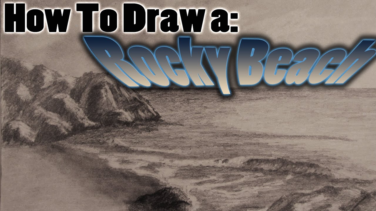
I will show you how I drew a realistic beach scene from start to finish. This video will take you through the steps using different techniques and styles to achieve a completed drawing.
Follow me for more content
Facebook: http://www.facebook.com/tylersartshack
Twitter: https://twitter.com/#!/TylersArtShack
Google+: https://plus.google.com/u/0/11....5405344518849808905/
I started this drawing by looking at images in google to get some ideas for composition and placement. I also had a few other similar sketches that I worked from to create this.
After I had a general composition that I liked, I just quickly drew in large objects to start filling in the page. After objects are placed. Start adding in all the details of the overall image. In this case I started with the sky.
The sky consisted of a light tone using an HB pencil. I used a method of cross hatching to achieve this. This is where you draw parallel lines in one direction and then another direction perpendicular to the original ones to create darker tones. This helps to prepare for the next step. Next step would be to take a blending stump and make the sky into a smooth value. Once this is done, use an eraser to erase out rough shapes that will take the form of clouds.
In this case, I left the drawing with a rough sky. I wanted the focus to be in the water and rocks of this drawing. I started next on the water. The water is very simple to make. All you need is a B or 2B pencil and start making parallel lines with varied pencil pressure to create texture. This helps to create the illusion of movement and gives the water some visual interest.
Up next were the rocks. They were difficult for me at first to render out but as soon as I got all the tone down and started to think of how I draw mountains, I started to get the hang of it. I usually learn as I go when it comes to drawing new things. I used a combination of erasing and darker pencils to create depth and tone. I then started to work on the rocks closer to the picture plane to help show the depth of the picture.
Once those rocks were done it was just a matter of fine tuning the small waves in the water and darkening certain objects.
This drawing overall took me about 3 hours or so to create.
Hope you enjoyed!
Leave me a comment!
Song: Helium Hues
Artist: Danosongs.com
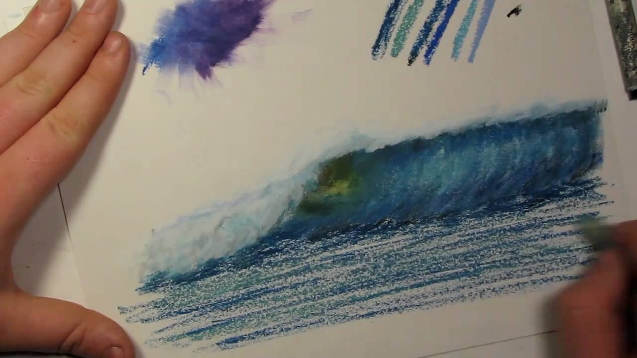
#Hello everybody. So I get questions quite often on how to blend oil pastels quite often. In a few of my videos I blend them with my fingers and in others I blend them with blending stumps. There isn't too big of a difference between the two methods it just depends on what I feel like doing. Some artists might say that blending with your fingers is not a good way to go about it because the oils on your fingers can have a negative effect on your drawings after time. The safest bet to blending colors is to use a blending stump. But for practicing whatever method you chose is fine.
So I figured with showing you this tutorial that I would also start a tips and tricks tutorial series. So when the audience asks questions about the way I draw certain things in my drawings, I can try my best to explain that particular thing. This will be the tips and tricks vlog 1.
Ill get right to it and show you how to blend with my fingers. Just take your finger and start blending the 2 colors together and you will see that they mix quite well. The color blends into one another. Ill zoom in so you can see what the effect of blending does. And again for those of you who don't know, the brand of oil pastels that I do use is sennelier oil pastels. I find that that they blend the best out of any other pastels that I use.
Besides from mixing up color blobs, lets do something a bit more challenging. I am just going to take my blue oil pastel and just going to sketch with it at the moment. I am going to create a wave. Now, I am just sketching this from my mind and I also have a picture in front of me from my last drawing that I did. Alright, so that is the basic sketch of the wave.
So lets grab some black for the top of the wave to show that it is dark. And a little bit for the bottom here to also show that it is dark. I will also mix in some of this blue at the bottom. Probably one of the biggest things I can say about blending is things for me tend to look more realistic when you add more colors to it. So instead of just making objects solid colors, add variety to it, it gives it more depth. You may find it to be a different case but that's what I find. So, give it a try and see how that turns out. I try and add in similar colors. For instance, Ill put in a murky blue color, a royal blue color, stormy blue color, a sky blue, purplish blue and a dark blue. I use the dark blue oil pastel a lot in the rocky beach sunset video. So I will add some of the dark blue as well as sky blue into the wave. I add the sky blue to the upper middle portion of the wave to show that the wave is thinning and light is penetrating through it more giving it a lighter color. I use a dark blue for the top of the wave as well. There is a section of the wave that I like to refer to the wave as the eye. It is the part of the wave that is breaking over and also the thinnest part of the wave. I like to portray this part of the wave as a yellowish green color.
Ill tell you what, Ill blend half this wave with my finger and then ill blend the other half with a blending stump to show you the difference. So when using my finger, I follow the direction of the wave and as you can see, the wave is starting to form. Now that I am using the blending stump, I use it more like a pen. You use the tip to blend around little amounts of color. You can also put the blending stump on its side and blend large amounts of color at the same time.
I start to use a gray color to show the white water splashes of the wave. I then use the lighter blue to guide where the wave will be when its crashes. I use gray to show shadow to the wave. I find by careful observation that the shadow color of white is not gray, it is blue. If you have snow where you live or clouds, look at either one of the 2. If you look at them very carefully you will notice the colors. If you look at snow, you will notice that the shadow color is a grayish blue color and the highlights of snow are a yellowish color. If you look at clouds you will see that the shadow is a lighter blue color.
I start to add white in a counter clockwise circle to show the white water. After blending that around, I then start to add in some more light blue to add more depth and shadow to the wave.
Underneath the splashing of the wave, there is a darker shadow that appears. I use the dark blue to portray that.

Hello everybody welcome back to another drawing tutorial. This will probably be the easiest drawing tutorial I will put on youtube.
Supplies to use to participate in the drawing:
-Drawing Quality Paper
-Range of pencil tones, or school pencil
-Erasers
-Practice
This is a simple drawing tutorial. All you need to do is draw lines in an up and down like motion like sound waves in an audio file. You can make the lines larger to demonstrate distance. The larger lines will simulate larger trees along with adding details to it. This drawing sets you up for drawing in a lake type scene.
Hope you enjoyed the drawing tutorial. I will have another one very soon!
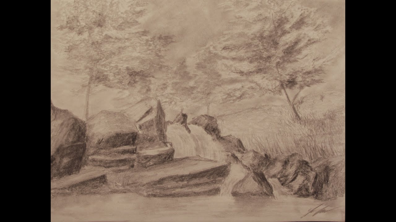
I show you how to draw a waterfall landscape from beginning to end showing you the pencils and tools you need.
Original Drawing is for SALE!!! http://cgi.ebay.com/ws/eBayISAPI.dll?ViewItem&item=200825632879
Follow me!
Facebook: http://www.facebook.com/tylersartshack
Twitter: https://twitter.com/#!/TylersArtShack
Google+: https://plus.google.com/115405....344518849808905/post
Deviant Art: http://tylersartshack.deviantart.com/
Drawing duration: 2 hours
Welcome back everyone to another drawing video and this time I draw a waterfall landscape. I started this one off with a darker outline so that it can be easily seen on video. I did it with a 4B pencil and normally I would use an HB pencil for the initial outline/sketch just so that it can be easily erased.
I started the sketch by drawing out the rocks and their general placement. I then moved on to a quick sketch of where the trees would be.
I first started by shading in the sky and then going into the leaves of the tree. To draw them, I use an underhand grip with the pencil and use a circular motion resemble the leaves. I make some spots darker than others to show volume and depth within the trees. It helps to make them look more realistic.
Once the trees were finished up I moved onto the rocks. I had to make a lot of texture to make them look realistic. I do this by using a varying amount of pencils. Use a lighter pencil to create details then go over the same area with a darker pencil. It will create a varying texture to help simulate a realistic texture.
Once the rocks were completed, I added the water and some grass on the right side of the image. That just about wrapped up the image.
Thanks everyone for checking out this video and I hope you enjoyed it!

Hey guys! so those of you that tuned into this video, the previous hangout I was doing crashed on me. My web browser decided to not support the hangout anymore and just closed itself thus ending the hangout. Luckily, I got the hangout back up and running rather quickly in this video. But this video ends rather abruptly as well because my computer decided to CRASH!
But anyways. this time Cark Mrilley was with me and he was doing that whole ordeal lol. I continued my landscape drawing and just had a great time chilling with the audience talking about random topics ranging from cartoons to more celebrities jumping off the cliff.... Fun times!!
I will continue to do these live hangouts, they make for a great time!

In this video, I will show you the steps that I took to create a city on top of a mountain.
Follow me!
Facebook: http://www.facebook.com/tylersartshack
Twitter: https://twitter.com/#!/TylersArtShack
Google+: https://plus.google.com/115405....344518849808905/post
Deviant Art: http://tylersartshack.deviantart.com/
Hey there everyone! Welcome to my video where I show you how to draw a city on some mountains. I had a great time with this one.
Here are some of the materials and info about this drawing
Duration:45 minutes
Pencils: HB 2B 4B
Kneaded Eraser
White Eraser
Tuff Stuff Eraser Stick
Blending Stump
65Ib sketching paper
This drawing started with just a simple idea that I had. I wanted to draw a mountain with some sort of observation outpost on the top of it. Or some sort of communications center of some sort. And from that Idea, I started to create the side of the mountain and as I was doing that, I wanted to include some large skyscrapers in it just to see how it would turn out.
That is normally something you would not see within a sketch so I was really just curious to see how it would turn out. I am happy to say that I really did enjoy the way that it turned out in the end.
What I really do enjoy about sketching is coming up with the overall composition. When that is completed, you can really get a sense for how the image is going to turn out. And creating the composition is really the best part about it. The creativity is only limited by what you can come up with. It really makes you think outside the box and makes you much more creative with your ideas.
You will also find that as you create your scenes, objects will often change shape along the way to better fit within the overall composition. One Idea you had for the very beginning of an image might change completely when you get to the end of that same drawing or sketch.
I hope you all enjoyed this one and please do not forget to hit the thumbs up button and subscribe for weekly videos! Thanks everyone!
Music info:
Song: Ethereal(nop_mix)
Artist: Lancefield
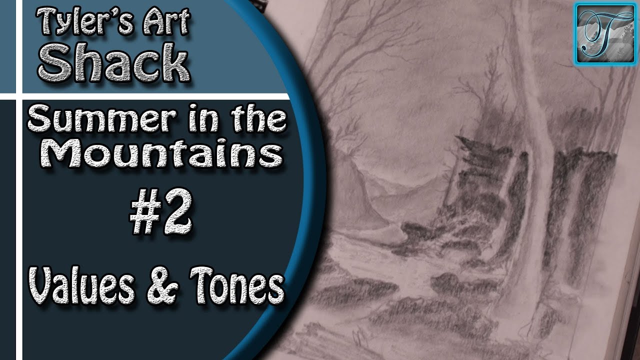
Welcome back everyone to part two on How to Draw - Summer in the Mountains Series Part Two - Adding Values and Tones
Other Places to Find my Art
Website: http://www.tylersartshack.com
Facebook: http://www.facebook.com/tylersartshack
Twitter: https://twitter.com/#!/TylersArtShack
Google+: https://plus.google.com/115405....344518849808905/post
Deviant: http://tylersartshack.deviantart.com
Lets get back into things! I started this one off by adding in a sky in the background to get that out of the way. I didn't want to add in too much of a sky because a lot of the trees will be covering it up and I didn't want to have them compete against the sky for attention. So, I just decided to leave the sky a tone of gray. I mainly used a blending stump to smooth things around to get it nice and smooth.
I also decided to get some of the far background details in place so that I can get an idea of how those will look against everything else. I still might add a bit more detail to them later on but for now, they will be just fine.
Like I had mentioned before, I am going for a pattern in my values and tones. The background will be light while the middle ground will be very dark. Then it goes back to light again for that large tree in the foreground. So I began with adding in some tones everywhere for a fairly even coating. I also made sure to start adding in some shadows where I know they might come in. When shading, start out light and keep building on top of it. It helps to build up a bit of depth and you can also really set in how dark you want everything to be.
I hope you all enjoyed this video and I hope to see you for part 3! Thanks a lot for watching everyone!
Music Info:
Artist: DanoSongs
Song: Remember How it Started
Music can be found at DanoSongs.com

This is a tribute drawing I did for Pinsetter1991 aka Andrew in response to his waterfall drawing.
I did this drawing and divided it up into 3 parts. The sky and trees, the rocks, and the water below. By dividing the picture into 3 areas it made it easier to draw. This was mostly drawn with pastels.
With dividing the drawing into 3 key areas I was able to start the drawing very quickly and draw it very efficiently and effectively. I started off with the rocks and quickly go over the entire area with a brown/orange color to do something I like to call the "greatest common color" Whatever this color happens to be in this case brown, I shade the entire area that color and work from there. From that point, I add highlights and shadows and rocks start to form. I do not use pastels for highlights and shadows, instead, I used charcoal and white charcoal. These for some reason really apply to the paper very well and much better than pastels would.
The next part of the drawing I worked on was the sky and tree area. This was easier to do that the rocks since there was much less detail that was needed. I started by erasing out the blue that I used to create the night sky so I could more easily apply the color of the trees. I applied trees as I saw fit and didn't over do it. I used cotton balls for smoothing out the sky portion of the drawing.
The water was quite difficult to do because of the water ripples. But then I was able to draw then im quite well after using charcoal. It ended up looking quite nice.
The music is by Kevin MacLeod and it is called Cattails.

LINKS!
Website: www.TylersTurnings.com
Facebook (Woodworking) www.facebook.com/tylersturnings
Facebook (Drawing)www.facebook.com/tylersartshack
As you can probably see, making cutting boards takes me many days during the week to actually get through each step of the process. During this vlog, I wanted to talk about cutting board terminology to the orientation of the wood while it is in an end grain cutting board and why it is beneficial to your knives for long term use. This is due to the fibers of the wood standing straight up and down. This allows for the fibers to separate to "accept" the blade much more than a glass cutting board or anything else that is hard. By the way, don't use glass cutting boards. They will literally bend your blades.
Throughout the rest of the video, I take the time to cut up the panels into smaller strips, these are then what are glued up into the final end grain form.
Hope you enjoy!
Music
Artist: Del Sound
Song: You never know (original mix)
Del Social Links:
https://soundcloud.com/del-sound
https://delsound.bandcamp.com/
https://www.youtube.com/user/TheDelsound
https://instagram.com/del_sound/
https://twitter.com/Del_Sound
https://delsound.tumblr.com/
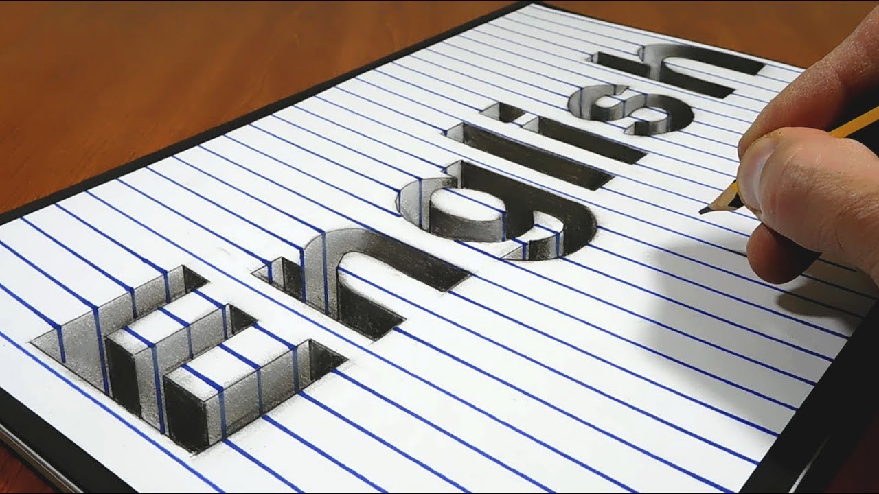
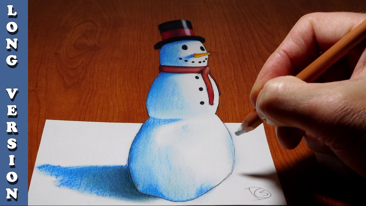
Cool Trick Art Drawing 3D on paper - Anamorphic illusion - Draw step by step.
Please Like and Subscribe to follow my work.
Follow me on Instagram: sonhoscomdimensao (https://www.instagram.com/sonh....oscomdimensao/?hl=pt
Truque Arte Desenho 3D em papel- Ilusão Ótica - Desenho passo a passo.
Não te esqueças do "Like" e subscreve o canal para seguires o meu trabalho.
Material used:
Paper A4 180g
Graphit and dry pastel pencil
Markers
Eraser
Materiais usados:
Papel A4 180g
Lápis de carvão e de pastel seco
Marcadores
Borracha
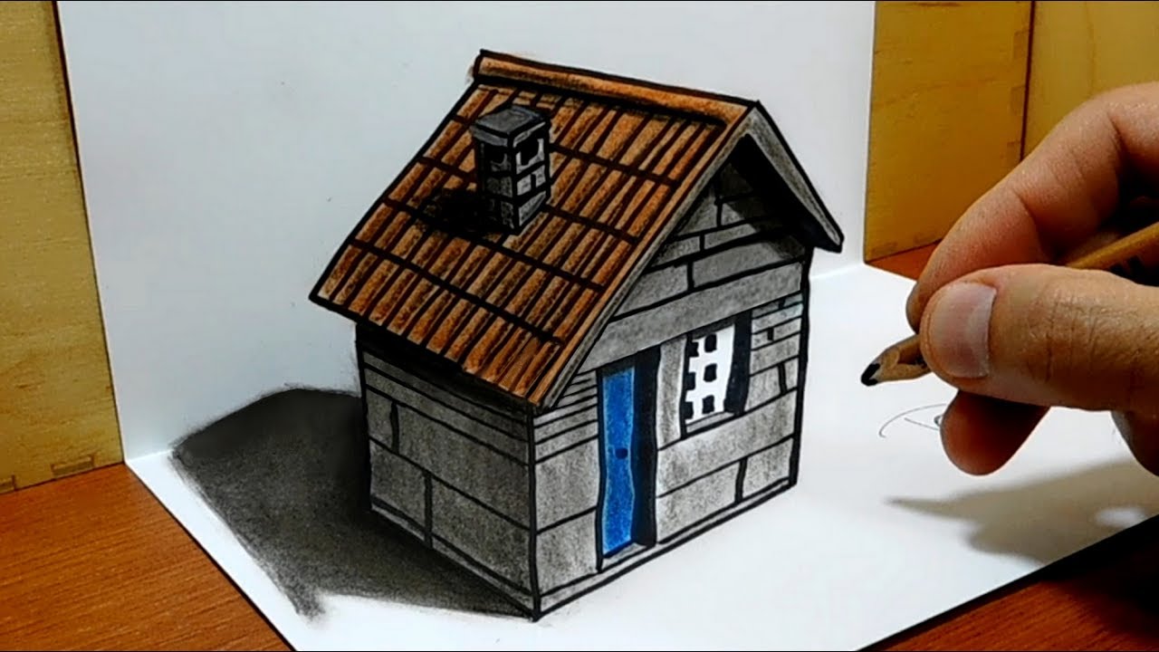
Amazing anamorphic illusion.
3D art on paper.
Speed drawing.
Used materials:
Paper A4 180g
Graphit and dry pastel pencil
Markers
Eraser
Materiais usados:
Papel A4 180g
Lápis de carvão e de pastel seco
Marcadores
Borracha
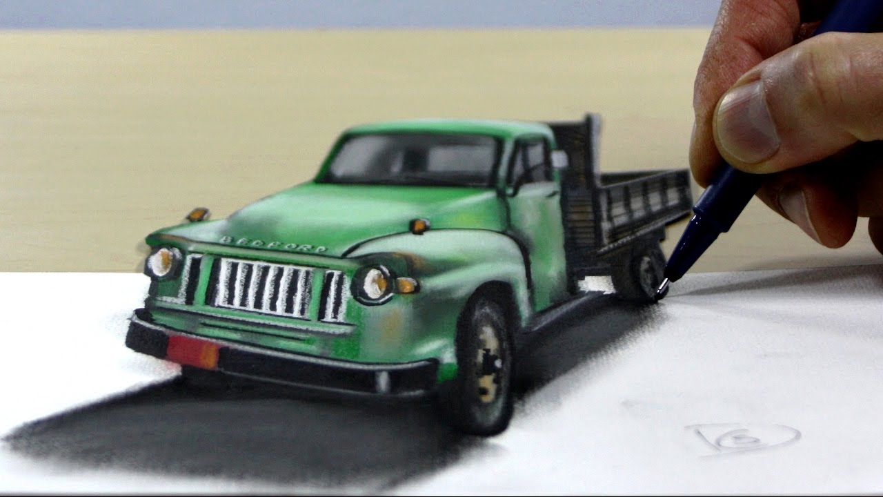
Amazing anamorphic illusion.
3D art on paper.
Speed drawing.
Used materials:
Paper A4 180g
Graphit and dry pastel pencil
Black markers
Eraser
Materiais usados:
Papel A4 180g
Lápis de carvão e de pastel seco
Marcadores pretos
Borracha

Técnica infalível de memorização da tabuada, associando música e imagem, com um tema diferente para cada tabuada.

Técnica infalível de memorização da tabuada do 7 com o tema profissões, associando música e imagem.
Há um tema diferente para cada tabuada.
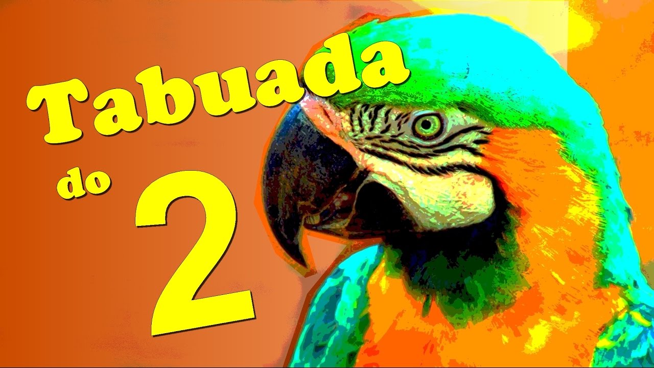
Técnica infalível de memorização da tabuada do 2 com o tema animais, associando música e imagem.
Há um tema diferente para cada tabuada.

Cool Trick Art Drawing 3D on paper - Anamorphic illusion - Draw step by step.
Please Like and Subscribe to follow my work.
Follow me on Instagram: sonhoscomdimensao (https://www.instagram.com/sonh....oscomdimensao/?hl=pt
Truque Arte Desenho 3D em papel- Ilusão Ótica - Desenho passo a passo.
Não te esqueças do "Like" e subscreve o canal para seguires o meu trabalho.
Material used:
Paper A4 180g
Graphit and dry pastel pencil
Markers
Eraser
Materiais usados:
Papel A4 180g
Lápis de carvão e de pastel seco
Marcadores
Borracha

Amazing anamorphic illusion.
3D art on paper.
Speed drawing.
Used materials:
Paper A4 180g
Graphit and dry pastel pencil
Black markers
Eraser
Materiais usados:
Papel A4 180g
Lápis de carvão e de pastel seco
Marcadores pretos
Borracha

Cool Art Drawing on paper - Draw step by step.
Please Like and Subscribe to follow my work.
Follow me on Instagram: sonhoscomdimensao (https://www.instagram.com/sonh....oscomdimensao/?hl=pt
Arte Desenho em papel - Desenho passo a passo.
Não te esqueças do "Like" e subscreve o canal para seguires o meu trabalho.
Material used:
Paper A4 180g
Graphit and dry pastel pencil
Eraser
Materiais usados:
Papel A4 180g
Lápis de carvão e de pastel seco
Borracha
Amazing anamorphic illusion.
3D art on paper.
Speed drawing.
Used materials:
Paper A4 180g
Graphit and dry pastel pencil
Black markers
Eraser
Materiais usados:
Papel A4 180g
Lápis de carvão e de pastel seco
Marcadores pretos
Borracha
