Образование
Подкатегория

Merrill Kazanjians Video on this topic: http://www.youtube.com/watch?v=aHvcc6NI8Tk&feature=g-u&context=G2e939cbFUAAAAAAACAA
Merrill's channel http://www.youtube.com/user/kazanjianm
Forum Post http://www.google.com/support/forum/p/youtube/thread?tid=28243f573c273478&hl=en&start=40
If you decide to make a vlog, post it as a video response to my video AND also do the same to Merrills original video. We need to get a large audience backing this up.
Here at youtube, there is no visual arts category. This leaves thousands of art videos with no home. They are scattered across multiple categories like howto and style, entertainment, film and animation, and education. With this massive separation in the visual artists, many of the artists dont know one another. If we can build up a gathering and get more people to help respond, we can make something happen. We need to get the art community together. Art is what adds color to the world.

Welcome back everyone to my first drawing video in 2013! This is something a bit different but something I have wanted to try for a while now. Drawing a bird sure did prove to be a challenge but I really did enjoy doing it! Thank you all for joining me on this one!
Other Places to Find my Art
Facebook: http://www.facebook.com/tylersartshack
Twitter: https://twitter.com/#!/TylersArtShack
Google+: https://plus.google.com/115405....344518849808905/post
Deviant: http://tylersartshack.deviantart.com/
This drawing mainly started out with just trying to get the overall shape for the bird correct. That took me quite a bit of time considering that I am not really used to drawing birds. I had to draw a series of lines for a rough shape and then just erased the lines that were no longer needed and was left with a pretty close representation of what the bird actually looked like.
To get myself started with the bird, I used a 2H pencil and just made a general shading all over the bird just to get the tone down. It was difficult to see how the bird was going to turn out so just getting that tone down helped.
After which, I started to work on the details of the wing. This is probably the most detailed part of the bird. I had to draw a lot of straight lines which I still can't do very well at all. So I had to break out one of my french curves to help me with the line work of this one just so that it would look better in the end.
The wing and other darker parts of thebird were mainly done with a B pencil. I didn't go to dark for these areas at all.
After the bird was finished up it just came down to drawing the tree branch. These branches I think were birch branches which are easy for me to draw because of the details that they have. They tend to have very dark nots and other such details as well as dark lines going around the branch. So using a B pencil for those details then using a 2H and 4H for the overall shading, it came out pretty well.
The snow was a challenge. I had to figure out how to make it pop without shading the tops of the snow in. I ended up using a 4H pencil to shade around the tops of the snow to make them pop more. So in the end it worked out really well.
In the end this drawing was very foreign for me to try and do but I am very happy to have tried it. It came out really well and really surprised myself. Every once in a while you get one of those and it just makes drawing really fun.
I hope you all enjoyed this one and I will see you all later!
Music Info
Song: Momentums
Artist: Chuck Berglund
Music can be found on cc.mixter.org
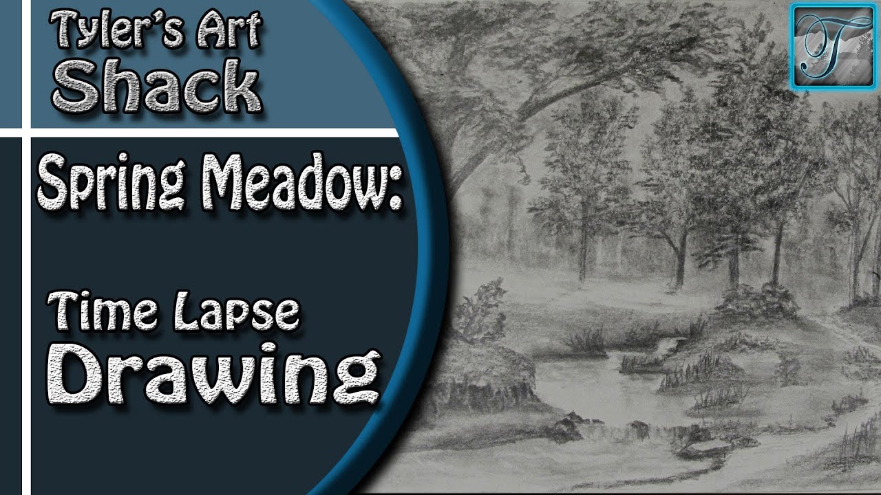
Welcome back everyone to the Art Shack, this video is going to be a time lapse video that puts parts 1-7 of my how to draw a spring meadow series all in one video to show you how everything came together in part 7 of the video series.
Be sure to check out the real time drawing series so that you can get a much better idea of how every part of this drawing was done in real time. Here is a link. http://www.youtube.com/watch?v=1pgwc5IxeE0&list=PLQ2Zh_NCUBvSMUQpSR5p42SX6m8AaOe2A&index=1
Other Places to Find my Art
Website: http://www.tylersartshack.com
Facebook: http://www.facebook.com/tylersartshack
Twitter: https://twitter.com/#!/TylersArtShack
Google+: https://plus.google.com/115405....344518849808905/post
Deviant: http://tylersartshack.deviantart.com
Music Info:
Artist: DJ Lang59
Song: Drops of H2O
Music can be found on cc.mixter.org

My e-mail to send photos... Tyler@tylersartshack.com
Did this drawing for a good friend of mine.
Drawing done with Sennelier oil pastels on 11 by 14 inch paper.
Approx drawing time was about 2 hours and 40 minutes.
Song: You May Run
Artist: Ryan Farish
Farish Music International (BMI)
Licensed with permission, RYTONE Entertainment
You can purchase this song by this link here
http://itunes.apple.com/us/album/bloom/id360509452?i=360509569&ign-mpt=uo%3D4

Did this for my art class. I drew 3 eggs in a glass bowl with a light on it.
You can view this drawing as well as all my other works of art from my deviant page. http://digg409.deviantart.com/art/Eggs-156738199
Song: Closer Away
Artist: Ryan Farish
Farish Music International (BMI)
Licensed with permission, RYTONE Entertainment
www.ryanfarish.com
You can purchase this song from itunes here
http://itunes.apple.com/us/alb....um/movement-in-light
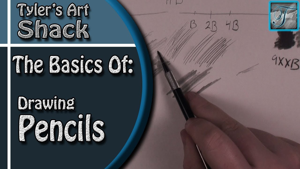
The Basics of Drawing Pencils:
Other Places to Find my Art
Website: http://www.tylersartshack.com
Facebook: http://www.facebook.com/tylersartshack
Twitter: https://twitter.com/#!/TylersArtShack
Google+: https://plus.google.com/115405....344518849808905/post
Deviant: http://tylersartshack.deviantart.com/
Welcome back everyone to a video where I talk about the basics of pencils and the pencils that I use. A lot of different pencil brands work just fine but Faber Castell is what I use. Here is a list of the Pencils that I have and Use.
6H 4H 2H HB B 2B 4B
Mechanical Pencils
2 of each: .7mm .5mm .3mm
I have 2H and B for most of them that I use.
Clutch Pencils
6H 4H 2H HB 2B 4B
Faber Castell Graphite 2mm Refills found off Ebay
Rosetta Clutch Pencils off Ebay
Going for clutch pencils or regular pencils personal preference. They are very similar but both have their advantages.
Kimberly 9XXB Drawing Pencil
This is the one I was talking about in the video that is almost black and has no shine while drawing.
I just want to let everyone know that in my experiences, any "artist drawing pencils" are pretty good. Faber Castell is just the name brand that I have gotten used to seeing and using. Also I use a range from 6H to 4B because of the camera and making sure that anything that I draw will show up on camera. Anything lighter than 6H has a hard time showing up on camera and anything higher than 4B has a lot of shine.
I hope you all enjoyed this video that gives you a little bit of information about drawing pencils and which ones that I use in drawings. Next video I will be talking about general use and textures that you can use to help in your drawings.
Thanks for watching everyone!

Facebook fan page
http://www.facebook.com/pages/....Tylers-Art-Shack/181
The best way to start any drawing no matter what it is would be to have some sort of reference image. This helps you whenever you are stuck and don't know where to go next.
I first start out with toning the sky. This process requires taking a stick of charcoal and applying to a separate sheet of paper. Then use a cloth and blend it onto the actual page where you would like the whole sky. You want to be careful of finger prints during this process. Keep blending the page out until you have a smooth transition all around the sky area.
When I make clouds, I don't draw them in. I usually erase them out. So eraser is usually made to correct mistakes. In this case it is being used to create shapes. I use a kneaded eraser for the first part because you can shape it to the shape you want and it makes it easier to use. I first start by pulling out very general shapes in the sky. There are only a few clouds in this picture so I don't have that much to do for this step. The clouds on the horizon should only be represented by simple gestures and strokes. You do not want to put too much detail for this part because you want to show the viewer that they are in the distance.
The kneaded eraser really comes in handy when you need a specific shape because it can be molded into that shape.
After you get all the general shapes with the kneaded eraser, I go back in with a mechanical eraser. This eraser is very good for putting in small details. I was able to refine all the edges when using this eraser.
At the very end you can go back in with some light pencil and add some more depth to the clouds by adding in some shadows. You can also add some charcoal to the top of the paper and blend that in to make the sky darker.
I hope this video helped everybody
Thanks for watching
drawing process took me about 20 minutes.

Welcome back everyone to How to Draw a Beach Series Part 1 - How to Start a Sketch
Other Places to Find my Art
Website: http://www.tylersartshack.com
Facebook: http://www.facebook.com/tylersartshack
Twitter: https://twitter.com/#!/TylersArtShack
Google+: https://plus.google.com/115405....344518849808905/post
Deviant: http://tylersartshack.deviantart.com
Make a Donation Via Paypal! http://tinyurl.com/o6cnnpv
I know many of you have been asking for colored tutorials and I hope that this series will be a great addition to my tutorials on the channel. This one will be about how to draw a sand dune beach scene with pastels. This first episode will mainly be about drawing in the sketch. You will primarily only need an HB or 2B pencil for the sketch and perhaps an eraser to fix any quick mistakes.
I did not use the grid method like I did for a lot of my other real time videos. The composition was simple enough to transfer over without too many issues. My other real time drawings had a lot more detail and needed more careful attention to placement. Although the composition is rather simple, there still will be a pretty good amount of detail added into the drawing.
I hope you all enjoyed the drawing and ill see you all next time for part 2 where I start to draw in the sky in pastel.
Music Info:
Intro/Outro
Song: Corporate Uplifting Rock
Artist: Plastic 3
http://tinyurl.com/nthpoga
Background
Song: The Red Chair
Artist: Brown House Media
http://tinyurl.com/koekde7

Welcome back everyone to the start of my series on how to draw the mountains in the mist!
If you need a reference photo, try this one! http://sphotos-c.ak.fbcdn.net/....hphotos-ak-snc7/4793
Other Places to Find my Art
Facebook: http://www.facebook.com/tylersartshack
Twitter: https://twitter.com/#!/TylersArtShack
Google+: https://plus.google.com/115405....344518849808905/post
Deviant: http://tylersartshack.deviantart.com/
How to Draw Mountains
The mountains start out by lightly shading in the highlight and shadow sides of the mountain. Keep the shadow side rather dark and keep the highlight side lighter. When all the mountains have some shading in them, you will be able to tell much more easily how they are going to end up looking towards the final stages. Using a combination of H pencils and B pencils. I add a lot of texture along the way to really give the mountains a lot of details. This takes time and constantly going back and forth between pencils and erasers to get the desired effect.
Remember, it just takes time and practice. But most of all, drawing takes patience.
Thanks everyone for watching!
Music Info
Artist: DJ Rkod
Song: Faster Than the Eye Can Persieve
Music can be found on cc.mixter.org

Welcome back everyone to a new drawing video. This time I draw a Hawaiian sunset in colored pastels.
Follow me!
Facebook: http://www.facebook.com/tylersartshack
Twitter: https://twitter.com/#!/TylersArtShack
Google+: https://plus.google.com/115405....344518849808905/post
Deviant Art: http://tylersartshack.deviantart.com/
This drawing started off with a fairly simple outlining sketch of the background mountains and some of the foreground details such as the wave and the rocks on the left side of the page. I did not want to define too many things at first. I wanted to leave most of it up for interpretation for when I actually got to drawing it. Some areas of the drawing I had an original intent on how I wanted it to look but when it came time for drawing it, I decided to do slight changes here and there. So keeping a light sketch helps this process.
Once the sketch is done the sky is almost always the next step since it is the furthest thing in the background and everything else gets drawn on top of it. Even though this was more of a sunset type scene, I still wanted to keep the sky light in color. I used a lot of washed out yellows and a few oranges to get a nice calm tone going. The tone gets lighter and lighter as it hits the horizon. I also made the sky more blue towards the top of the page. I made the dividing area between these 2 colors clouds. Just to help separate them. Using the white pastel sometimes does not always do its job with sitting on top of all the other colors so using white charcoal can help that process a lot. The white charcoal can really show up much better and helps with drawing in the clouds with the strong whites.
Next area I drew in was the mountains. I had a difficult time getting the right shades in and took some practice to figure out how to do it the way I wanted it to look. The distant mountains I added a lot of blues and purples into to help push it into the distance. I also used some yellows and greens to add just a hint of highlights to them.
The closer set of mountains I used a lot of black to really silhouette them out. But for the areas where I did highlight them, I used more of an olive green instead of an emerald green just to fit the sunset tone that the image had. Colors are going to be much warmer for the highlights because of the sunset.
The closer hills I filled in with vegetation. Used several varying shades and colors of green to create the vegetation. I also used a lot of black to create some of the rocks that make their way down to the beach. And shades of brown for where the water meets the dirt and rocks.
Adding in the water I used shades of dark blue with some purple and dark green. And used black to darken the whole thing down and then blended horizontally to create the water. I added in highlights by where the sun was setting.
The large wave I used several shades of dark blue and a lot of the white charcoal again to really punch those highlights. I did the same for the foam on the beach. For the sand I used quite a few shades of tan and brown for where the foam meets the sand.
I added in a few rocks on the beach to add in a nice touch. The left side of the page was filled in with mostly rocks and a few bushes. I finished up the image with some palm trees mostly silhouetted out. Added in just a hint of color
I hope you all enjoyed this one and stay tuned for next weeks video!
Music Info:
song by Alex Beroza
Song: Improvisation on Friday
Music can be found on cc.mixter.org
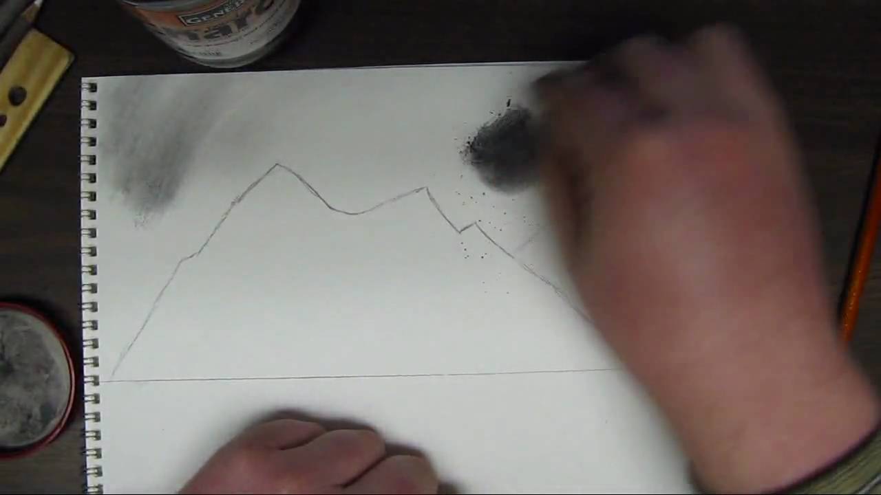
Hello and welcome to the first part in my how to draw landscape series. In this part ill cover how to create a simple sky and mountains using charcoal techniques.
This video is part 1 of 3 in this series so be sure to watch the other 2 videos to complete this whole videos.
For the complete series here Ill be using different grades of generals charcoal pencil. Compressed charcoal in 6b. Generals white charcoal.
3 different types of erasers. kneaded eraser, a white one and a pink eraser.
Ill also be using blending stumps pencil sharpeners and sandpaper.
This tutorial focuses on the sky and the mountains. I first start off by drawing an outline to the mountains. Powdered charcoal works great for shading in the sky. This creates a nice even coat. Use a cotton ball with this or a paper towel. This creates a very even tone for the sky and really sets it up nice if you wanted to add in some clouds. Add in the sky area first in the drawing so that you dont mess up any detail you set into the mountains.
After the sky is shaded in. Re define the mountain area and once that is done you want to create some lines going from the peaks of the mountains down to the base. After this you want to establish a direction of light and any mountain face that is facing away from that light will be shaded while everything facing the light source will be highlighted. This creates a 3d and realistic look to them.
Be sure to come back and watch part 2 to put in trees and a distance beach in the background along with a lake, close up pine trees, and some rocks. Hope you enjoyed and thanks for watching!

In this video, I show you in real time how to draw a phoenix step by step to create a realistic drawing.
Follow me!
Facebook: http://www.facebook.com/tylersartshack
Twitter: https://twitter.com/#!/TylersArtShack
Google+: https://plus.google.com/115405....344518849808905/post
Supplies:
Paper: Canson Classic Cream Hard Bound Sketch Book
Pencils: Faber Castell 2H HB 2B 4B
Kimberly 9xxB Graphite Pencil
Blending Stump
Erasers: Tuff Stuff Eraser Stick
Music: Song from CCmixter.org Song: "A Driving Rain" Artist: The Spark That Thought
What is going on everyone!! Little bit of back story to this drawing: I posted a similar drawing to this (seen in beginning intro) on my FB page and it went rather crazy with activity from my audience so I just had to make a tutorial on how to draw a Phoenix.
This drawing first time around took me about a half hour or so to create but this tutorial took me closer to an hour to draw. I sped up portions of the video just to save time.
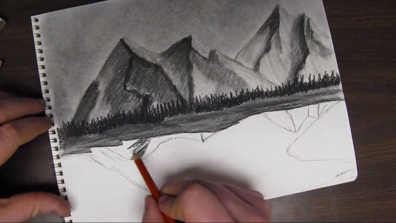
Welcome back to how to draw a landscape part 2. In this video I will be mainly going over how to start out drawing some hills or a beach in the background and some trees into the very far background. This part is very simple. All you need to do is draw some "m" like shapes for the hills/beach area. Shade that in simply, not much need for detail at this point. The trees i the background are only defined by up and down strokes. You only put in minor detail for the distance trees because after all they are very far in the background.
Next comes the reflections. I will be reflecting the tops of the mountains into the water. I start out by drawing simple lines that look like a mirror in the lake and shade them in simply. The water reflections usually are not as detailed as the mountain itself so leaving detail out is not a big deal. you want to blend them in quite well and get them nice and even.
Next comes the water. I use the powdered charcoal to get a nice even coat on the water area to get the tone down. After which I use a charcoal pencil to start putting in horizontal strokes. Add more of these marks closer to the bottom of the page. As the water reseeds into the background, add less detail into the water. It adds a sense of perspective into the drawing and shows depth.
I start on drawing in the pieces of land right after the lake is completed. Make sure the lake is done before you start to draw in the areas of land. I use the powdered charcoal to shade in the areas of land. Right after that I start drawing in lines that will be the trees. I add in a few of these trees.
Part 3 of this tutorial will cover the last of the trees that will be added in. So please come back and watch part 3!
You can find this drawing for a reference image as well as other drawings from my deviant page.
http://digg409.deviantart.com/gallery/

Welcome back everyone to the start of my series on how to draw the mountains in the mist!
If you need a reference photo, try this one! http://sphotos-c.ak.fbcdn.net/....hphotos-ak-snc7/4793
Other Places to Find my Art
Facebook: http://www.facebook.com/tylersartshack
Twitter: https://twitter.com/#!/TylersArtShack
Google+: https://plus.google.com/115405....344518849808905/post
Deviant: http://tylersartshack.deviantart.com/
How to Draw Mist
During the video I seem to have an issue with the difference between clouds and mist haha. They both have very similar techniques for drawing them so that is the main reason why I was mixing them up during the video. :)
The Mist layer starts out with just using the blending stump from last video and blending out the bottoms of the mountains. Then using a combination of an eraser and a pencil, I go back in and start to erase out some cloud like shapes that will become the mist. It is then just a matter of going back in and adding some shadows to the mist and this layering effect will start to really show through creating some nice looking mist.
I hope you all enjoyed this one and I hope to see you all again for the next part of how to draw the mountains in the mist!
Music Info:
Artist: DJ Lang59
Song: Drops of H20
Music can be found on cc.mixter.org

In this video, I show you how to take in atmospheric perspective and give the illusion of depth in a drawing by varying the shade and texture of distant mountains.
Follow me!
Music is from ccmixter.org
Song: Yiourgh
Artist: DoKashiteru
Facebook: http://www.facebook.com/tylersartshack
Twitter: https://twitter.com/#!/TylersArtShack
Google+: https://plus.google.com/115405....344518849808905/post
Welcome back everyone to another drawing tutorial. Due to the positive feedback on real time drawing tutorials. I am going to try and do more of them. I will still do some in my older fashion but it will be more of a mixed bag from here on.
Anyway, in this drawing I wanted to show you my knowledge on Atmospheric Perspective. This happens in landscapes where you can see over a large distance. As you look further and further to distant hills, mountains, and other objects they tend to decrease in contrast and detail. The further back they are, the more blue/gray they become depending upon the time of day. In mid day, they will turn more blue but in early and late evening, they can range widely in color. All the way from oranges to reds and peaches depending on the overall sky color.
The reason why this happens is because of the water vapor in the air. As light from those distant objects comes towards your eye, the light becomes distorted because of the shape of the water vapor. Because of the distorted light, a lot of light from the sky is mixed into the color of the objects which is why more distant objects become lighter and lighter. The effect is magnified significantly.
So when you apply this to drawing, you can make very believable distance within a simple landscape demonstration like this one I am drawing now. I start with closer mountains showing more texture and details while ones that are further back, I lighten the shade and add less detail and texture to push it back into the background. Increase this effect the further an object is away from the viewer.
Knowing atmospheric perspective is a great tool to help show distance in a drawing and makes them much more believable and understandable to view.
I hope this video has helped you and as always, thank you for watching and please like and subscribe! Stay tuned for next weeks video!

This video will show you how to draw a realistic landscape scene by taking it step by step.
Tools used:
Faber Castell Pencils
4H, 2H, HB, 2B, 4B, 6B
Kneeded Eraser
Tuff Stuff eraser stick
White erasers
Canson hard bound sketch book with 90Ib drawing paper.
Follow me!
Facebook: http://www.facebook.com/tylersartshack
Twitter: https://twitter.com/#!/TylersArtShack
This drawing is a continuation of last weeks tutorial where I took the time to show you how to draw a realistic tree using textures. In this tutorial, I will show you how to seat the tree in the ground and how to draw a simple landscape around that tree. The completed picture will be a nice little farm style landscape picture.
This tutorial starts off by drawing in grass in front of the tree. Since I am not drawing in the base or roots of the tree, I am using the grass to convince the viewer that all of that detail is hiding behind the grass.
The grass starts off as simple pencil strokes in a slight arc or angle to convey that the grass is blowing in the wind. It helps to create a likeness and realistic feel to the overall landscape. The pencils that can be used for this are a 2H for the initial sketch of the grass. An HB to shade a bit and a B or 2B to shade a bit darker.
A tool that is an absolute must for this drawing is a small eraser. I use a tuff stuff plastic eraser that is like a mechanical pencil but has an eraser instead of the graphite sticks. This tool is used to erase out single blades of grass. Erase these out contrasting to the pencil strokes. Erase in different directions to show variation in the pattern of the grass.
Once some grass is erased out of the picture, shading should be done around that single blade of grass c loser to where that eraser mark started to show that it is surrounded by multiple darker blades of grass. After this is done more grass can be drawn over the highlighted ones to show more depth.
This process is quite time consuming and takes a while to get used to. Take the time to practice drawing this before applying it to a completed landscape picture.
After a large enough patch is drawn, you can continue with the landscape picture. In this case, I decided to draw fence posts receding into the background. I used a ruler for this part of the drawing. When all of the fence posts were drawn, I used the ruler once again to draw in the wire connecting the posts to one another.
Once that was done, I took a moment to decide what the picture needed and decided to draw in a few more trees way in the background to give it some visual interest. I did this by simplifying the detail needed for a tree by a lot. This helps to show the viewer that the tree does not have a lot of detail so it must be far back into the background of the picture.
Reducing the detail of an object helps to push objects into the background.
Once that was done this picture pretty much wrapped itself up. Thanks for joining me on this one and I hoped you enjoyed it!
The music of this video was created by danosongs.com
The name of the song is "Imagine Magneta"

Welcome back everyone! This video will be about The Basics of Highlights Midtones and Shadows
Other Places to Find my Art
Website: http://www.tylersartshack.com
Facebook: http://www.facebook.com/tylersartshack
Twitter: https://twitter.com/#!/TylersArtShack
Google+: https://plus.google.com/115405....344518849808905/post
Deviant: http://tylersartshack.deviantart.com
Make a Donation Via Paypal! http://tinyurl.com/o6cnnpv
This video is all about highlights, midtones, shadows, cast shadows, and reflected light. I will use an apple to demonstrate all of these and give you a basic understanding of this so that you can apply this method to other drawings.
I wanted to start out by explaining different types of lighting to show you how one light source or multiple can really change how an object looks. Using one light source is a great way of being able to clearly see highlights and shadows. Think of a highlight as a direct reflection or the brightest area of a drawing and a shadow as the absence of light. The midtones are indirect light that is illuminating an object.
Now that this has been established, the next thing is to begin drawing. Before that though, we need to understand where the highlights midtones, and shadows are. This can be difficult when looking at an object in color. So what I like to do is take a photo of the object and turn it into black and white with a filter. This gets rid of all the color and you can see the true value scale of the drawing. This helps a huge amount and this method can be used for anything you wish to replicate in pencil.
Working on the drawing now, I really only used an HB and 2B pencil for the entire piece. I began by drawing a rough circle for the overall apple shape and then the cast shadow. Afterwards, I toned the background. Keeping in mind where the lightest tones would be, I began to shade the whole apple in that tone. Then with the darker tones, I shaded the overall apple starting in those darker areas and working my way around. I want to build up layers while shading to help build up depth. This is a process that can take a bit of time and with practice, you should see some improved results.
I hope you all enjoyed this video and thanks a lot for watching!
Music Info:
Song: Corporate Uplifting Rock
Artist: Plastic 3
http://tinyurl.com/nthpoga

Welcome back everyone to this weeks video about how to draw a realistic water texture.
Other Places to Find my Art
Website: http://www.tylersartshack.com
Facebook: http://www.facebook.com/tylersartshack
Twitter: https://twitter.com/#!/TylersArtShack
Google+: https://plus.google.com/115405....344518849808905/post
Deviant: http://tylersartshack.deviantart.com
This drawing starts out with some guidelines for where I wan't the bulk of the choppy water to be. Once I have established that, I use the underhand grip to get the majority of the texture done. I like to create jagged edges on the tops of the peaks just to give it a bit more texture and interest as well.
Once I have everything to my general liking, I will polish things over with a blending stump and an eraser. The eraser will create some highlights for water reflections and also adding in some little details as well. I used the blending stump between everything just to smooth some things out.
Thank you all very much for watching and I hope you all enjoyed it!
Music Info:
Artist: DJlang59
Song: Drops of H20
Music can be found on cc.mixter.org
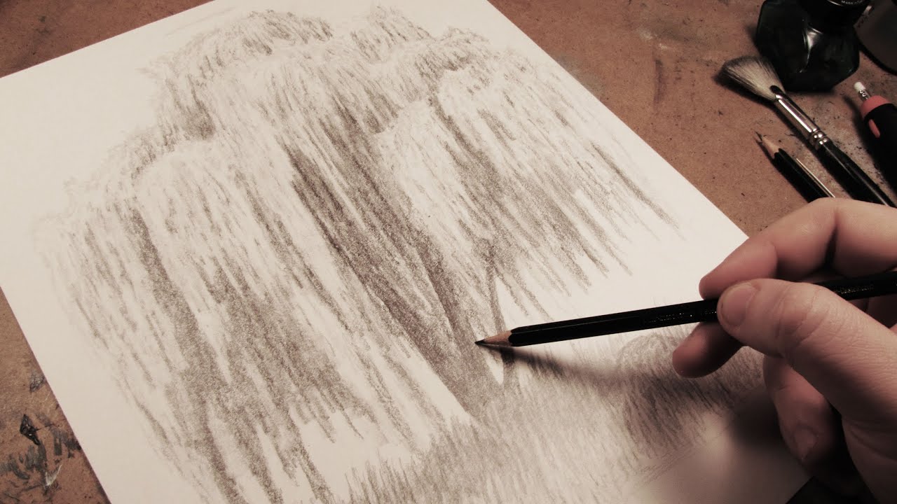
In this video, I show you the steps that I took to draw a complete weeping willow tree from start to finish.
Other Places to Find my Art
Facebook: http://www.facebook.com/tylersartshack
Twitter: https://twitter.com/#!/TylersArtShack
Google+: https://plus.google.com/115405....344518849808905/post
Deviant: http://tylersartshack.deviantart.com/
Welcome back everyone to another drawing tutorial! This time I took on the challenge of drawing a weeping willow tree after it has been heavily requested by my audience. So I was happy to give it a shot! I have to say though, that this was one of the more complicated drawings that I have done just because of the repetitive details. But I really did enjoy doing this one especially in the end result. I thought It came out well. So I hope you all enjoy this one as well!
Music Info:
Artist: DoKashiteru
Song:Echo
Music can be found on cc.mixter.org

Welcome back to another drawing tutorial everyone! This time let's take a look at how to draw a barn house!
Other Places to Find my Art
Website: http://www.tylersartshack.com
Facebook: http://www.facebook.com/tylersartshack
Twitter: https://twitter.com/#!/TylersArtShack
Google+: https://plus.google.com/115405....344518849808905/post
Deviant: http://tylersartshack.deviantart.com/
How to Draw a Barn House
This drawing I started off with just some light sketch lines for general placement of different trees and hills in the background and then placed in the barn. I used some photo reference to give myself a hand while drawing this but I usually will put my own twist on the drawing to turn it into my own style of drawing.
I started off with the barn and I quickly realized that I would need a ruler for the straight lines. I am usually pretty good with drawing landscapes but when it comes to drawing a straight line, I need to break out the ruler.
I used 2 point perspective to draw the barn. I had the foundation of the barn resting on the horizon and then I had 2 dots to the left and to the right of the barn. The closer the dots are together, the more extreme angles you will get with the barn. So I put those lines pretty far back on the page so that I would just only get a slight angle on the barn.
After the barn had its rough sketch lines in, I started to work on other aspects of the landscape like the sky. I used mainly a 4B pencil for the shading and used a blending stump to smooth it all out making sure not to cover all the sky because I want to leave some white for the clouds. Using a kneaded eraser and an eraser stick, you can start to create some wispy cloud texture. You can always go back into the clouds and add a bit more detail and texture of you like.
After the clouds, went into drawing the background hills which I eventually make darker towards the end of the video. I mostly used 2H pencils to start but switched to 2B pencils to darken the whole thing to make it balance more with the drawing. I did not add too much details to the background hills either. Just some slight eraser texture and left some natural texture from the pencil thats all.
Getting onto the Barn, I used a combination of B pencils along with mechanical pencils to get nice sharp and crisp lines. I wanted to create wood texture and using the eraser stick to pick up lines here and there really helped to add to thee detail of it.
The trees in the landscape used B and H pencils and I actually started with the darker pencils and used the lighter ones over that and it gave a pretty nice overall texture and look. I will usually do it opposite.
Drawing in the ground texture was just simply using an HB pencil lightly covering the area and then using a blending stump to smooth some of it out. Drawing in the road was similar. For the far back road, I just put some graphite on it with my dirty blending stump and for the closer road, I only put down a light layer and blended it out.
The finishing touches was adding in the fence. I feel that it really tied everything together. I also put in some nice shadow lines for them and that made everything pop!
I hope you all enjoyed this video and I will see you all again next week!
Thanks for watching!
Music Info:
Song: Our Lives are Changing
Artist: RJMarshal
Music can be found on cc.mixter.org
