Лучшие

Донат https://wpruse.ru/r/donat/
Запись на критику временно закрыта
Сезон 3. Выпуск 10. Видеокритика в прямом эфире.
Смотрим сайты
http://blog-moneta.ru/
http://chilloutfm.ru/
http://mollyna.ru/
http://infomager.ru/
http://teplocube.galos.ru/
https://waterluxfilter.co.il/
http://agp-kharkov.com.ua/
http://zachetperm.ru/
https://dzmitrock.ru/
Чат в телеге
https://telegram.me/c_wordpress
*********************************************************************
Полезные плейлисты
Подготовка сайта под поисковое продвижение "Сеоподготовка" http://bit.ly/2lR3t6Z
Сайт медленно загружается? Смотри "Оптимизация скорости" http://bit.ly/2meDFm0
Как натянуть хтмл на вордпресс? Смотри подробный сериал "HTML2WP" http://bit.ly/2meta22
Смотри обзоры бесплатных и премиум http://bit.ly/2lClXFH
Не знаешь как выглядит сайт со стороны? Смотри видеокритику и записывайся http://bit.ly/2mjVrks
Пишем разные решения. Кодим понемногу http://bit.ly/2l6EE2E
*********************************************************************
Рекомендую
Темы и разработчики
Купить тему Divi http://bit.ly/ET_Divi
Купить разработки WP-Puzzle http://bit.ly/wp-puzzle
Купить тему и плагины ElegantThemes http://bit.ly/ArtElegantThemes
Хостинги
Быстрый хостинг Fozzy http://bit.ly/fozzyhost купон на скидку 10% wpruse
Доступный хостинг Beget http://bit.ly/BeGetArt
Хороший хостинг EuroByte http://bit.ly/EuroByte
Домены покупаю на регточкару http://fas.st/d8lQuw
*********************************************************************
Поддержать канал
http://wpruse.ru/?p=1079
*********************************************************************
Контакты
Страница VK: https://vk.com/artikus13
Группа про WordPress https://vk.com/wpruse
Канал на YouTube: https://www.youtube.com/c/wpruseru
Блог о разном http://artabr.ru/
Блог в поддержку канала http://wpruse.ru/
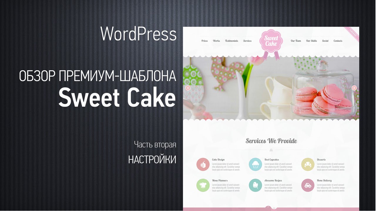
Хороший премиум-шаблон Sweet Cake. Одностраничник. Выполнен в карамельно-конфетных цветах. Подойдет для кафе, компаний занимающихся какими-то сладкими вещами или для сайта женской тематики.
Настройки позволяют настроить любую секцию этого шаблона - от шрифтов до фона на отдельных секциях
Данные с themeforest.net
Создан: 8.09.2013
Разработчик - nicdark
Рейтинг - 4.58
Количество продаж - около 3000
Дата создания - сентябрь 2013
Последнее обновление - сентябрь 2014
Цена - 38$
Ссылка на шаблон - http://themeforest.net/item/sw....eet-cake-responsive-
Использована музыка
Art Blakey & The Jazz Messengers - Moanin
The Dave Brubeck Quartet - I Feel Pretty
Art Blakey - Ill Wind
-----------
Поддержать канал
https://wpruse.ru/r/donat/
https://wpruse.ru/r/donatalert/
-----------
Рекомендую
---
Хостинги
Fozzy https://wpruse.ru/r/fozzy/
SprintHost https://wpruse.ru/r/sprinthost/
Евробайт https://wpruse.ru/r/eurobyte/
---
Темы
Divi https://wpruse.ru/r/divi/
SalesZone https://wpruse.ru/?p=2666
GridLove https://wpruse.ru/r/gridlove/
RelinPro https://wpruse.ru/r/relinpro/
SimplePuzzle https://wpruse.ru/r/simplepuzzle/
Nitro https://wpruse.ru/r/nitro/
Root https://wpruse.ru/r/tema-root/
--
Магазины
ElegantThemes http://bit.ly/ArtElegantThemes
TemplateMonster http://bit.ly/TM_wpruse
WPPuzzle https://wpruse.ru/r/wp-puzzle/
ThemeForest https://wpruse.ru/r/themeforest/
Premmerce https://wpruse.ru/r/premmerce/
WPShop https://wpruse.ru/r/wpshop/
CrocoBlock https://wpruse.ru/r/crocoblocks/
---
Рассылки
SendPlus http://bit.ly/sendpulseart
MailerLite http://www.mailerlite.com/a/covvxdhuza
-----------
Полезные плейлисты
Подготовка сайта под поисковое продвижение "Сеоподготовка"
https://www.youtube.com/playli....st?list=PLzFj4L-LMRz
Оптимизация скорости
http://bit.ly/2meDFm0
Натяжка на WordPress #html2wp
https://www.youtube.com/playli....st?list=PLzFj4L-LMRz
Натяжка на WordPress #html2woo
https://www.youtube.com/playli....st?list=PLzFj4L-LMRz
Правильное изменение WooCommerce
https://www.youtube.com/playli....st?list=PLzFj4L-LMRz
Смотри обзоры пермиум тем
https://www.youtube.com/playli....st?list=PLzFj4L-LMRz
-----------
Контакты
http://wpruse.ru/

Уже сегодня пройдет WordCamp 2017 в Москве. Для тех кто не смог приехать есть возможность следить за выступлениями в телеграмм.
Ребята, которые смогли поехать, будут вести текстовую трансляцию, а также прикреплять фоточки. В этом чате вы не только сможете в режиме реального времени следить за происходящим, но и задать свой вопрос, как сообществу чата, так и спикерам мероприятия, и, по мере возможности, наши ребята их озвучат там.
Чат WordCamp - https://t.me/wordcamp_ru
Чат о WordPress - https://t.me/ru_wp
Оф. сайт - https://2017.moscow.wordcamp.org/
*********************************************************************
Полезные плейлисты
Подготовка сайта под поисковое продвижение "Сеоподготовка" http://bit.ly/2lR3t6Z
Сайт медленно загружается? Смотри "Оптимизация скорости" http://bit.ly/2meDFm0
Как натянуть хтмл на вордпресс? Смотри подробный сериал "HTML2WP" http://bit.ly/2meta22
Смотри обзоры бесплатных и премиум http://bit.ly/2lClXFH
Не знаешь как выглядит сайт со стороны? Смотри видеокритику и записывайся http://bit.ly/2mjVrks
Пишем разные решения. Кодим понемногу http://bit.ly/2l6EE2E
*********************************************************************
Рекомендую
Темы и разработчики
Купить тему Divi http://bit.ly/ET_Divi
Купить разработки WP-Puzzle http://bit.ly/wp-puzzle
Купить тему и плагины ElegantThemes http://bit.ly/ArtElegantThemes
Хостинги
Быстрый хостинг Fozzy http://bit.ly/fozzyhost купон на скидку 10% wpruse
Доступный хостинг Beget http://bit.ly/BeGetArt
Хороший хостинг EuroByte http://bit.ly/EuroByte
Домены покупаю на регточкару http://fas.st/d8lQuw
*********************************************************************
Поддержать канал
http://wpruse.ru/?p=1079
*********************************************************************
Контакты
Страница VK: https://vk.com/artikus13
Группа про WordPress https://vk.com/wpruse
Канал на YouTube: https://www.youtube.com/c/wpruseru
Блог о разном http://artabr.ru/
Блог в поддержку канала http://wpruse.ru/

Небольшой обзор нововведений в новой Yoast 3.3
*********************************************************************
Я в соцсетях
Страница VK: https://vk.com/artikus13
Группа про WordPress https://vk.com/wpruse
FB: https://www.facebook.com/mgsmvolga
Instagram: https://www.instagram.com/artikus11/
Канал на YouTube: https://www.youtube.com/user/wpdummy13
*********************************************************************
Мои сайты
Блог о разном http://artabr.ru/
Блог в поддержку канала http://wpruse.ru/
*********************************************************************
Хорошие темы и разработчики
WP-Puzzle http://bit.ly/wp-puzzle
TemplateMonster http://bit.ly/TM_wpruse промокод на 10% wpruse
*********************************************************************
Хорошие хостинги
Fozzy http://bit.ly/fozzyhost купон на скидку 10% wpruse
Beget http://bit.ly/BeGetArt
EuroByte http://bit.ly/EuroByte
*********************************************************************
Поддержать канал
PayPal https://www.paypal.me/artabr
ЯКошелек и карточки http://yasobe.ru/na/wpruse
**********************************************************************************

В этом году Черная пятница и Кибер понедельник идут с 23 по 26 ноября. Прекрасная возможность купить то что вы хотели с ха-а-арошими скидками!
Все скидки в одной статье
https://wpruse.ru/novosti/black-friday-2018/
*********************************************************************
Полезные плейлисты
Подготовка сайта под поисковое продвижение "Сеоподготовка" http://bit.ly/2lR3t6Z
Сайт медленно загружается? Смотри "Оптимизация скорости" http://bit.ly/2meDFm0
Как натянуть хтмл на вордпресс? Смотри подробный сериал "HTML2WP" http://bit.ly/2meta22
Смотри обзоры бесплатных и премиум http://bit.ly/2lClXFH
Не знаешь как выглядит сайт со стороны? Смотри видеокритику и записывайся http://bit.ly/2mjVrks
Пишем разные решения. Кодим понемногу http://bit.ly/2l6EE2E
*********************************************************************
Рекомендую
Темы и разработчики
Купить тему Divi http://bit.ly/ET_Divi
Купить разработки WP-Puzzle http://bit.ly/wp-puzzle
Купить тему и плагины ElegantThemes http://bit.ly/ArtElegantThemes
Хостинги
Быстрый хостинг Fozzy http://bit.ly/fozzyhost купон на скидку 10% wpruse
Доступный хостинг Beget http://bit.ly/BeGetArt
Хороший хостинг EuroByte http://bit.ly/EuroByte
Домены покупаю на регточкару http://fas.st/d8lQuw
*********************************************************************
Поддержать канал
http://wpruse.ru/?p=1079
*********************************************************************
Контакты
Страница VK: https://vk.com/artikus13
Группа про WordPress https://vk.com/wpruse
Канал на YouTube: https://www.youtube.com/c/wpruseru
Блог о разном http://artabr.ru/
Блог в поддержку канала http://wpruse.ru/

1. Скидки - 0:47
WPShop - https://wpshop.ru/lp/halloween/?partner=1787
Crocoblock - скидка 13% на лайфтайм https://wpruse.ru/r/crocoblocks/
TemplateMonster 30-31 Октября cкидки на все до 20% http://tiny.cc/7ajwez
BrainStormForce - аддоны для Elementor скидка 25%
Ultimate Addons For Elementor https://wpruse.ru/r/ultimate-addons/
Astra WordPress Theme https://wpruse.ru/r/astra/
2. WordPress - 2:51
https://wordpress.org/news/201....9/09/wordpress-5-2-3
https://wordpress.org/news/201....9/10/wordpress-5-2-4
https://make.wordpress.org/cor....e/2019/09/25/whats-n
https://make.wordpress.org/cor....e/2019/09/24/new-blo
https://make.wordpress.org/cor....e/2019/09/23/date-ti
https://make.wordpress.org/cor....e/2019/09/27/block-e
https://make.wordpress.org/cor....e/2019/10/15/changes
https://make.wordpress.org/cor....e/2019/10/03/wp-5-3-
https://make.wordpress.org/cor....e/2019/10/03/wp-5-3-
https://make.wordpress.org/cor....e/2019/10/10/wordpre
https://wordpress.org/news/201....9/10/wordpress-5-3-r
3. Gutenberg - 4:16
https://make.wordpress.org/cor....e/2019/08/28/whats-n
https://make.wordpress.org/cor....e/2019/09/19/whats-n
https://make.wordpress.org/cor....e/2019/10/02/whats-n
https://make.wordpress.org/cor....e/2019/10/16/whats-n
4. Yoast - 7:00
https://yoast.com/yoast-seo-12-0/
https://yoast.com/yoast-seo-12-1/
https://yoast.com/yoast-seo-12-2/
https://yoast.com/yoast-seo-12-3/
5. RankMath - 8:14
6. WooCommerce - 9:32
https://woocommerce.wordpress.....com/2019/10/09/wooco
https://woocommerce.wordpress.....com/2019/10/29/wooco
7. DIVI - 10:35
https://www.elegantthemes.com/....blog/theme-releases/
8. Elementor - 11:10
https://elementor.com/blog/int....roducing-pro-gallery
9. Crocoblock - 11:42
https://crocoblock.com/jetsmar....tfilters-presenting-
https://crocoblock.com/jetengi....ne-2-1-multi-optiona
https://crocoblock.com/jetstyl....emanager-insuring-yo
10. Новинки плагинов и тем 15:19
https://wordpress.org/plugins/....zoospas-project-for-
https://wordpress.org/plugins/....shmapper-by-teplitsa
https://wordpress.org/plugins/gutenslider/
https://wordpress.org/plugins/....carousel-upsells-and
https://wpcraft.ru/blog/avtori....zaczii-cherez-soczia
11. Обновления плагинов и тем 19:38
https://ru.wordpress.org/plugi....ns/mihdan-yandex-tur
https://wpml.org/2019/09/wpml-....4-2-8-launched-throu
https://wpastra.com/astra-2-1/
https://wpruse.ru/r/tema-root/
https://wordpress.org/plugins/....easy-woocommerce-aut
https://ru.wordpress.org/plugi....ns/mihdan-mailru-pul
12. Новый канал о разработке плагинов https://t.me/luckywp
-----------
Поддержать канал
https://wpruse.ru/r/donat/
https://wpruse.ru/r/donatalert/
-----------
Рекомендую
---
Хостинги
Fozzy https://wpruse.ru/r/fozzy/
SprintHost https://wpruse.ru/r/sprinthost/
Евробайт https://wpruse.ru/r/eurobyte/
---
Темы
Divi https://wpruse.ru/r/divi/
SalesZone https://wpruse.ru/?p=2666
GridLove https://wpruse.ru/r/gridlove/
RelinPro https://wpruse.ru/r/relinpro/
SimplePuzzle https://wpruse.ru/r/simplepuzzle/
Nitro https://wpruse.ru/r/nitro/
Root https://wpruse.ru/r/tema-root/
--
Магазины
ElegantThemes http://bit.ly/ArtElegantThemes
TemplateMonster http://bit.ly/TM_wpruse
WPPuzzle https://wpruse.ru/r/wp-puzzle/
ThemeForest https://wpruse.ru/r/themeforest/
Premmerce https://wpruse.ru/r/premmerce/
WPShop https://wpruse.ru/r/wpshop/
CrocoBlock https://wpruse.ru/r/crocoblocks/
---
Рассылки
SendPlus http://bit.ly/sendpulseart
MailerLite http://www.mailerlite.com/a/covvxdhuza
-----------
Полезные плейлисты
Подготовка сайта под поисковое продвижение "Сеоподготовка"
https://www.youtube.com/playli....st?list=PLzFj4L-LMRz
Оптимизация скорости
http://bit.ly/2meDFm0
Натяжка на WordPress #html2wp
https://www.youtube.com/playli....st?list=PLzFj4L-LMRz
Натяжка на WordPress #html2woo
https://www.youtube.com/playli....st?list=PLzFj4L-LMRz
Правильное изменение WooCommerce
https://www.youtube.com/playli....st?list=PLzFj4L-LMRz
Смотри обзоры пермиум тем
https://www.youtube.com/playli....st?list=PLzFj4L-LMRz
-----------
Контакты
http://wpruse.ru/

Донат https://wpruse.ru/r/donat/
Запись на критику временно закрыта
Сезон 3. Выпуск 11. Видеокритика в прямом эфире.
Смотрим сайты
http://granstein.com.ua/
http://studio-vocal.ru/
http://remtech63.ru/
http://tellman.ru
https://multi-viza.com.ua/
http://boroda4.ru
https://isgot.ru/
http://magiyasporta.ru/
https://voda-34.ru
https://netprog.net/
Чат в телеге
https://telegram.me/c_wordpress
*********************************************************************
Полезные плейлисты
Подготовка сайта под поисковое продвижение "Сеоподготовка" http://bit.ly/2lR3t6Z
Сайт медленно загружается? Смотри "Оптимизация скорости" http://bit.ly/2meDFm0
Как натянуть хтмл на вордпресс? Смотри подробный сериал "HTML2WP" http://bit.ly/2meta22
Смотри обзоры бесплатных и премиум http://bit.ly/2lClXFH
Не знаешь как выглядит сайт со стороны? Смотри видеокритику и записывайся http://bit.ly/2mjVrks
Пишем разные решения. Кодим понемногу http://bit.ly/2l6EE2E
*********************************************************************
Рекомендую
Темы и разработчики
Купить тему Divi http://bit.ly/ET_Divi
Купить разработки WP-Puzzle http://bit.ly/wp-puzzle
Купить тему и плагины ElegantThemes http://bit.ly/ArtElegantThemes
Хостинги
Быстрый хостинг Fozzy http://bit.ly/fozzyhost купон на скидку 10% wpruse
Доступный хостинг Beget http://bit.ly/BeGetArt
Хороший хостинг EuroByte http://bit.ly/EuroByte
Домены покупаю на регточкару http://fas.st/d8lQuw
*********************************************************************
Поддержать канал
http://wpruse.ru/?p=1079
*********************************************************************
Контакты
Страница VK: https://vk.com/artikus13
Группа про WordPress https://vk.com/wpruse
Канал на YouTube: https://www.youtube.com/c/wpruseru
Блог о разном http://artabr.ru/
Блог в поддержку канала http://wpruse.ru/

Критикую сайт pcgu.ru
Хотите покритикую ваш сайт?
Пишите сюда https://new.vk.com/topic-113973676_33982409
Но лучше записаться здесь http://wpruse.ru/kritika-sajtov/
*********************************************************************
Я в соцсетях
Страница VK: https://vk.com/artikus13
Группа про WordPress https://vk.com/wpruse
Канал на YouTube: https://www.youtube.com/user/wpdummy13
*********************************************************************
Мои сайты
Блог о разном http://artabr.ru/
Блог в поддержку канала http://wpruse.ru/
*********************************************************************
Домены покупаю здесь http://fas.st/d8lQuw
*********************************************************************
Хорошие темы и разработчики
WP-Puzzle http://bit.ly/wp-puzzle
TemplateMonster http://bit.ly/TM_wpruse промокод на 10% wpruse
ElegantThemes http://bit.ly/ArtElegantThemes
*********************************************************************
Хорошие хостинги
Fozzy http://bit.ly/fozzyhost купон на скидку 10% wpruse
Beget http://bit.ly/BeGetArt
EuroByte http://bit.ly/EuroByte
*********************************************************************
Поддержать канал
PayPal https://www.paypal.me/artabr
ЯКошелек и карточки http://yasobe.ru/na/wpruse
**********************************************************************************

Критикую сайт streetline54.ru????
Хотите покритикую ваш сайт?
Пишите сюда https://new.vk.com/topic-113973676_33982409
Но лучше записаться здесь http://wpruse.ru/kritika-sajtov/
Опрос по поводу проведения критики https://vk.com/wpruse?w=wall-113973676_46%2Fall
*********************************************************************
Я в соцсетях
Страница VK: https://vk.com/artikus13
Группа про WordPress https://vk.com/wpruse
Канал на YouTube: https://www.youtube.com/user/wpdummy13
*********************************************************************
Мои сайты
Блог о разном http://artabr.ru/
Блог в поддержку канала http://wpruse.ru/
*********************************************************************
Домены покупаю здесь http://fas.st/d8lQuw
*********************************************************************
Хорошие темы и разработчики
WP-Puzzle http://bit.ly/wp-puzzle
TemplateMonster http://bit.ly/TM_wpruse промокод на 10% wpruse
ElegantThemes http://bit.ly/ArtElegantThemes
*********************************************************************
Хорошие хостинги
Fozzy http://bit.ly/fozzyhost купон на скидку 10% wpruse
Beget http://bit.ly/BeGetArt
EuroByte http://bit.ly/EuroByte
*********************************************************************
Поддержать канал
PayPal https://www.paypal.me/artabr
ЯКошелек и карточки http://yasobe.ru/na/wpruse
**********************************************************************************

Сериал по натяжке HTML шаблона на WordPress.
Тринадцатая серия. В этой серии: исправляем ошибки, добавляем анимацию, добавляем настройки для раздела О нас, выводим все это.
Весь плейлист https://www.youtube.com/watch?v=DfNtSQ4Jz_s&list=PLzFj4L-LMRzszss1UVC3xwzV_mC6TTyYp
Конструктор https://generatewp.com
Статьи http://wpruse.ru/html2wp/
Гитхаб https://github.com/artikus11/BusinessTheme
Обучение https://htmlacademy.ru/
Для разработчиков https://developer.wordpress.org/
Группа про WordPress https://vk.com/wpruse
*********************************************************************
Поддержать канал
http://wpruse.ru/?p=1079
*********************************************************************
Полезные плейлисты
Сеоподготовка http://bit.ly/2lR3t6Z
Оптимизация скорости http://bit.ly/2meDFm0
HTML2WP http://bit.ly/2meta22
Обзоры тем http://bit.ly/2lClXFH
Видеокритика http://bit.ly/2mjVrks
Кодим http://bit.ly/2l6EE2E
*********************************************************************
Рекомендую
Темы и разработчики
Divi http://bit.ly/ET_Divi
WP-Puzzle http://bit.ly/wp-puzzle
ElegantThemes http://bit.ly/ArtElegantThemes
Хостинги
Fozzy http://bit.ly/fozzyhost купон на скидку 10% wpruse
Beget http://bit.ly/BeGetArt
EuroByte http://bit.ly/EuroByte
Домены http://fas.st/d8lQuw
*********************************************************************
Контакты
Страница VK: https://vk.com/artikus13
Группа про WordPress https://vk.com/wpruse
Канал на YouTube: https://www.youtube.com/c/wpruseru
Блог о разном http://artabr.ru/
Блог в поддержку канала http://wpruse.ru/

Сериал по натяжке HTML шаблона на WordPress.
Девятнадцая серия. В этой серии: заканчиваем страницу О нас.
Весь плейлист https://www.youtube.com/watch?v=DfNtSQ4Jz_s&list=PLzFj4L-LMRzszss1UVC3xwzV_mC6TTyYp
Конструктор https://generatewp.com
Статьи http://wpruse.ru/html2wp/
Гитхаб https://github.com/artikus11/BusinessTheme
Обучение https://htmlacademy.ru/
Для разработчиков https://developer.wordpress.org/
Группа про WordPress https://vk.com/wpruse
*********************************************************************
Поддержать канал
http://wpruse.ru/?p=1079
*********************************************************************
Полезные плейлисты
Сеоподготовка http://bit.ly/2lR3t6Z
Оптимизация скорости http://bit.ly/2meDFm0
HTML2WP http://bit.ly/2meta22
Обзоры тем http://bit.ly/2lClXFH
Видеокритика http://bit.ly/2mjVrks
Кодим http://bit.ly/2l6EE2E
*********************************************************************
Рекомендую
Темы и разработчики
Divi http://bit.ly/ET_Divi
WP-Puzzle http://bit.ly/wp-puzzle
ElegantThemes http://bit.ly/ArtElegantThemes
Хостинги
Fozzy http://bit.ly/fozzyhost купон на скидку 10% wpruse
Beget http://bit.ly/BeGetArt
EuroByte http://bit.ly/EuroByte
Домены http://fas.st/d8lQuw
*********************************************************************
Контакты
Страница VK: https://vk.com/artikus13
Группа про WordPress https://vk.com/wpruse
Канал на YouTube: https://www.youtube.com/c/wpruseru
Блог о разном http://artabr.ru/
Блог в поддержку канала http://wpruse.ru/

Инструкция по эксплуатации сайта karkas-mebel.ru
Следующая часть, в которой рассматривается общая структура сайта и структура отдельных страниц.
Сайт разработан на CMS WordPress.
Использована тема Hueman (правильно читать Хьюмен, а не так как вы прочитали:)
Ссылка в репозитории https://wordpress.org/themes/hueman/
Используется музыка Firehouse Charleston Band - Alexander's Ragtime Band

Донат https://wpruse.ru/r/donat/
Запись на критику временно закрыта
Сезон 3. Выпуск 9. Видеокритика в прямом эфире.
Смотрим сайты
https://cloud-paper.ru
http://www.bud-lux.ru
http://pro-football.com.ua/
http://progames.info/
http://secondhaus.ru/
https://niksongames.ru
http://atomig.galos.ru
https://maniabetting.ru
https://lense.com.ua
http://vacuum.lift-constanta.ru/
Чат в телеге
https://telegram.me/c_wordpress
*********************************************************************
Полезные плейлисты
Подготовка сайта под поисковое продвижение "Сеоподготовка" http://bit.ly/2lR3t6Z
Сайт медленно загружается? Смотри "Оптимизация скорости" http://bit.ly/2meDFm0
Как натянуть хтмл на вордпресс? Смотри подробный сериал "HTML2WP" http://bit.ly/2meta22
Смотри обзоры бесплатных и премиум http://bit.ly/2lClXFH
Не знаешь как выглядит сайт со стороны? Смотри видеокритику и записывайся http://bit.ly/2mjVrks
Пишем разные решения. Кодим понемногу http://bit.ly/2l6EE2E
*********************************************************************
Рекомендую
Темы и разработчики
Купить тему Divi http://bit.ly/ET_Divi
Купить разработки WP-Puzzle http://bit.ly/wp-puzzle
Купить тему и плагины ElegantThemes http://bit.ly/ArtElegantThemes
Хостинги
Быстрый хостинг Fozzy http://bit.ly/fozzyhost купон на скидку 10% wpruse
Доступный хостинг Beget http://bit.ly/BeGetArt
Хороший хостинг EuroByte http://bit.ly/EuroByte
Домены покупаю на регточкару http://fas.st/d8lQuw
*********************************************************************
Поддержать канал
http://wpruse.ru/?p=1079
*********************************************************************
Контакты
Страница VK: https://vk.com/artikus13
Группа про WordPress https://vk.com/wpruse
Канал на YouTube: https://www.youtube.com/c/wpruseru
Блог о разном http://artabr.ru/
Блог в поддержку канала http://wpruse.ru/

Подгоняем размер картинок в виджетах под ширину виджета через HTML. Не самый лучший способ, но рабочий. Хотя лучше всего вычислить нужный размер картинки, подогнать его в фотошопе и по новой загрузить на сайт
-----------
Поддержать канал
https://wpruse.ru/r/donat/
https://wpruse.ru/r/donatalert/
-----------
Рекомендую
---
Хостинги
Fozzy https://wpruse.ru/r/fozzy/
SprintHost https://wpruse.ru/r/sprinthost/
Евробайт https://wpruse.ru/r/eurobyte/
---
Темы
Divi https://wpruse.ru/r/divi/
SalesZone https://wpruse.ru/?p=2666
GridLove https://wpruse.ru/r/gridlove/
RelinPro https://wpruse.ru/r/relinpro/
SimplePuzzle https://wpruse.ru/r/simplepuzzle/
Nitro https://wpruse.ru/r/nitro/
Root https://wpruse.ru/r/tema-root/
--
Магазины
ElegantThemes http://bit.ly/ArtElegantThemes
TemplateMonster http://bit.ly/TM_wpruse
WPPuzzle https://wpruse.ru/r/wp-puzzle/
ThemeForest https://wpruse.ru/r/themeforest/
Premmerce https://wpruse.ru/r/premmerce/
WPShop https://wpruse.ru/r/wpshop/
CrocoBlock https://wpruse.ru/r/crocoblocks/
---
Рассылки
SendPlus http://bit.ly/sendpulseart
MailerLite http://www.mailerlite.com/a/covvxdhuza
-----------
Полезные плейлисты
Подготовка сайта под поисковое продвижение "Сеоподготовка"
https://www.youtube.com/playli....st?list=PLzFj4L-LMRz
Оптимизация скорости
http://bit.ly/2meDFm0
Натяжка на WordPress #html2wp
https://www.youtube.com/playli....st?list=PLzFj4L-LMRz
Натяжка на WordPress #html2woo
https://www.youtube.com/playli....st?list=PLzFj4L-LMRz
Правильное изменение WooCommerce
https://www.youtube.com/playli....st?list=PLzFj4L-LMRz
Смотри обзоры пермиум тем
https://www.youtube.com/playli....st?list=PLzFj4L-LMRz
-----------
Контакты
http://wpruse.ru/

Расширение для поиска групп на бирже рекламы ВКонтакте.Как многим известно ВКонтакте с 25 декабря изменили свою биржу рекламы сделав ее маркет платформой. Теперь подать рекламу в нужное именно вам сообщество через биржу практически невозможно, так как в новой версии отсутствует строка поиска конкретной группы. Как отмечают многие рекламодатели это крайне не удобно и именно для таких людей и было создано расширение AdSpoiler , которое помогает легко найти нужную группу.
Ссылка на установку: https://vk.cc/7y7Xmc
Канал VK от А до Я всегда рад помочь вам в оформлении вашего сообщества, для этого необходимо написать в сообщения группы по
ссылке https://vk.com/vkhelp_info или лично мне https://vk.com/egor742
На канале очень много видео о создании , оформлению и продвижению групп ВКонтакте, Применяйте на практике и желаю Вам успехов!

7 секретных функций вконтакте, о которых молчат верстальщики! Друзья вики разметка вконтакте содержит в себе множество функций
, которые новичку очень сложно применить на практике и сделать красивое меню в группу вконтакте...как сделать меню +в группе вконтакте
, что бы оно не только было красивым , но и много функциональным... Данная серия видео уроков покажет Вам всю красоту и приемущество
вики страниц.
Ссылка https://vk.com/widget_community.php?act=a_subscribe_box&oid=-*****&state=1
---------------------------------------------------------------------
Смотрите также на канале:
Как быстро удалить все записи на стене : https://www.youtube.com/watch?v=A7sZeKvgjnY
Как читать комментарии друга : https://www.youtube.com/watch?v=pn_mQp2esxM
Как скачать музыку и видео из вк https://www.youtube.com/watch?v=wUJXzTQfYsM
Как удалить группу : https://www.youtube.com/watch?v=8bNbg98wxjI
Как зачеркнуть слово : https://www.youtube.com/watch?v=GUJUlu4bAQ0
3 фишки с сообщениями : https://www.youtube.com/watch?v=0TYMnTATlEo
КАК ЗАРАБОТАТЬ В ВК https://www.youtube.com/watch?v=SemkEX5jMLw
КАК ВЕРНУТЬ СТАРЫЙ ДИЗАЙН ВКОНТАКТЕ https://www.youtube.com/watch?v=lQesxLKCJIE
---------------------------------------------------------------------
ССЫЛКА НА КАНАЛ С ПОЛЕЗНОЙ ИНФОРМАЦИЕЙ
https://www.youtube.com/channe....l/UChkppYoUi_2Vbgkdl

ВКонтакте ввели новые правила размещения товаров в группах! Теперь необходимо указывать контактную информацию,
способы доставки, возврата и оплаты.... А вот где это все указать - подробнее в видео!
Ссылка на новые правила: vk.com/page-59800369_54937556
-----------------------------------------------------
Огромное спасибо тем кто ценит мой труд!
Donate:
Яндекс кошелек: 410012904683157
Webmoney: R392478261888
Qiwi: 89831318029
-----------------------------------------------------
Канал VK от А до Я всегда рад помочь вам в оформлении вашего сообщества, для этого необходимо написать в сообщения группы по
ссылке https://vk.com/vkhelp_info или лично мне https://vk.com/egor742
На канале очень много видео о создании , оформлению и продвижению групп ВКонтакте, Применяйте на практике и желаю Вам успехов!
Интересные и полезные видео:
О приложении АНТИ СПАМ БОТ:
https://www.youtube.com/watch?v=vlEeIrHHMMU&list=PLM_jwrlNer2AeD2Vd2hOlk098YCjoI2qI
О продвижении групп:
https://www.youtube.com/watch?v=UYreAk7sEGY&list=PLM_jwrlNer2BpFlFB1s4EWZrSgskkAZ1D
О VKHelper:
https://www.youtube.com/watch?v=RL1loxUtRro&list=PLM_jwrlNer2CU4OiYwaEKOiNSDXMwGLGv
О Фишках в вики разметке:
https://www.youtube.com/watch?v=u1yrsVR57rY&list=PLM_jwrlNer2BoTdXu8M0JBDM-FJ8REK
#Группа #ВКонтакте #VKотАдоЯ

ВКонтакте появилась новинка, которая будет экономить время админимтраторам групп! Что такое RSS и как его подключить в свою группу из своего сайта. Как сделать что бы все выпускаемые статьи на сайте автоматически публиковались на стене группы.
Ссылка на статью о настройке RSS : https://vk.com/@adminsclub-rss
-----------------------------------------------------
Канал VK от А до Я всегда рад помочь вам в оформлении вашего сообщества, для этого необходимо написать в сообщения группы по
ссылке https://vk.com/vkhelp_info или лично мне https://vk.com/egor742
На канале очень много видео о создании , оформлению и продвижению групп ВКонтакте, Применяйте на практике и желаю Вам успехов!
Интересные и полезные видео:
О продвижении групп:
https://www.youtube.com/watch?v=UYreAk7sEGY&list=PLM_jwrlNer2BpFlFB1s4EWZrSgskkAZ1D
О VKHtlper:
https://www.youtube.com/watch?v=RL1loxUtRro&list=PLM_jwrlNer2CU4OiYwaEKOiNSDXMwGLGv
О Фишках в вики разметке:
https://www.youtube.com/watch?v=u1yrsVR57rY&list=PLM_jwrlNer2BoTdXu8M0JBDM-FJ8REKol
#rss #вконтакте #vkотадоя

ВКонтакте появились новые бесплатные стикеры от Дюрекс. Получить стикеры Durex очень просто , достаточно
следовать инструкции которая в этом видео... Приятного Вам общения ВКонтакте!!!!
Канал VK от А до Я всегда рад помочь вам в оформлении вашего сообщества, для этого необходимо написать в сообщения группы по
ссылке https://vk.com/vkhelp_info или лично мне https://vk.com/egor742
На канале очень много видео о создании , оформлению и продвижению групп ВКонтакте, Применяйте на практике и желаю Вам успехов!
Группа Дюрекс :https://vk.com/durex
Рекомендую отличного помошника для работы ВКонтакте https://vk-helper.pro/pages/download.html
-------------------------------------------------------------------—
Смотрите также на канале:
Как читать комментарии друга : https://www.youtube.com/watch?v=pn_mQ...
Как скачать музыку и видео из вк https://www.youtube.com/watch?v=wUJXz...
Как удалить группу : https://www.youtube.com/watch?v=8bNbg...
Как зачеркнуть слово : https://www.youtube.com/watch?v=GUJUl...
3 фишки с сообщениями : https://www.youtube.com/watch?v=0TYMn...
КАК ЗАРАБОТАТЬ В ВК https://www.youtube.com/watch?v=SemkE...
КАК ВЕРНУТЬ СТАРЫЙ ДИЗАЙН ВКОНТАКТЕ https://www.youtube.com/watch?v=lQesx...

Как вернуть страницу ВКонтакте из лап мошенников.
Сегодня поговорим о безопасности ВКонтакте. Наверняка многие не знают, что мошенники не имея даже ваш логин и пароль могут управлять вашей страницей и вы об этом можете и не знать. Есть специальный ключ доступа, который называется token, вот именно с помощью этого ключа мошенники могут многое. Например украсть вашу группу, рассылать сообщения и многое-многое другое.Обезопасить себя можно, об этом подробно в видео.
-----------------------------------------------------------
Канал VK от А до Я всегда рад помочь вам в оформлении вашего сообщества, для этого необходимо написать в сообщения группы по
ссылке https://vk.com/vkhelp_info или лично мне https://vk.com/egor742
На канале очень много видео о создании , оформлению и продвижению групп ВКонтакте, Применяйте на практике и желаю Вам успехов!
Интересные и полезные видео:
О продвижении групп:
https://www.youtube.com/watch?v=UYreAk7sEGY&list=PLM_jwrlNer2BpFlFB1s4EWZrSgskkAZ1D
О VKHtlper:
https://www.youtube.com/watch?v=RL1loxUtRro&list=PLM_jwrlNer2CU4OiYwaEKOiNSDXMwGLGv
О Фишках в вики разметке:
https://www.youtube.com/watch?v=u1yrsVR57rY&list=PLM_jwrlNer2BoTdXu8M0JBDM-FJ8REKol
