Лучшие

Explaining the basics of painting water droplets and how they work. Raindrops are some of my favorite subjects! Art store discount: MAYSIXTH
30 minute bonus videos: http://lenadanya.com
Art Store: http://lenadanyastore.com
twitter: http://twitter.com/LenaDanya
facebook: http://www.facebook.com/LenaDanyaPage
instagram: http://instagram.com/lenadanya
tumblr: http://lenadanya.tumblr.com
Music:
1st song | evergreen by astrosteps and transphere
transphere: https://soundcloud.com/transphere
Astrosteps: Facebook: www.facebook.com/AstroStepsOfficial
Twitter: twitter.com/AstroStepsMusic
Soundcloud: https://soundcloud.com/astro-steps
Youtube: www.youtube.com/user/AstroStepsMusic
2nd song towards the end:
Amarante - Buried Beneath
http://soundcloud.com/amarantemusic
http://amarantemusic.com
http://youtube.com/amarantemusic

Oil painting basics for beginners, explaining what mediums are, what they're for, and how to use them! Check out my "how to build layers video" where I demonstrate the use of mediums: https://www.youtube.com/watch?v=m-EUUkPuocE
Art Store: http://lenadanyastore.com
twitter: http://twitter.com/LenaDanya
facebook: http://www.facebook.com/LenaDanyaPage
instagram: http://instagram.com/lenadanya
tumblr: http://lenadanya.tumblr.com
Music:

You guys asked for this so much! So here you go, I hope it's helpful! Sorry this is late, I didn't realize how much time this kind of video would take!
Follow me:
website: http://lenadanya.com
official art store: http://lenadanyastore.com
Instagram: http://instagram.com/lenadanya
Facebook: http://www.facebook.com/LenaDanyaPage
Tumblr: http://lenadanya.tumblr.com
Twitter: http://twitter.com/lenadanya
Music credits:
"the day i die" - TeknoAXE
http://www.youtube.com/teknoaxe
http://teknoaxe.com
Thank you for watching!
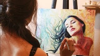
A time lapse of me creating my latest oil painting, "Letting Go." Thank you for watching! Subscribe & like for more art!
Art Store: http://lenadanyastore.com
instagram: http://instagram.com/lenadanya
twitter: http://twitter.com/LenaDanya
facebook: http://www.facebook.com/LenaDanyaPage
tumblr: http://lenadanya.tumblr.com
twitter: http://twitter.com/LenaDanya
facebook: http://www.facebook.com/LenaDanyaPage
instagram: http://instagram.com/lenadanya
tumblr: http://lenadanya.tumblr.com
Music:
► Rameses B - Memoirs
Get this song for free on his facebook page!
● Facebook: http://www.facebook.com/RamesesB.official
● Soundcloud: http://soundcloud.com/RamesesB
● Youtube: http://youtube.com/RamesesB
● Twitter: http://twitter.com/RamesesB
● Bandcamp: http://ramesesb.bandcamp.com

Working on a fun new painting of a figure in water, using watercolors.
Follow me on instagram: http://instagram.com/Lenadanya
Art Store: http://lenadanyastore.com
twitter: http://twitter.com/LenaDanya
facebook: http://www.facebook.com/LenaDanyaPage
instagram: http://instagram.com/lenadanya
tumblr: http://lenadanya.tumblr.com
Music: Artist: Ridvan Düzey (MachinimaSound) - Dancing with an Angel
License: http://goo.gl/ZSoZf
Source: Youtube.com/audiopad

Recent painting inspired by sunflowers, I also tried something different for me and made this piece more abstract. Thanks so much for watching!
I am an artist residing in sunny, warm [humid] florida! My paintings are heavily inspired by nature and its beauty. I work primarily in oil, and sometimes watercolor. The vast majority of what I share here on youtube involves my creation process: paintings, drawings, time lapses, tips, and occasionally artist vlogs, where I share bits of my life as an artist. Creating art is my greatest passion and I'm thankful for the chance to share it with you. ♥
☾ My Links:
⋆ Patreon: http://patreon.com/LenaDanya
⋆ Art Store: http://lenadanyastore.com
⋆ Instagram: http://instagram.com/lenadanya
⋆ Facebook: http://www.facebook.com/LenaDanyaPage
⋆ Tumblr: http://lenadanya.tumblr.com
Painting Time Lapses | mostly oil paintings and some watercolor:
https://www.youtube.com/playli....st?list=PLKQ3ynSeXKJ
Water Series | time lapses of my oil paintings depicting realistic water: https://www.youtube.com/playli....st?list=PLKQ3ynSeXKJ
⋆ Sketchbook Sunday | Casual series where I make sketches in my moleskine and chat with you about various art-related topics:
https://www.youtube.com/playli....st?list=PLKQ3ynSeXKJ
⋆Art help, tips, oil painting tutorials for beginners:
https://www.youtube.com/playli....st?list=PLKQ3ynSeXKJ
⋆Lena's Art Diary | Vlog series where I share some of my life. Travels, adventures, art museums, galleries, nature, food, at-home work days, etc:
https://www.youtube.com/playli....st?list=PLKQ3ynSeXKJ
Music: Sappheiros - Falling (Ft. eSoreni)
Soundcloud https://soundcloud.com/sappheirosmusic
Spotify https://goo.gl/hE9MDJ
Twitter https://twitter.com/SappheirosMusic
Instagram https://www.instagram.com/sappheirosmusic
Facebook https://www.facebook.com/SappheirosMusic
Discord https://discord.gg/Pk87yN9
eSoreni:
https://soundcloud.com/esoreni
https://www.esoreni.com
https://facebook.com/eSoreni
https://twitter.com/esoreni
https://www.youtube.com/redirect?q=https%3A%2F%2Fwww.looperman.com%2Facapellas%3Fmid%3DeSoreni&v=E_e4ro2hzpc&event=video_description&redir_token=DkO1lx8zDPQ-vIFZVGGpfVup8dV8MTUzMTk1MzgyMUAxNTMxODY3NDIx

Tips, advice, and personal experience about painting from a self-taught painter.
Art store: http://lenadanyastore.com
instagram: http://instagram.com/lenadanya
tumblr: http://lenadanya.tumblr.com
facebook: http://facebook.com/lenadanyapage
Free royalty-free stock photos:
http://www.sxc.hu/
http://www.photos4artists.co.uk/
Michael's:
http://weeklyad.michaels.com/coupons/
Music: Artist: Grafit
Track: Be Free
Licence: http://goo.gl/ZSoZf
source: youtube.com/audiopad

A video about some of my art supplies!
instagram: http://instagram.com/lenadanya
facebook: http://www.facebook.com/LenaDanyaPage
tumblr: http://lenadanya.tumblr.com
Art Store: http://lenadanyastore.com
DIY palettes: https://www.youtube.com/watch?v=MTRGk85z0ZA
Products I mentioned:
winsor & newton artist's oil colors:
http://www.winsornewton.com/na..../shop/oil-colour/art
winsor & newton wintons:
http://goo.gl/MqIXHU
gamblin artist oils:
http://www.dickblick.com/produ....cts/gamblin-artists-
grumbacher oil colors:
http://www.dickblick.com/produ....cts/grumbacher-pre-t
daler rowney georgian oil set:
http://www.jerrysartarama.com/....discount-art-supplie
Turpenoid:
http://www.dickblick.com/produ....cts/weber-odorless-t
grumbacher stand oil:
http://www.misterart.com/paint....ing/oil-paints/mediu
liquin:
http://www.dickblick.com/produ....cts/winsor-and-newto
oleogel:
http://www.naturalpigments.com/oleogel.html
Winsor & Newton watercolor compact set (scroll down the options are down there)
http://www.jerrysartarama.com/....discount-art-supplie
Canson 300g watercolor pads
http://www.dickblick.com/produ....cts/canson-xl-waterc
Toned Gray sketchbook:
http://goo.gl/rqAoRq
Little black sketchbook:
http://www.dickblick.com/produ....cts/fabriano-ecoqua-
fixitive:
http://www.michaels.com/grumba....cher-final-fixative-
General's charcoal pencils:
http://www.michaels.com/10015500.html
FTC: this is not a sponsored video and not affiliated with any companies. nothing was sent to me for free. All opinions are my own

A time lapse of one of my new oil painting landscape inspired by the beautiful state of Oregon. I share a little bit of my trip and inspiration for this painting.
I am an artist residing in sunny, warm [humid] florida! My paintings are heavily inspired by nature and its beauty. I work primarily in oil, and sometimes watercolor. The vast majority of what I share here on youtube involves my creation process: paintings, drawings, time lapses, tips, and occasionally artist vlogs, where I share bits of my life as an artist. Creating art is my greatest passion and I'm thankful for the chance to share it with you. ♥
☾ My Links:
⋆ Patreon: http://patreon.com/LenaDanya
⋆ Art Store: http://lenadanyastore.com
⋆ Instagram: http://instagram.com/lenadanya
⋆ Facebook: http://www.facebook.com/LenaDanyaPage
⋆ Tumblr: http://lenadanya.tumblr.com
Painting Time Lapses | mostly oil and some watercolor:
https://www.youtube.com/playli....st?list=PLKQ3ynSeXKJ
Water Series | time lapses of my paintings depicting realistic water: https://www.youtube.com/playli....st?list=PLKQ3ynSeXKJ
⋆ Sketchbook Sunday | Casual series where I make sketches in my moleskine and chat with you about various art-related topics:
https://www.youtube.com/playli....st?list=PLKQ3ynSeXKJ
⋆Art help, tips, oil painting tutorials and techniques for beginners:
https://www.youtube.com/playli....st?list=PLKQ3ynSeXKJ
⋆Lena's Art Diary | Vlog series where I share some of my life. Travels, adventures, art museums, galleries, nature, food, at-home work days, etc:
https://www.youtube.com/playli....st?list=PLKQ3ynSeXKJ
Music:
• UberVice - Staring into the eye of infinity
https://soundcloud.com/ubervice
https://facebook.com/UberViceMusic
https://twitter.com/UberVice
https://instagram.com/ubervice
heroboard
» Twitter: https://twitter.com/heroboard
» Spotify: https://is.gd/elemud
http://youtube.com/heroboard

Drawing a realistic portrait of a girl with charcoal and watercolor in my moleskine sketchbook, I also discuss how perfectionism can harm an artist, as well as my experience with it.
Art Store: http://lenadanyastore.com
twitter: http://twitter.com/LenaDanya
facebook: http://www.facebook.com/LenaDanyaPage
instagram: http://instagram.com/lenadanya
tumblr: http://lenadanya.tumblr.com
Music:
KiFi - flight 135
Twitter: http://goo.gl/nbuO3E
Soundcloud: http://goo.gl/RheQDD

Easy and simple painting tutorial for beginners in oil, creating a beautiful evening sunset sky, demonstrating color mixing and use of mediums.
Art Store: http://lenadanyastore.com
twitter: http://twitter.com/LenaDanya
facebook: http://www.facebook.com/LenaDanyaPage
instagram: http://instagram.com/lenadanya
tumblr: http://lenadanya.tumblr.com
Music:
Amarante - Into the Dark (Instrumental)
http://amarantemusic.com
http://soundcloud.com/amarantemusic
http://youtube.com/amarantemusic
http://facebook.com/amarantemusic

Painting a landscape in Skyrim inspired by my own gameplay. Thanks so much for watching!
Art Store: http://lenadanyastore.com
twitter: http://twitter.com/LenaDanya
facebook: http://www.facebook.com/LenaDanyaPage
instagram: http://instagram.com/lenadanya
tumblr: http://lenadanya.tumblr.com
Music:
Rameses B - Skyrim in the knee
● https://www.facebook.com/RamesesB.official?fref=ts&ref=br_tf
● Soundcloud: http://soundcloud.com/RamesesB
● Youtube: http://youtube.com/RamesesB
● Twitter: http://twitter.com/RamesesB
● Bandcamp: http://ramesesb.bandcamp.com

I felt compelled to combine my love for 40s pinup and 20s silent films into a video, I hope you all enjoy, I had so much fun making this! This is a "trailer" made to fit youtube's new channel design.
Thank you for your support and kindness! xo
official art store: http://lenadanyastore.com
website: http://lenadanya.com
other places you can find my work:
Instagram: http://instagram.com/lenadanya
Facebook: http://www.facebook.com/LenaDanyaPage
Tumblr: http://lenadanya.tumblr.com
Twitter: http://twitter.com/lenadanya
Music credits:
silent film soundtrack by Kevin Macleod, royalty free from http://incompetech.com
future transition song:
"Breathe" by Singularity
License: http://bit.ly/nEI0Gt
Source: http://youtube.com/audiopad

Painting some watercolor randomness in my moleskine skatechbook!
I am an artist residing in sunny, warm [humid] florida! My paintings are heavily inspired by nature and its beauty. I work primarily in oil, and sometimes watercolor. The vast majority of what I share here on youtube involves my creation process: paintings, drawings, time lapses, tips, and occasionally artist vlogs, where I share bits of my life as an artist. Creating art is my greatest passion and I'm thankful for the chance to share it with you. ♥
☾ My Links:
⋆ Patreon: http://patreon.com/LenaDanya
⋆ Art Store: http://lenadanyastore.com
⋆ Instagram: http://instagram.com/lenadanya
⋆ Facebook: http://www.facebook.com/LenaDanyaPage
⋆ Tumblr: http://lenadanya.tumblr.com
Painting Time Lapses | mostly oil and some watercolor:
https://www.youtube.com/playli....st?list=PLKQ3ynSeXKJ
Water Series | time lapses of my paintings depicting realistic water: https://www.youtube.com/playli....st?list=PLKQ3ynSeXKJ
⋆ Sketchbook Sunday | Casual series where I make sketches in my moleskine and chat with you about various art-related topics:
https://www.youtube.com/playli....st?list=PLKQ3ynSeXKJ
⋆Art help, tips, painting tutorials for beginners:
https://www.youtube.com/playli....st?list=PLKQ3ynSeXKJ
⋆Lena's Art Diary | Vlog series where I share some of my life. Travels, adventures, art museums, galleries, nature, food, at-home work days, etc:
https://www.youtube.com/playli....st?list=PLKQ3ynSeXKJ
Music:

Painting a portrait of Augustus and Hazel from The Fault In Our Stars by John Green. Thanks for watching! Get your free audiobook: http://audible.com/lena
Art Store: http://lenadanyastore.com
twitter: http://twitter.com/LenaDanya
facebook: http://www.facebook.com/LenaDanyaPage
instagram: http://instagram.com/lenadanya
tumblr: http://lenadanya.tumblr.com

Time-lapsed process for an oil painting landscape of a forest in the mountains. I love painting nature!
Art Store: http://lenadanyastore.com
twitter: http://twitter.com/LenaDanya
facebook: http://www.facebook.com/LenaDanyaPage
instagram: http://instagram.com/lenadanya
tumblr: http://lenadanya.tumblr.com
Music:
belmont - Lip
https://soundcloud.com/belmont-music
https://www.youtube.com/watch?v=WfvgGuTIMn4
License: http://creativecommons.org/licenses/by-sa/3.0

Time-lapsed painting of some fall tree color studies with oil paint in my moleskine sketchbook!
Art Store: http://lenadanyastore.com
twitter: http://twitter.com/LenaDanya
facebook: http://www.facebook.com/LenaDanyaPage
instagram: http://instagram.com/lenadanya
tumblr: http://lenadanya.tumblr.com

Painting Time-Lapse of waterlilies in my sketchbook, using watercolor, charcoal, and acrylic!
Art Store: http://lenadanyastore.com
twitter: http://twitter.com/LenaDanya
facebook: http://www.facebook.com/LenaDanyaPage
instagram: http://instagram.com/lenadanya
tumblr: http://lenadanya.tumblr.com
Music:
• Nomyn -Daydreamer
https://soundcloud.com/nomyn
https://facebook.com/NomynMusic
https://youtube.com/channel/UC....f1rozseSOhdHJTo2Ij2S

MUSIC: "Remember this Autumn" by Cinquequarti
please feel free to visit http://audiojungle.net/user/Cinquequarti
http://www.marcellobarenghi.com
Support my FACEBOOK page:
https://www.facebook.com/MarcelloBarenghi :)
FOLLOW ME ON G+:
https://plus.google.com/+marcellobarenghi
FOLLOW ME ON TWITTER:
https://twitter.com/BarenghiM
FINAL PICTURE:
http://www.marcellobarenghi.com/2015/04/a-bottle-of-beer-saison-dalliance.html
DRAWING TOOLS AND ART SUPPLIES:
http://www.marcellobarenghi.com/p/materials-used-for-my-drawing-video-on.html
I also used my old airbrush for doing some shadows
THIS DRAWING TOOK ME:
5 hours and 19 minutes
Check out the full drawing process in this youtube video! A time lapse of the drawing from beginning to end.
How to draw and color a bottle of beer with cork, mixed media on gray paper by Marcello Barenghi - Italian Art.
Desenho hiper-realista time-lapse: Assim é a garrafa da Saison d'Alliance cerveja
Dibujo hiperrealista time-lapse: botella de cerveza Saison d'Alliance
ハイパーリアルな描画 - タイムラプス - ビールのボトル
超真实的绘图 - 的时间推移 - 一瓶啤酒
Dessin hyperréaliste time-lapse: une bouteille de bière "Saison d'Alliance"
гиперреалистичный рисунок - покадровая съемка - бутылка пива "Альянс сезон"
Disegno iperrealistico: una bottiglia di birra brasiliana
Hyper-realistische Zeichnung - Zeitraffer: eine Flasche Bier
http://www.marcellobarenghi.com
Support my FACEBOOK page:
https://www.facebook.com/MarcelloBarenghi :)
FOLLOW ME ON G+:
https://plus.google.com/+marcellobarenghi
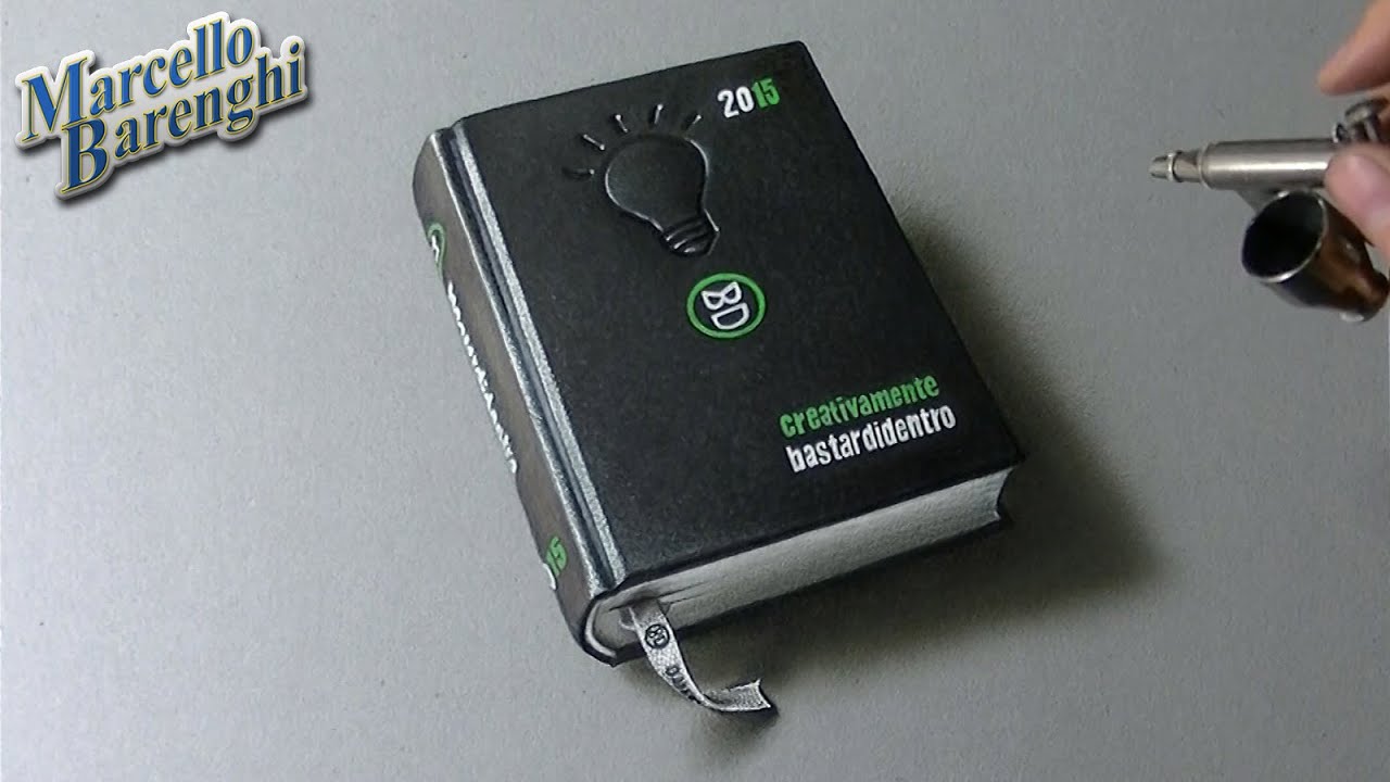
Disegno dell'agenda BASTARDI DENTRO 2014-2015 "Creativamente"
http://www.bastardidentro.it
Tempo impiegato: 3 ore e 50 minuti
Materiali utilizzati: http://www.marcellobarenghi.it/p/materiali.html
Hyperrealistic speed drawing of Bastardi Dentro (Bastards Inside) school diary, mixed media on gray paper by Marcello Barenghi - Italian Art.
Creativamente Bastardi Dentro means Creatively Bastards Inside
FINAL PICTURE:
http://www.marcellobarenghi.com/2014/05/agenda-bastardi-dentro-2014-2015.html
DRAWING TOOLS:
http://www.marcellobarenghi.com/p/materials-used-for-my-drawing-video-on.html
I also used my old airbrush for doing some shadows
THIS DRAWING TOOK ME:
3 hours and 50 minutes
MUSIC - MUSICA: "Summer Songs" by Jewelbeat.com
http://www.jewelbeat.com (Standard Licence)
